Discussion Redesign Update

SamGarza1
Instructure
Instructure
56
11969

Canvas.png

Hello Community! Over the last two years since this feature group was created, our team has released many updates to the Discussion/Announcement Redesign feature preview. Taking user feedback from this group, the community as a whole, and internally to ensure that what we created didn’t have any loss in functionality but also provided new functionality that our users needed. With our recent deploys which include flexible viewing, inline and split view, and edit history we feel that now the time has come to enforce the redesign so everyone has access. 


I’ve included a list of all the functionality that currently exists in the legacy version and what’s new below to give a comprehensive overview of the redesign. 

Discussions Redesign
SamGarza1_0-1701471846031.png


To start we wanted to ensure that there was no loss of functionality between the old and new experience. Users will still be able to set up discussions in the same way with the same requirements. 

Discussions

  • Users must post before seeing replies
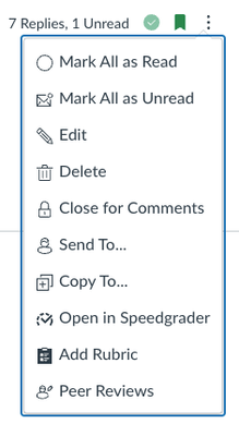
  • Reply posts can be marked as read or unread
  • Discussion time stamp edit display
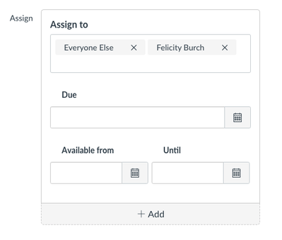
  • Multiple Due Dates (addition: individual student names are displayed instead of the total number of students)
  • Available From and Until Dates

SamGarza1_1-1701471845811.png


  • Previous/Next buttons for Modules
  • Group Discussions
  • Peer Review
  • Add to student to-do list
  • View deleted posts (change: deleted posts always show)
  • Rubrics

SamGarza1_2-1701471845946.png


Once we were sure that no functionality would be lost, we shifted our focus to new functionality that we could add. This includes:

  • Improved search with highlighting
  • Edit History
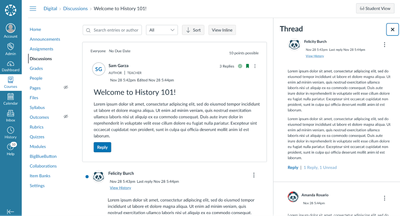
  • Flexible viewing options: Inline and split view
  • Role Labels
  • Quoting
  • Reply Reporting and notifications to Instructors
  • Full and partial anonymous graded discussions
  • Sort options (Newest to Oldest, Oldest to Newest)
  • Filtering (All, Unread, Read)

Announcements

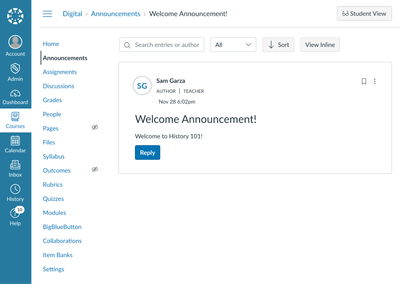
While Announcements is also getting a facelift to improve accessibility and provide design consistency, no functionality has been changed. 
SamGarza1_3-1701471845977.png


How to experience the redesign?

Before July 20, 2024, users will need to turn on the Discussions/Announcements Redesign feature flag. If this has been turned off at the account/root level you’ll need to contact your admin to enable it.

After July 20, 2024, the redesign will be enabled for everyone - no migration or further action is needed. All existing discussions and announcements will simply be updated with the new UI and have access to all the new functionality. 

We value your continued feedback and are looking forward to taking this next step. More information can be found in the Product Blog and the Feature Group Knowledge Base

Best, Sam

56 Comments
mmoore1
Community Contributor

Great News.  We will start advertising at Ventura College. 

gwitmer
Community Novice

I'm so glad to see anonymous discussion boards finally become possible. This is absolutely critical for some of what I teach.

One question: does the redesign allow the instructor to know the identity of the anonymous student poster? I know that students would want to know whether they are truly anonymous or only anonymous to the other students.

Thanks for this very good news; I will be using it asap this spring 2024 semester.

james_whalley
Community Coach
Community Coach

@SamGarza1 wrote:
  • Filtering (All, Unread, Read)

Is the Read filter something that is still being worked on, as it does not look available in the View dropdown.

ereagan
Community Member

I have opted into the "Discussions/Announcements" feature preview in one of my classes. 

I still do not see any "Checkpoints" or multiple due dates option for Discussions. When will it be available before the July 2024 implementation? Shouldn't all of the new options available in the "preview" be launched in this stage also?

I only see the View Options and Anonymous Posting available so far in the preview.

Am I missing a step? 

Thanks,

Evette

morlin
Community Participant

I really look forward to the multiple due dates for the assignment as a whole.

It so confuses my students to have the initial post date and then the date change for the response. If anyone's developed a good technique/wording for that, please share.

I would really appreciate; so would my students!

callinger
Community Participant

In reference to the "Multiple Due Date" discussion:

I'm hoping someone from Instructure can confirm this, but I believe that the phrasing "multiple due dates" here has gotten our hopes up. This seems to be in reference to the function that we can differentiate assignments -- assign different students or sections different due dates. What we all have been hoping for (and asking for) is being able to have multiple due dates in the sense that initial posts are due on X date and replies are due on Y date. This desired functionality doesn't seem to be on the current roadmap, as far as I can see. Please confirm, Instructure Peeps?

@morlin -- FYI: My workaround is to set one due date in Canvas itself (e.g. date for initial posts) and then set a calendar item for the other due date (e.g. titled "Week 1 Discussion Replies Due"). When I have the time, I even link the assignment in the event description. This is not an elegant workaround, but it only requires up-front work rather than work while the course is running. 

JamesSekcienski
Community Coach
Community Coach

@ereagan @morlin @callinger 

Multiple due dates is a feature that is already available.  Multiple due dates refers to the ability to use the "Assign To" settings to assign different due dates to different users.

Checkpoints is the name of the feature that will allow an instructor to set one due date for when the initial post is due and a second due date for when replies are due.  This feature is still in development and has not yet been released so you won't see it in the Discussion Re-design yet.  @SamGarza1 has shared before that they are working on this and hope to have it released in Q1, but an exact date hasn't been announced yet.  If you look at the Product Roadmap, this feature is listed under Q1 2024 - Q2 2024 as part of the following: "Students engage in deeper, more meaningful discussion with classmates with clear checkpoints to guide their way."

rpsloan
Community Participant

@SamGarza1 Would at any point before the enforcement would this discussion become available in the app?

PhyllisPost
Community Member

I'd like to see the ability to use editing options (like bold or highlighting text) in Discussion posts.


james_whalley
Community Coach
Community Coach

@PhyllisPost Are you talking about applying formatting when making the post or editing a post you've already made? I believe those functions are already available. Is there something different you are looking for?

lshulman
Community Participant

@SamGarza1  wrote:

Users will still be able to set up discussions in the same way with the same requirements. 

Discussions

  • Users must post before seeing replies
  • Reply posts can be marked as read or unread
  • Discussion time stamp edit display
  • Multiple Due Dates (addition: individual student names are displayed instead of the total number of students)
  • Available From and Until Dates

===========

EXCEPT no longer able to specify "allow threaded replies" (so, so very important to many of us)

And what about "graded" and "allow liking"???

GRADED discussions is also VERY important option.

Current (old) version of discussions:

Options

 
jawmedina
Community Participant

I like the look and feel of the new Canvas discussions, but it is difficult to navigate to specific discussions. I try to spread out my comments to all students throughout the semester, but the New Canvas discussion makes that extremely difficult. For example, if I mark that I read and replied to a student's post, as soon as another student replies to that post, the OP post is marked unread and I have to mark the replies I didn't read as read so it shows the original post was read. Also, the sort function needs more options. I cannot see the posts in the order they are posted as they are either posted with the most current activity or the oldest activity.

Is there a way to allow individual posts to remain marked as read even if there are new replies? How can I sort based on the newest and oldest posts, not newest and oldest activity? As it is now, I may have to discontinue its use.

jawmedina
Community Participant

@ereagan @morlin @callinger 

For the different dates and replies, I make the initial post due (due date) on Tuesday and then I make the replies due on Thursday (end date). They get to see the due date in the calendar, but not the reply date (end) date. I then award points if they meet the initial post due date. It works fairly well for me. If there is a post after the due date, Canvas marks it as late. It isn't ideal, but it works well enough. 

WhitniBuckles
Community Explorer

Does this redesign allow for the use of Turnitin with Discussions? This is a critical need.

afurr0026
Community Participant

It would be ideal if a Discussion/Announcement Redesign training could be added to the Training Services Portal as an option for admins and faculty (regardless if the institution has an elevated subscription or not to the portal).

We all have access to a New Quizzes Essentials training and it seems that if Instructure is going to enforce the Discussion/Announcement Redesign tool, then at the least, there should be some type of universal training available for all admins and faculty that could be easily accessed. Admins could then direct faculty to a universal training that thoroughly explains this redesigned tool before the transition is enforced for all this July. Stumbling across information in the Community and/or reviewing numerous guides is not ideal or acceptable. 

If a training cannot be created, then a detailed video explaining the redesigned tool would be extremely beneficial. Maybe this already exists, and I've overlooked it. If so, could someone share the location of the video? 

roberta_niche
Community Participant

This is training is essential.

TrinaAltman
Community Participant

@afurr0026 great ideas!

Regarding your question on the video resource, on 12/1/23 Sam Garza from Instructure said, "Our team is also working on overview and comparison videos and will have those available in the next 1-2 weeks." Community members have asked about the status of the videos a few times along the way (including this post by @vanzandt as recently as last week). I haven't seen a response yet nor notice that the videos are available, but maybe I missed it. @SamGarza1 would you be able to provide an update or link to the videos if they are available? Thank you.

Jeff_F
Community Coach
Community Coach

@SamGarza1 

Hello! Can it please be explained why the font of the 2nd, 3rd, etc. level replies is smaller than the initial reply?

--------------

Smaller fontSmaller font


afurr0026
Community Participant

Just to follow up on my 2/28/24 post, an overview video is now posted at the top of this page, and it can also be found at Dive into the Discussion Redesign with Our New Video!

Also, within the Dive into the Discussion Redesign with Our New Video! comments, @KevinMeredith posted a direct link and embed code for the video. 

pray4
Community Participant

I'll just say quite frankly that if you force this update prior to having an "allow threaded replies" option functioning in parity with the existing discussion boards, you are doing your clients an incredible disservice.

The new quizzes launch was highly problematic, but at least in that instance, you rightfully backed off the forced implementation. We are at the point as administrators where we need to communicate out the impact of these changes and sound the alarms where necessary. If you are going to delay the forced rollout as most think you should, it would be greatly appreciated if you would provide us all an update on that now, rather than force us to work through a PM fiasco that will also involve communicating out to multiple committees, creating new resources, etc.

The checkpoints option has yet to be added. How can we properly prepare for rollout when we are mere months away and still do not have final product in place for testing, review, and so on?

arovner
Community Contributor

A faculty just explained that he was struggling so much using Groups in New Discussions that he just turned it off and went back to using "classic" Discussions. He says that in classic Discussions, it's very easy as a Teacher to click on your discussion and see a list of all the groups and how many posts are in each one. In the new discussions, there is a drop down menu that you have to navigate to each separate group and no indication of how many responses are in each one. It's a lot of extra clicks and he is super frustrated. 

Thank you for reading.

Nancy_Webb_CCSF
Community Champion

Hi @arovner,  I hadn't tested group discussions and verified what you experience.  Luckily, it looks like the 4/10 update will add the number of unread posts to that dropdown list, hopefully both in the main discussion and also in the "select group" dropdown when viewing a group's workspace.  Discussions/Announcements Redesign: Release Change... - Instructure Community - 478033 (canvaslms.co...

It is still an extra click to view the dropdown list with unread count, but at least teacher will know if a group discussion needs a visit.  I hope it will also show total messages, guess we'll soon see.

hesspe
Community Champion

 Re: @Nancy_Webb_CCSF  to @arovner

I hope you're right about the unread posts dropdown issue being resolved in the 4/10 deploy. The Release Notes for the 4/10 deploy lists that as a "Feature Preview."  Does this mean it will be  a "Feature Option" that an Admin can turn on in their instance at will?  The description quoted below makes it seem like it may not be.  Perhaps @SamGarza1  or someone else from Instructure can clarify with regard to this improvement (or we can wait three days and see what happens).

"A Feature Preview indicates a feature option in active development. Users who opt into the feature and join the Community user group can help improve the feature...When this feature option is available for general use, the feature option will be announced in the Canvas Release Notes."  

kda106
Community Participant

@SamGarza1 This says "Full and partial anonymous graded discussions", but when you make a Discussion either full or partially anonymous, it can no longer be graded.


hesspe
Community Champion
 

groups.png

Jeff_F
Community Coach
Community Coach

@SamGarza1 @SamGarza1 

GM! - Like everyone else, we have begun preparations for communicating the required adoption of the redesign. While we created our own brief video to help instructors, it would be very helpful if the Canvas guides, including existing video resources for students, were updated to reflect the features of the redesign. See the link below.

https://community.canvaslms.com/t5/Video-Guide/Discussions-Overview-Students/ta-p/383515 

I would like such a video to make mention of any key changes. For example, resorting of the boards based on the most recent post (and comment?), the need to click the expand all button in the Inline view to view all posts without having to click the Replies link under each post, the requirement to click the View Replies link to see replies in the split screen view, the change in the indenting, mentions, etc.

Perhaps that exists but I am not finding it.

Our group appreciates all the effort that goes into the planning, UI design, coding, QA testing, documentation, and support. Please send a high-five to everyone on the team. 

Our email goes out to the +150 faculty teaching in our April term this morning. And then we have the +800 courses in May.  Wish us luck. 🍀

afurr0026
Community Participant

@Jeff_F 

A video existed, but I'm unable to locate it now in the Canvas Guides.

However, I do have the embed code since we created our own training for faculty and included this embed code as an optional resource that they could then add to their discussions. 

Unsure if Canvas folks are planning to update this resource since it definitely no longer exists in the guides. 

Found it:  How do I reply to a discussion in Discussions Redesign as a student? 


<iframe width="560px" height="320px" allowfullscreen="true" allow="autoplay *" title="Canvas Shorts: How do I reply to a discussion in discussions redesign?" src="https://community.instructuremedia.com/embed/039130b6-e41d-4d2a-aa65-a97bf0d04321" frameborder="0"></iframe>

SamGarza1
Instructure
Instructure
Author

Hi @kda106

Apologies for any confusion! You are correct, anonymous and partially anonymous discussions can not be graded at this time. We're working to update the documentation and video. 

rpsloan
Community Participant

@SamGarza1 We're turning this setting ON on May 13 and the SpeedGrader view is still not fixed. And I'm assuming the fix for this is related to the delayed Release note 04/24/24 - Discussion View Updated in SpeedGrader [Delayed as of 2024-04-16]

Can you verify if this release note will fix this? If so, is the new date anytime within the next two weeks?

Your post in this thread says the change has been reverted, but I'm still seeing Canvas load fully in the SpeedGrader view when clicking "view full discussion".

dspiel
Community Participant

We turned New Discussions in Spring of 2023. Overall not to many complaints, but any faculty member that uses group discussions has turned it off and refuse to use New Quizzes in any of their courses. It takes faculty much longer to check each group to see if there has been any new posts where as the original discussions had numbers showing number of posts for each group that could be monitored.

The other complaint is GET RID OF MULTIPLE PAGES. Make it one stream. There is no reason having to go from page to page. Faculty have found those on pages 2 or 3 have very few if any responses when responses to a posting is required.

davidgs
Community Participant

Yes, I see no reason for multiple pages for discussions. And the page numbers are so small, my students don't see them, so they don't know that there are more pages. As a result, I field many "My post disappeared!" messages, and students tend to reply only to posts on the first page because they don't realize there are more, as you note.

I turned off New Quizzes, too, for my courses.

dspiel
Community Participant

a minimum word count would be extremely useful.

aletinsky
Community Member

After diving in for several days with the new discussion format, I switched back to classic. I'm really good at adapting to new technology and updates, but I've lost too much functionality with the new version. The ability to tag students with @ is a big improvement, but it doesn't outweigh the problems I've found.

#1 Threads marked as unread as opposed to initial posts separately marked read or unread

As an instructor who stays engaged throughout the week, this is a big problem. I don't just read everything at once, but I come back to topics over the course of the week.

The entire thread is marked as unread if there's any post within that is unread.

We need the ability to mark individual posts as read or unread, to allow us to come back to address any particular element of the thread at a later time.

#2 It is extra time-consuming to scan for new threads as opposed to just new replies

The former version collapsed the discussions to a much smaller version of the thread. This allows instructors to scan quickly through the posts to see what new thread is available and prioritize responding to threads that are brand new.  It takes far longer to look at all the different threads to determine if the initial post is new or not.

I am an instructor who prioritizes new threads before new responses. This might not be true for others, but it's very important to me to address the primary posts, which are the initial posts of new threads. I need to be able to address those first, and there's now a lot of wading through other content to find those. 

#3 Unreliable marking of whether a thread is read or unread

Because the new format requires us to scan through many threads to determine if there are any new threads, the scanning process can mark some unread, when we were merely just trying to look to see if there were any new threads. 

This is another problem that could be solved by collapsing the threads smaller and allowing us to mark individual posts as unread instead of the whole thread. 

Proposed solutions:

Make the initial post previews much smaller in the collapsed version, similar to what they were in the previous version of discussions.

Go back to making each un-read post easily identified as read or unread, as it was before (a simple click of a button as opposed to navigating a menu and selecting unread or read), instead of marking entire threads as read or unread.


hesspe
Community Champion

I can understand the concerns that @aletinsky is expressing, and I know at least some of them have been made by several posters.  I can see the other side too - that for some it might be useful to have threads with new replies promoted to the top.  Since I am not a heavy user of Canvas discussions myself, I don't have a strong opinion about what one choice would serve the most people.  I do think when a change is made to how things worked previously, it imposes a higher burden for justification.  There have been changes made to the gradebook and New Quizzes that I know from first-hand experience caused and continue to cause a lot of frustration by violating expectations based on previous use. In this case, it's pretty obvious that giving users an option to choose whether new top level posts or new replies are prioritized for recency would be the most satisfying.  But that's not the reason I started writing this post.  My motivation was to express concern that very well articulated and valid concerns expressed here repeatedly elicit no response from the product team.  In the case of the Discussions Redesign process, it makes one wonder if the development team either disbanded or decided that the best way to keep out of trouble is just to hunker down.  Nu?

lshulman
Community Participant

@aletinski

(Why is there no "reply" directly associated with each post here?)

I agree with your concerns. I too would like to see initial posts also collapse, making for shorter scroll downs on a discussion page. Just show post header and first line of post, as in old discussions. 

Another issue I see with the green dot for "read/unread"... can no longer just click the dot to toggle on or off. That action is now a more cumbersome menu to open. 

pray4
Community Participant

I'll echo these same concerns as well, which relate back to my concerns from two months ago. We still do not have complete functionality based on what was pledged. The lack of communication and looming forced rollout do not feel at all client, or student friendly for that matter. I've escalated with our own Success rep as well. It would be nice to hear from someone on the Canvas side regarding this matter and the concerns raised here.

lshulman
Community Participant

< (change: deleted posts always show)>

I noticed this. I don't like it. I find it a distraction and potentially confusing.

Are these deleted posts visible to all users, just the instructor, or just to the user who deleted the post (instructor or the original student poster - if students are allowed to delete)?

While it can be sometimes helpful to view deleted posts, at least make these collapsed by default, so they are less of a distraction.

Nancy_Webb_CCSF
Community Champion

Hi @lshulman, I hadn't noticed this change. 

In classic discussions, teachers have to click an "eye" icon in order to see deleted posts, although deleted posts in a thread always display the deleted post and are visible to all users.  You can't see the content of the post, just that one was deleted (a placeholder), the date, and the name of the deleter, be it teacher or the student. I tested and the above change means a placeholder for deleted posts is always visible, it's not necessary to click an icon.

In classic discussions, students could see a deleted placeholder in a thread, but not if a post without replies were deleted.  In discussions redesign, all deleted posts have a placeholder visible to all users.  

I remember teachers being sure they saw a post that since disappeared, and they had to click the eye to see that one had been deleted.  For me, it's better that it's easy to see if a post has been deleted.

jawmedina
Community Participant

The redesign appears to have many great features. 

How have the issues/needs identified in this discussion been addressed? The UI is great. The UX isn't. I haven't seen any replies by the Canvas staff about the specific issues that have been brought up. Does that mean they won't be addressed/added?


@SamGarza1, you mentioned, "Taking user feedback from this group, the community as a whole, and internally to ensure that what we created didn’t have any loss in functionality but also provided new functionality that our users needed." It seems a lot of functionality in the old discussion that teachers desire is being removed/lost. 

cheryltice
Community Participant

Hello, @SamGarza1 

Thank you for the update. Our instructors have been experiencing issues with the updated interface, which we would like to bring to your attention:

  1. Settings and preferences:
    • The buttons at the top to change settings do not preserve users' preferences and can be confusing. Clearer labels (such as Switch to <setting>) and the ability to save preferences would help improve the user experience.
    • Users cannot set and maintain preferred settings, leading to settings being reset to default upon refreshing or navigating away from the page, which can happen frequently for a variety of reasons.

  2. Tracking and sorting replies:
    • The lack of formatting (extra indentation, background color, borders, etc.) makes it challenging to differentiate original posts and levels of threaded replies.
    • Sorting options are limited, making it difficult to find unread replies and track original posts in chronological order.
    • After a certain number of replies, the discussion is arranged on multiple pages, making it harder to scan for inappropriate posts or find specific replies.
    • The additional formatting has resulted in a lag time when loading discussions with a large number of replies. This was not an issue before.

  3. Marking posts as read/unread:
    • The blue indicators for read/unread posts/replies are not clickable, requiring extra clicks to mark items as read/unread, which can be time-consuming in longer discussions. Our instructors used the boxes to mark items read/unread frequently in the legacy version to help them return to posts to respond quickly.

  4. SpeedGrader integration:
    • Clicking a link associated with a reply in SpeedGrader takes the user to the top of the discussion instead of directly to the corresponding reply, making it difficult to view the reply in context.

  5. Editing and deleting replies:
    • Separate checkboxes for allowing or preventing students from editing and deleting replies would be beneficial.
    • When students delete a reply, there is no record of the deletion (except for the initial notification email, if enabled).
    • When instructors delete a reply, a placeholder with the instructor's name and date of deletion remains, which instructors indicated they would prefer not to show.

  6. Miscellaneous issues:
    • Some instructors have reported duplicate replies that disappear upon refreshing or navigating away from the page.
    • Replying to discussions from Outlook notification emails attaches the entire email thread to the discussion formatted in the same way as the original notification email.
    • The "Go to Reply" feature is inconsistent and can be confusing when it appears.

Our instructors would greatly appreciate a view that more closely resembles the legacy discussions interface, particularly the ability to anchor original posts in chronological order. The Sort feature does not sort that way. The current interface makes it challenging to track read/unread posts and replies effectively, which has impacted workflow.

We would be grateful for any improvements or solutions to these issues to enhance the user experience for our instructors. Thank you for considering our feedback.

Best regards,

Cheryl
Instructional Technology Strategist

dspiel
Community Participant

Change the initial Reply button at the top to Post or something similar as the first posting is not a Reply.

hesspe
Community Champion

I think this is a great suggestion.  Thinking of a discussion as a prompt, followed by posts responding to that prompt,   followed by replies to individual post (aka threads), reinforces the mental model that is most effective when using of discussions as a way of encouraging critical thinking.   Giving both the posts and replies the same label suggests (inaccurately) a flattened structure.  Such an easy change to make. Big reward at next to no cost.

lshulman
Community Participant

@cheryltice

Everything you say, I share these issues. Thank you for phrasing these issues so clearly. 

Jeff_F
Community Coach
Community Coach

Hello @hesspe - seeing your comments being typically positive of this redesign, perhaps you might have insights for a few questions I've had and/or read. Here they are:

  1. Why does the sort option go by initial posts and all the replies?
  2. What is the purpose and benefit of the split screen view?
  3. Why is the font size of the 2nd, 3rd, etc. level replies smaller than the initial reply?

By the way, I've used several discussion tools over the years including at least two other LTI integrations that also sort by all posts and replies. I found that a little maddening as I had to rescan the entire list of posts each evening looking for new initial replies for me to read and reply to.

I found it rather inefficient however with those tools (Yellowdig and Harmonize) at least I had some amount of automation with aspects of grading (meeting word count, number of posts, etc.). With the Canvas redesign, I see the extra work of having the rescan the posts with no reward (time savings) on the back end. 


hesspe
Community Champion

@Jeff_F  My thoughts about all of the items you mentioned is that there are valid reasons why someone would prefer the options you apparently do and that others might prefer the alternatives you aren't crazy about.  Someone who places a high value on students' interactions with other students, for example, might like that posts with the most recent replies are promoted (and those threads marked as unread), while someone who looks primarily for  (and grades on) a students post to the main prompt would find it an impediment.  (I would love to see it as an settings choice).  I like the side-by-side view, but as a support person,  I'm very glad that there is an option (which I think is the default)  not to use it, since it feels quite quirky if you're used to a linear presentation.  Once you get used to it, though,  I like that you can choose to isolate individual threads.   I guess the font size choice has to do with differentiating posts from replies, but I have to admit I didn't notice it until it was pointed out to me and I have nothing to add pro or con.

SamGarza1
Instructure
Instructure
Author

Hi @rpsloan, we have fixed the issue with the entirety of Canvas loading within speedgrader and that fix is on production currently. The feature here Release note 04/24/24 - Discussion View Updated in SpeedGrader [Delayed as of 2024-04-16] is for further improvements to the discussion speedgrader experience that our team is still working on and will be in a release after the discussion redesign is enforced. 

SamGarza1
Instructure
Instructure
Author

Hi @cheryltice , Thank you for collecting all of that instructor feedback! 

While we won't be able to add functionality to remember a user's setting preferences on a discussion before the enforcement it is something we're looking into as future improvements. So far the feedback has primarily been around remembering an individual's choices, but would you see any need for setting those options at the course level for all users?

We're working on changing the sorting experience. If you're interested please leave your feedback on this blog if you haven't already. We're also working to reimplement the one-click mark as read on posts.

Thank you for mentioning the issue with the links I'll look into it with the team. We're also looking into how we can separate out edit and delete permissions. 

For the issue with the email notifications, is it only happening in Outlook?


SamGarza1
Instructure
Instructure
Author

Hi @jawmedina Thank you for all the feedback. I just posted a blog that overviews some of the refinements we're making and asking for feedback on the sorting. We're also looking at what changes we want to prioritize in the long term and will be sure to update the community. 

cheryltice
Community Participant

Hello, @SamGarza1,

Thank you for your response. I will share my reply here and at the blog link.

Regarding your question about the potential need for setting discussion options at the course level for all users, I think it would be useful for instructors to be able to set discussion options at the course level to ensure a consistent experience for all students in a course. Based on the feedback we have received so far, the ability for instructors to organize initial posts in chronological order would be most useful.

At the same time, I think individual settings should be available to allow users to adjust individual settings and override any course-level settings if they differ. Flexibility for users to customize their own experience is important.

Our instructors will be relieved to hear that the one-click "mark as read" feature will be in a future release. Hopefully, it will be released soon.

Thank you for looking into the issue with links and the permissions for editing/deleting.

Regarding the email notification issue, when the instructor receives an email notification from the discussion board, if they reply to it from the email message, the reply is added to the discussion and formatted the same way as the email.

Please let me know if you have any other questions! Your attention to these issues is appreciated.

Best,

Cheryl

lshulman
Community Participant

@SamGarza1 

I agree with @cheryltice "ability for instructors to organize initial posts in chronological order would be most useful."

If I want students to avoid posting duplicate questions or topics, they do need to see what has already been posted. And then, if they do post a duplicate, *I* need to see who was the FIRST student to post that question/topic so I can then determine who to ask to repost with a different question/topic. If posts shift around in other than chronological order, that will make my job immensely more time consuming if I have to check the date and time posts were made.

If posts shift around based on timing of replies (rather than timing of initial posts), each time I view a discussion, I will see posts in a different order. That can be terribly confusing. I would not know what to expect. Typically, I order posts oldest first, so I expect to see new initial posts below what I've already seen. If post order shifts based on the date of (sometimes hidden) replies, new initial posts/threads might be mixed in with older posts/threads and I may very well miss something or take unnecessary time re-reading something I'd already seen.

An "unread" mark and/or number of "new replies" by any given initial post should be sufficient to alert me to what thread I need to open to read new replies. I don't need such threads pushed to the top of the discussion.