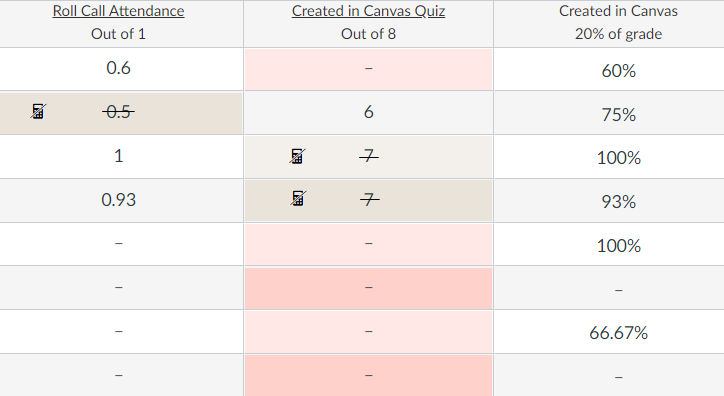
[Accessibility] Non-color indicator needed for dropped grades in gradebook
It seems that in the Grades tool, the only indicator of a dropped grade is a colored background on corresponding cells. The color is barely noticeable by someone who can see it, and it is not a sufficient indicator for users with visual impairment (e.g., color deficiency, screen reader users). Per this discussion: Dropped grades in the gradebook, "In light of Canvas's commitment to accessibility, we would not develop a feature that relies on color alone to convey meaning," but from what I can tell, that is how the gradebook was developed.
I recommend adding a strikethrough on each dropped grade's value, as well as a calculator icon with alt text/label of "This grade has been dropped." in the cell for a dropped grade. When tabbing to or clicking on the calculator icon, the text label should be visible. Mock-up below.

