[Accessibility] Non-color indicator needed for dropped grades in gradebook

It seems that in the Grades tool, the only indicator of a dropped grade is a colored background on corresponding cells.  The color is barely noticeable by someone who can see it, and it is not a sufficient indicator for users with visual impairment (e.g., color deficiency, screen reader users).  Per this discussion: Dropped grades in the gradebook, "In light of Canvas's commitment to accessibility, we would not develop a feature that relies on color alone to convey meaning," but from what I can tell, that is how the gradebook was developed.

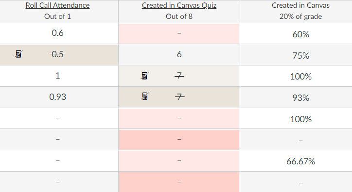
I recommend adding a strikethrough on each dropped grade's value, as well as a calculator icon with alt text/label of "This grade has been dropped." in the cell for a dropped grade.  When tabbing to or clicking on the calculator icon, the text label should be visible.  Mock-up below.

mockup-dropped-grades.png

8 Comments
KristinL
Community Team
Community Team
Status changed to: Open
 
Gregory_Putman
Community Participant

Hi,

I agree this is important.  I have some sight issues so can sympathize.  In addition to that I would suggest not even having the grade with strike-through or an icon that needs explaining or alt text, just have the word "Dropped" show up.

KristinL
Community Team
Community Team
Status changed to: Added to Theme
 
CanvasCCUser
Community Member
*****This is NOT THE SAME PROBLEM AS STATED ABOVE***** but relates to the original issue brought forth "dropped grades in the gradebook"
The above discussion of the grade tool is an issue with the INSTRUCTOR VIEW. The problem I have stated below is the STUDENT VIEW. The student view is NOT the same as the instructor view and I argue that is is MORE PROBLEMATIC than the instructor view because there are more students than instructors who are viewing the grades so students are more affected. The original discussion expresses this. 
 
Problem statement:

When students view their grades in Canvas LMS by clicking on "Grades" they cannot clearly see which grade or grades are dropped if an instructor has selected, for example, the lowest grade on an assignment group to be dropped. On the instructor end, the instructor can see it because it is color coded. That is not the problem. The problem is from the STUDENT VIEW OF GRADES. Currently, students can only tell if that is their dropped grade by hovering over the assignment and seeing a message that it is the dropped grade. This is incredibly problematic and tedious if there are numerous (for me that would be 30+) assignments listed that a student must comb through. As a result, I get multiple emails from students asking if I actually dropped their lowest grade because all of their grades show and students cannot tell which grade is dropped because there is not easy indicator that it is dropped. Again, this is from the STUDENT point of view, not from gradebook view of the instructor.

Proposed solution:

Easiest solution: put an "x" next to the grade that is dropped so the student can easily see without hovering over all of the individual grades posted, that is the dropped grade. This was a feature before and then it was removed. This should be an easy fix if the system had an "x" next to the dropped grade before. This is better than color coding or greying out an item because visually it's easier to see. Having to hover over an item to see if it is the dropped grade is not very accessible, nor is it intuitive or useful. WHY? By simply adding a visual indicator such as an "x", next to the dropped grade in the STUDENT view: 1) you'll be restoring what was already in place that worked before 2) it will reduce the number of emails sent to instructors from students inquiring why their grades weren't dropped 3) make it easier for instructors to confirm the system is calculating student grades as expected

User role(s):

instructor

sbrownuk
Community Member
Like the previous instructor who reported this, as well as another reporting this problem in the forum, this is not an INSTRUCTOR GRADEBOOK VIEW problem. This is a STUDENT VIEW accessibility problem. Please stop filing these problems under this Idea, they need to be a separate Idea because when I change the colors in the INSTRUCTOR GRADEBOOK VIEW it has zero effect on the STUDENT VIEW. These pages are linked in no way other than the data.
 
 
Problem statement:

In the student grades view (in Safari and Chrome), dropped grades are indicated using a gray font, whereas non-dropped grades are indicated with black font. These are way too close and I receive emails from students asking when their lowest grades from the assignment categories will be dropped. I have trouble distinguishing the black and gray, so I know for some of my students that may have some difficulties with colors/shades, it could be impossible The current workaround is to slowly mouseover ALL the assignments as the ones that are dropped will have a mouseover text pop-up stating it is a dropped assignment. I have a lot of low-stakes assignments and this is not an equitable solution, as it would take a good amount of extra time to mouseover all of the assignments.

Proposed solution:

Use a symbol or highlight in such a way that it would still be accessible to students with color deficiencies to indicate which grades are dropped. This would allow them to easily see that grades are already being dropped and which specific ones.

User role(s):

admin,instructor,student,ta,observer

nathanatkinson
Community Team
Community Team
Status changed to: New
 
nathanatkinson
Community Team
Community Team
Status changed to: New
 
nathanatkinson
Community Team
Community Team
Status changed to: Open