Celebrate Excellence in Education: Nominate Outstanding Educators by April 15!
Turn on suggestions
Auto-suggest helps you quickly narrow down your search results by suggesting possible matches as you type.
Options
- Subscribe to RSS Feed
- Mark Topic as New
- Mark Topic as Read
- Float this Topic for Current User
- Bookmark
- Subscribe
- Mute
- Printer Friendly Page
[ARCHIVED] Rubric Resizing
- Mark as New
- Bookmark
- Subscribe
- Mute
- Subscribe to RSS Feed
- Permalink
- Report Inappropriate Content
08-14-2018
08:25 PM
In Speedgrader, is there a way to shrink the size of the rubric? In order to see my entire rubric and the place to leave qualitative remarks, I have to move the rubric screen so far to the left that it shrinks the student submission until it's nearly illegible. Ideally, I'd be able to see both the student submission and the full rubric together. As it is now, the rubric is much bigger than it needs to be for scoring/commenting. Actually, it became worse just today; I assume Canvas made an update to the rubrics, but as a result of the update the rubric scoring is much more unwieldy.
I've included a screenshot to illustrate the problem:
Any insight is much appreciated!
Solved! Go to Solution.
2 Solutions
- Mark as New
- Bookmark
- Subscribe
- Mute
- Subscribe to RSS Feed
- Permalink
- Report Inappropriate Content
08-15-2018
08:25 AM
Well that's troubling.
Our semester hasn't started yet, so I haven't experienced the new layout, which sounds less than ideal. Hopefully someone else has a better idea or solution.
- Mark as New
- Bookmark
- Subscribe
- Mute
- Subscribe to RSS Feed
- Permalink
- Report Inappropriate Content
12-16-2020
08:14 PM
I have found something that works for me, but it seems a bit finicky. I do this using the Speedgrader feature of Canvas, and Google's Chrome browser.
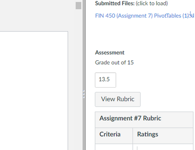
1. In Speedgrader, your screen should look something like this:
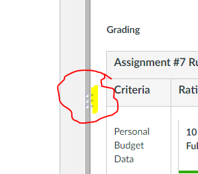
2. Click on "View Rubric" and the screen will change to show the rubrics. Notice that the dark gray dividing line between the opened file and the Grading section now has an additional three dots (highlighted in yellow) to the right:
3. Drag the center dark gray bar that separates the opened file and the Grading section so the Grading section is the width you'd like it to be.
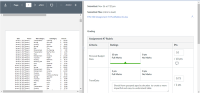
4. Click and HOLD those three dots and drag your mouse to the right and it should resize the rubric section. Here's my "before drag":
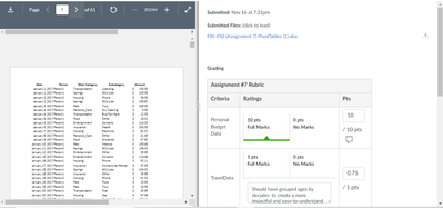
and my "after drag."
There seems to be a limit to how narrow it will make the Rubric section, but it definitely makes it narrower. I'm grading on a 13-inch laptop so I need my rubrics to be pretty narrow. It seems to look at the width of the Grading section to decide how narrow to make the rubric section which is why I resize using the dark gray dividing bar BEFORE I click and hold the three dots.
If you tried this and it works, please let me know! Or, if you figure out how to make it less finicky! Sometimes it seems like it doesn't work.
Pamela
43 Replies
- Mark as New
- Bookmark
- Subscribe
- Mute
- Subscribe to RSS Feed
- Permalink
- Report Inappropriate Content
08-15-2018
06:00 AM
@rachelbryson1 , the only thing I’ve ever been able to figure out is dragging the middle bar between the rubric and the student’s submission until I find a sweet spot that seems to be ok for both. Not ideal, but it works.
Kona
- Mark as New
- Bookmark
- Subscribe
- Mute
- Subscribe to RSS Feed
- Permalink
- Report Inappropriate Content
08-15-2018
07:28 AM
Hi @kona ,
Thanks for your reply. In the past, I've found that to be a workable solution, but in this recent update to rubrics, that "sweet spot" has been removed. To be able to actually read the paper, only the first 2-3 columns of the rubric can be seen. To see the rubric well enough to access the comments/feedback button for each rubric category, the paper is too small. I suppose my point is that Canvas updated the rubrics to make them, perhaps, more visually appealing to the student but less navigable for the instructor.
Thanks again,
Rachel
- Mark as New
- Bookmark
- Subscribe
- Mute
- Subscribe to RSS Feed
- Permalink
- Report Inappropriate Content
08-15-2018
08:25 AM
Well that's troubling.
Our semester hasn't started yet, so I haven't experienced the new layout, which sounds less than ideal. Hopefully someone else has a better idea or solution.
- Mark as New
- Bookmark
- Subscribe
- Mute
- Subscribe to RSS Feed
- Permalink
- Report Inappropriate Content
09-11-2018
01:31 PM
Our instructors are having the same issues with the sizing of the rubrics. Before the update, it wasn't much of an issue, but now we are having it be way too big for instructors to use (easily) on every device.
- Mark as New
- Bookmark
- Subscribe
- Mute
- Subscribe to RSS Feed
- Permalink
- Report Inappropriate Content
09-11-2018
05:15 PM
Yes, exactly! If I'm on a computer with a large screen, the new rubrics work okay, but on almost any other device, including the laptop I normally use with Canvas, the rubrics have become extremely unwieldy.
- Mark as New
- Bookmark
- Subscribe
- Mute
- Subscribe to RSS Feed
- Permalink
- Report Inappropriate Content
09-14-2018
10:06 AM
We've had several cases come in about this issue. L2 Support said that if your account has the "Non-scoring rubrics" feature option enabled, then rubrics will look gigantic like this.
Unfortunately, that feature option is account-level not course-level so we can't toggle it off for specific courses. I've reached out to my CSM to ask about this frustrating design choice because it forces us to either have huge rubrics that make grading much more difficult or block instructors from using non-scoring rubrics.
- Mark as New
- Bookmark
- Subscribe
- Mute
- Subscribe to RSS Feed
- Permalink
- Report Inappropriate Content
09-25-2018
12:29 PM
Looks like it was not the most well thought of thing. We are getting complaints too.
- Mark as New
- Bookmark
- Subscribe
- Mute
- Subscribe to RSS Feed
- Permalink
- Report Inappropriate Content
10-08-2018
01:52 PM
Wow this makes grading cumbersome. Who changes these things without getting feedback?
- Mark as New
- Bookmark
- Subscribe
- Mute
- Subscribe to RSS Feed
- Permalink
- Report Inappropriate Content
10-12-2018
09:25 AM
An instructor just brought this to my attention. I'm filing a bug report, just because.
- Mark as New
- Bookmark
- Subscribe
- Mute
- Subscribe to RSS Feed
- Permalink
- Report Inappropriate Content
10-12-2018
09:26 AM
Please keep us posted because I'm interested to hear if you receive the same response I received.
- Mark as New
- Bookmark
- Subscribe
- Mute
- Subscribe to RSS Feed
- Permalink
- Report Inappropriate Content
10-12-2018
12:15 PM
Thanks for posting this. It looks like recently the rubric boxes are even bigger, making the problem worse! Would love to see this improved.
- Mark as New
- Bookmark
- Subscribe
- Mute
- Subscribe to RSS Feed
- Permalink
- Report Inappropriate Content
10-14-2018
08:38 AM
Ugh. Just ugh. I am very frustrated with the recent change that made the grading rubrics so unwieldy. There can be no way that a human looked at this before approving this change.
Also, the problem shows up no matter what browser I use.
- Mark as New
- Bookmark
- Subscribe
- Mute
- Subscribe to RSS Feed
- Permalink
- Report Inappropriate Content
10-14-2018
09:04 AM
What a pain. Yet another thing for our faculty to complain directly to our provost about. Can't say I blame them.
- Mark as New
- Bookmark
- Subscribe
- Mute
- Subscribe to RSS Feed
- Permalink
- Report Inappropriate Content
10-15-2018
06:35 AM
Thanks @brysonroad for posting this as our instructors have been complaining about this too.
- Mark as New
- Bookmark
- Subscribe
- Mute
- Subscribe to RSS Feed
- Permalink
- Report Inappropriate Content
10-16-2018
07:05 AM
Very cumbersome for our teachers. It makes educators not want to use robust rubrics!
- Mark as New
- Bookmark
- Subscribe
- Mute
- Subscribe to RSS Feed
- Permalink
- Report Inappropriate Content
10-16-2018
07:15 AM
FYI - erinhallmark has posted a comment here that, basically, states to keep an eye on this Feature Idea for updates. Interestingly, I've come across faculty with another issue: they have trouble clicking-and-dragging the rubric, to begin with. (I admit I've fumbled with those controls more than once myself.) Let's hope there's a keyboard accessible way to access them in the future, too.
- Mark as New
- Bookmark
- Subscribe
- Mute
- Subscribe to RSS Feed
- Permalink
- Report Inappropriate Content
06-11-2020
04:01 PM
Thank you for suggesting that this feature be keyboard-accessible. All the Canvas features should be keyboard-accessible in compliance with the ADA.
- Mark as New
- Bookmark
- Subscribe
- Mute
- Subscribe to RSS Feed
- Permalink
- Report Inappropriate Content
10-22-2018
08:37 AM
I know that this was fixed - thank you, Canvas. I also wanted to mention how very much I hate the new rubric style. Instead of marking a selection by turning it colored, the new rubric underlines the selected criteria. I am finding it much more difficult to track everything I have graded in this new style. Does anyone else agree? Or am I alone in this preference?
- Mark as New
- Bookmark
- Subscribe
- Mute
- Subscribe to RSS Feed
- Permalink
- Report Inappropriate Content
11-13-2018
02:33 PM
Has there been any movement on this issue? We're seeing the same thing. Gigantic rubric and tiny document.
- Mark as New
- Bookmark
- Subscribe
- Mute
- Subscribe to RSS Feed
- Permalink
- Report Inappropriate Content
11-14-2018
08:36 AM
Our ticket for this issue is #03760105.
- Mark as New
- Bookmark
- Subscribe
- Mute
- Subscribe to RSS Feed
- Permalink
- Report Inappropriate Content
11-14-2018
09:21 AM
I am not sure where to post this exactly, but is anyone else having feedback on the color change in the rubric. It used to be that when you clicked on an item in the rubric, the whole square would be colored. That made it very easy to see what you had completed and what you had not. Now there is just an underline and if you give partial credit, there isn't even an underline. This makes it very difficult to ensure that all items in the rubric get marked at some level. We have students coming back to see why they did not get scored on an item when in reality it is just that the professor missed that criteria - because it is hard to see what is done and what is not at a glance. Bring back the old rubric ![]() (See illustration).
(See illustration).
- Mark as New
- Bookmark
- Subscribe
- Mute
- Subscribe to RSS Feed
- Permalink
- Report Inappropriate Content
11-14-2018
09:45 AM
Hi (again since yesterday!) @nancy_lachance - That underlining came about as part of the introduction of non-scoring rubrics, which started as a feature option but was later pushed out to all institutions and is described here within the October 6 release notes. You can see from a few comments at the bottom of the original Production Release Notes of July 14 when introduced as an option that a few people did not like it then. The best I can recommend is voting on this Feature Option, as I did, which can definitely use a bit more love right now: https://community.canvaslms.com/ideas/12663-make-color-coding-optional-in-rubrics .
- Mark as New
- Bookmark
- Subscribe
- Mute
- Subscribe to RSS Feed
- Permalink
- Report Inappropriate Content
11-15-2018
08:18 AM
This has been a problem for our faculty too. We first got around it by disabling the Non-Graded Rubric feature at the account level, but then it was pushed out and cannot be disabled.
- Mark as New
- Bookmark
- Subscribe
- Mute
- Subscribe to RSS Feed
- Permalink
- Report Inappropriate Content
12-21-2018
07:20 AM
Hi, everyone, I've marked this as Assumed Answered—not because a single satisfactory solution has emerged, but rather because the conversation has branched off in a number of different directions on various rubric-related topics, so we're hoping to regain focus: as mentioned elsewhere in the thread, the best places to continue these conversations are in https://community.canvaslms.com/ideas/12663-make-color-coding-optional-in-rubrics and https://community.canvaslms.com/ideas/12268-change-the-rubric-back (marked complete, but the conversation continues there nevertheless). Thanks!
- Mark as New
- Bookmark
- Subscribe
- Mute
- Subscribe to RSS Feed
- Permalink
- Report Inappropriate Content
01-03-2019
08:05 AM
Thanks, Stephanie. I am not sure where to go to keep this moving forward. The lack of marking in rubrics is a major problem from the perspective of our faculty. Where would you suggest that I post this for further attention. I would like to get this on the "IDEA" list - something that is votable unless there is some plan to improve the rubric - where I can argue for fixing the lack of marking that occurs in a range-based rubric. Let me know what the next best step is to move this idea. Thank you, as always ![]()
- Mark as New
- Bookmark
- Subscribe
- Mute
- Subscribe to RSS Feed
- Permalink
- Report Inappropriate Content
01-03-2019
08:20 AM
@nancy_lachance , I'm glad you asked, because this particular conversation has so many different topics folded into it that it would be more constructive to have a separate new idea out there, especially since neither https://community.canvaslms.com/ideas/11928-more-color-options-for-non-scoring-rubrics nor https://community.canvaslms.com/ideas/12663-make-color-coding-optional-in-rubrics directly addresses what you've depicted. Your screenshot from November 14, 2018 would make an excellent centerpiece for the idea description. If you haven't yet reviewed it, please have a look at How do I create a new feature idea in the Canvas Community? for guidance.
- Mark as New
- Bookmark
- Subscribe
- Mute
- Subscribe to RSS Feed
- Permalink
- Report Inappropriate Content
01-03-2019
11:59 AM
The idea has been posted here: https://community.canvaslms.com/ideas/13270-rubric-marking-conventions
Please vote it up ![]()
- Mark as New
- Bookmark
- Subscribe
- Mute
- Subscribe to RSS Feed
- Permalink
- Report Inappropriate Content
01-17-2019
12:38 PM
As far as I know, we're still seeing super large rubrics in some courses.
- Mark as New
- Bookmark
- Subscribe
- Mute
- Subscribe to RSS Feed
- Permalink
- Report Inappropriate Content
04-30-2019
01:39 PM
Is there any response at all to the scaling problems mentioned here? When will they be addressed? This is super annoying unless you are working on a giant screen. Grading on a laptop this time of year is just terrible. This is not a feature request, it is a bug fix. This was a bad update to rubrics and has been going on far too long.
- Mark as New
- Bookmark
- Subscribe
- Mute
- Subscribe to RSS Feed
- Permalink
- Report Inappropriate Content
05-01-2019
08:05 AM
I have not seen anything on my end as an individual user, Otis. Encourage as many people to upvote this issue so that it can fixed. Every time I use a rubric to grade, I am reminded of how much efficiency is lost in resizing, extra clicks, and other effort that could be repaired with a fairly limited fix of the size of the rubric.
And for someone (like me) with vision issues, I face the problem of having to balance readability with fitting everything on one screen: I have to jump back and forth increasing and decreasing font size. Super annoying, and borderline non-compliance with ADA/Section 504 if this is also an issue on the student end.
- Mark as New
- Bookmark
- Subscribe
- Mute
- Subscribe to RSS Feed
- Permalink
- Report Inappropriate Content
06-15-2019
11:29 AM
At least your rubric has aligning columns in it - in our version of canvas the columns are all over the place and it looks hideous and disorganized.
- Mark as New
- Bookmark
- Subscribe
- Mute
- Subscribe to RSS Feed
- Permalink
- Report Inappropriate Content
06-15-2019
11:53 AM
It only looks lined up because the criteria in each column is the exact same. If it was different, then the rows wouldn't be the same size either.
Kona
- Mark as New
- Bookmark
- Subscribe
- Mute
- Subscribe to RSS Feed
- Permalink
- Report Inappropriate Content
06-15-2019
12:19 PM
How is this question "Assumed Answered"?
- Mark as New
- Bookmark
- Subscribe
- Mute
- Subscribe to RSS Feed
- Permalink
- Report Inappropriate Content
06-15-2019
12:34 PM
If you read through the comments, you'll see one from stefaniesanders on December 21, 2018, that explains why it was marked as assumed answered.
The original question is "In Speedgrader, is there a way to shrink the size of the rubric?" and I would assert that it was answered for the normal user with the first response and that it should have been marked with a correct answer long before everyone else started adding their comments. Just because you don't like an answer doesn't mean that it isn't correct.
- Mark as New
- Bookmark
- Subscribe
- Mute
- Subscribe to RSS Feed
- Permalink
- Report Inappropriate Content
06-15-2019
01:28 PM
I don't see the assumption in your last sentence as helpful.
- Mark as New
- Bookmark
- Subscribe
- Mute
- Subscribe to RSS Feed
- Permalink
- Report Inappropriate Content
06-18-2019
07:07 AM
Agreed, Elizabeth! We are discussing issues with the rubric, and the method by which bugs and problems in Canvas get fixed is through...commenting and up-voting in these forums. High traffic on a topic equates to attention by Canvas engineers and coders, or at least this is what we have been told.
Or, if you prefer the correct jargon, substitute the phrase "feature idea process" in place of "fixing bugs."
If a snarky person employed the same logic you used, James, the result would be something like this: just because you do not like our comments does not mean that they lack validity.
I would personally prefer to avoid snarkiness in favor of problem-solving, though.
- Mark as New
- Bookmark
- Subscribe
- Mute
- Subscribe to RSS Feed
- Permalink
- Report Inappropriate Content
09-18-2020
12:18 PM
It also takes several minutes for the rubric to load to be able to resize it. This makes grading impossibly long for 75 students. Please fix this . Chrome/ Win 10
- Mark as New
- Bookmark
- Subscribe
- Mute
- Subscribe to RSS Feed
- Permalink
- Report Inappropriate Content
12-15-2020
12:46 PM
I am having the same issues with rubric sizing as the user in the original post (2+ years ago). When I see that it is "Solved!", I am happy to click on "Go to Solution." And the solution says:
"Well that's troubling. Our semester hasn't started yet, so I haven't experienced the new layout, which sounds less than ideal. Hopefully someone else has a better idea or solution."
THIS IS A PROBLEM, and it's bigger than just the rubric issue.
- Mark as New
- Bookmark
- Subscribe
- Mute
- Subscribe to RSS Feed
- Permalink
- Report Inappropriate Content
12-16-2020
08:14 PM
I have found something that works for me, but it seems a bit finicky. I do this using the Speedgrader feature of Canvas, and Google's Chrome browser.
1. In Speedgrader, your screen should look something like this:
2. Click on "View Rubric" and the screen will change to show the rubrics. Notice that the dark gray dividing line between the opened file and the Grading section now has an additional three dots (highlighted in yellow) to the right:
3. Drag the center dark gray bar that separates the opened file and the Grading section so the Grading section is the width you'd like it to be.
4. Click and HOLD those three dots and drag your mouse to the right and it should resize the rubric section. Here's my "before drag":
and my "after drag."
There seems to be a limit to how narrow it will make the Rubric section, but it definitely makes it narrower. I'm grading on a 13-inch laptop so I need my rubrics to be pretty narrow. It seems to look at the width of the Grading section to decide how narrow to make the rubric section which is why I resize using the dark gray dividing bar BEFORE I click and hold the three dots.
If you tried this and it works, please let me know! Or, if you figure out how to make it less finicky! Sometimes it seems like it doesn't work.
Pamela
 Community Help
View our top guides and resources:
Find My Canvas URL Help Logging into Canvas Generate a Pairing Code Canvas Browser and Computer Requirements Change Canvas Notification Settings Submit a Peer Review AssignmentTo participate in the Instructure Community, you need to sign up or log in:
Sign In


This discussion post is outdated and has been archived. Please use the Community question forums and official documentation for the most current and accurate information.