Updates to the Assign To Interface

AllisonHowell
Instructure
Instructure
51
12730

Canvas.png

Tl;dr: We heard your feedback—the extra step to set due dates is too much. Within the next month, the edit pages for assignments, quizzes, and discussions will revert to their previous design, while preserving the new features for selective module release and quick due date edits from the index pages.

Many of you have been closely tracking this month’s changes to the “Assign To” interface, introduced alongside the ability to assign modules to individual students and sections. Your feedback in the Release Q&A comments section has been invaluable, and while I’ve addressed many of your comments, a quick update is in order. 

The "Assign To" feature has been a popular request, aimed at providing more options to personalize the learning experience for better outcomes. We appreciate the efforts of our designers, engineers, and others who reviewed your feedback to bring this functionality to Canvas.

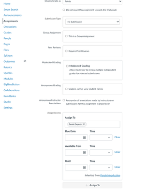
That being said, we got one of the workflows wrong. Pre-release testing of the new tray received positive feedback for unifying the selective module release experience, but it didn't account for the need to quickly view due dates. Post-release feedback and a subsequent survey indicated a strong preference for the original design of the page. Therefore, we’re reverting to that design. Below is a screenshot of what the page will look like after the change.

We understand it is important to roll this out as quickly as possible, and our engineering team is working diligently to implement this fix. We are committed to releasing this change in August, and should have an official date for you soon. We will update the Community and your CSM with the exact date as soon as it's confirmed.


Screenshot 2024-07-31 at 12.38.13 PM.png


EDIT: Here's a quick screencast that goes over what you can expect with the changes we're making.


51 Comments
RobDitto
Community Champion

Wonderful news, @AllisonHowell! Thanks so much for this update.

With this new plan, is the intention also to improve loading performance of Assign To, even in large courses? A number of customers have On Hold cases with Canvas Support about slow loading seen with July's redesign.

chriscas
Community Coach
Community Coach

Hi @AllisonHowell,

Thank you for the update on this update, seeing more details is very welcome after the Q&A comment the other day.

I think this reversion is generally a good idea, the less clicks the better (and I think this may fix some other reported issues with the new design as well, like error messages about dates not appearing if the sidebar was not open).

I do have one question about this change/reversion that it might be helpful to address if you can...  I see in your screenshot that the date and time fields are separated (when they were not previously).  Will there be more options for times in the dropdown menu?  I know 11:59 (either am or pm) is a highly requested option, and really probably every hour with 59 minutes, and maybe even 29 minutes.  I know the dropdown shouldn't be too long, but I feel more options are needed.  I'd almost suggest separating the hour and minute and displaying every possibility, but that would add another click which I know a lot of people may not appreciate.  Being able to type times outside of what's shown is good, but many people don't realize that's even an option.  If you could provide any comment on what this will look like (especially if there's still potential room for quick conversation and change before the update releases), I think a lot of users would appreciate it!

Again, thank you and your team for the hard work on this, and the willingness to roll back some of the change based on feedback.  I know this is a lot of unanticipated work for people, and we appreciate everything you're doing to address the issues users have found.

-Chris

nuscitpkg
Community Participant

Yes, this will solve the error messages about dates not appearing if the sidebar was not open! We still get questions despite Impact messages about this on Edit Assignment, as well as one on the Save button (because if the dates are invalid and the instructor clicks Save... nothing happens and nothing is displayed).

Thank you!

audra_agnelly
Community Champion

Thank you @AllisonHowell this is great news! 

@chriscas I agree about issues with the dropdown issues, I'd originally posted about it on the release notes because it was unclear that I could type in my own times, but I'd lean in the other direction and have fewer times, or really, just no drop down at all. Having the dropdown with limited values makes it look like you are limited to those choices. Just prepopulate the time with institutional or course default time and let the instructor manually type in a different time. 

LMacaulay
Community Participant

Can someone clarify the "inherited from" line that you see in the screenshot?  I know this is a setting from the new assign to feature in modules. But will reverting back to the old layout change any of the behavior with this component that is a new feature?

cms_hickss
Community Coach
Community Coach

This is great news @AllisonHowell.

I will admit that I did like the "Assign To" option/tray for editing a due date after the assignment, quiz, discussion, etc had been created. I just didn't like the tray as part of the creation process since all of the other settings were visible on the screen (but who were assigning it to and when you were assigning it).

And like a few others here, the time field had faculty thinking that everything had to be released on the hour or half hour and that it wasn't a typable field. I figure you were trying to make it easier for faculty with the dropdown but sometimes a typable field is better.

My only concern now is that we don't have a date for the pullback on this interface and Fall classes for many of us start mid-August.

dbrace
Community Coach
Community Coach

Thank you for listening to our feedback. I will say, one of my colleagues had already updated our institution's trainings and documentation because of self-paced opportunities that became available to our faculty today (Thursday, August 1, 2024). Because of that it is a little frustrating.

Does this mean that the new "Assign To" button will no longer exist? Honestly, that was something we really like because it meant it was not necessarily to go into full "edit mode" to make date and assigning adjustments.

sample assignment 2024-08-01.png

LMacaulay
Community Participant

@dbrace I agree. I hope they keep that button, even if it just jumps to the section of the Assignment page where we enter the information. That would be so nice to not have to scroll to the bottom of the page to view/edit that info! I know we can use the bulk edit tool, but sometimes I need to see all of the assignment details before editing who it is assigned to and/or when it is due.

melodyc_lam
Community Coach
Community Coach

@AllisonHowell 

Chiming in to also point out that 1) the change is welcome but 2) the lack of a date on when the update will occur is a little concerning, as we're heading into teacher workdays and school starting in August.

I know many teachers, especially at the HS level, would like to have it clear that we can edit the time and not have it in discrete chunks. I feel that it's much easier to drop the dropdowns for time (except AM/PM) and let that be a field that can be typed into and validated. 

melissa_kamp
Community Participant

Will reverting fix the following issue with the "Assign to" feature in Assignments and Modules?

When faculty assign an assignment to a specific section or group of students and then add this same assignment into a module that has also been assigned to this same section/group, the course does not recognize that this is the same section/group and displays a "Mutliple Due Dates" indicator on the assignment in the Module view even though only one due date is assigned. In the assignment itself, both sections (though they are the same) are listed below the prompt, but when the "Assign to" panel is opened to try and remove the "extra" listing, no extra dates display in the panel. 

Aside from having faculty NOT assign assignments to sections before placing them in modules, is there any way to get rid of the extra section listing so there is no "Mutliple Due Dates" in the module view? Better yet, is there a way for the system to recognize that these are the same?

douglasorme
Community Explorer

This is terribly fussy, but @chriscas "I think this reversion is generally a good idea, the less clicks the better...".

"'fewer' is preferred for countable nouns like 'clicks'.

That said, the less/fewer distinction may be going the way of the Dodo in contemporary North American English, so my correction may be a case of closing the barn door after the horse has bolted. Please feel free to roll your eyes and get on with your day. 😉

Thanks, 

Doug (recovering English teacher)

SusanNiemeyer
Community Contributor

Thank you for listening to instructors and reversing course.

Please disband any plans to bring back dropdown menus with set times (12:00 am, 12:30 am, 1:00 am....) for assignments.

At the college / university level, Canvas is mostly used to teach asynchronous courses. For these courses, instructors will generally prefer the default opening time of 12:00 am and the default closing time of 11:59 pm. 

For K-12 classes as well as synchronous online classes, these times (3:00, 3:30, 4:00, 4:30...) will rarely, if ever, correspond to a bell schedule. For example, I have set quizzes to open up at 12:15 pm and close at 12:35 pm.

What we had before worked.


AllisonHowell
Instructure
Instructure
Author

@RobDitto An added benefit of this design change is that you should see improved performance with large courses. If you do notice performance issues, please report them so that we can make sure to address quickly. 

@chriscas Thank you for your kind words and understanding. I have a colleague from the design team that is going to touch on the date/time input feedback shortly. The tl;dr from me is that we do have a designer on our team looking into how we can make some adjustments to improve this, which will be covered in another comment. 

 Just wanted to make sure you saw my reply above - we have a designer that will be commenting shortly on this. 

@LMacaulay The “inherited from” line is showing that I had differentiated the assignment at the module level. It's there to orient the educator so they know why someone already has access to the assignment. This will stay as part of the card with this release since we are not taking away any new functionality.

 I hear you and we will update with a date as soon as possible. We have a designer that will be giving more context on the date/time changes shortly.

 We do plan to keep the Assign To button at the top because we've heard from most of you that you like it when in "edit" mode, but not in creation, as you say. I think this is a great compromise! Regarding the time field, we have a designer that will be responding shortly!

@dbrace I am very sorry for the extra work and appreciate your patience as we’ve tried to be responsive to community feedback. The good news is that we do plan to keep the “Assign To” button at the top of each page as we think that still brings a lot of value and saves time. The change is being kept to the edit pages for these items and removing the “Manage Assign To” button in favor of the cards on the page (as it previously was). We will still have the tray come out when you are not in edit mode. 

@LMacaulay Very glad you like this part of the design! As I answered above, we are keeping that as-is.

@melissa_kamp I looked into this and the team is aware that the frontend is not behaving properly. It's working properly on the backend but not reflected in the UI. We have an engineering ticket for this and are working to fix this as soon as we can, but as you mentioned, for the workaround is to assign in modules first. 

@SusanNiemeyer Thanks for your input on this new date/time component. We have a designer reviewing the comments that will be responding with more info shortly. 


AllisonHowell
Instructure
Instructure
Author

I'd also like to share a short screencast of what you can expect these changes to look like! I hope this helps everyone have a better understanding of the changes we're making based on your feedback.


dkpst5
Community Participant

Noo! The new interface is a significant improvement! So it's one extra click. Its unification of UI is a huge plus, and working as a tray fixes other UI/UX issues. The old interface was outright BROKEN that you couldn't see the full date-time, and teachers were constantly confused by the date-picker. The new UI of separate date and time. Reintroducing an inconsistency for "sometimes in tray, sometimes embedded" isn't good.

I don't see why anyone would be complaining about the new improvements. Our faculty immediately adapted and appreciated the upgrade. They will not be happy to see a rollback and it will confuse them and hurt their faith in Canvas.

EDIT: I do see concerns about the time field being restricted to intervals, that's a legit concern we hadn't run into. There's no reason for it not to allow arbitrary time selection.

audra_agnelly
Community Champion

I think this is great @AllisonHowell, what a Friday afternoon gift!👏

lbach
Community Participant

Can I ask why the date and time are now in two separate boxes? 

I may have a unique issue as I manage multiple sections of the same course. All of the sections of the class are in the same Canavs course to ensure all sections have the same information and assignments, but each section has their own due dates based on their class date and time. Setting up separate due dates for multiple sections within the same Canvas course wasn't super easy before, but it's a lot harder now.

Before, when the date and time were in the same box, I could set up an Excel sheet to format the due dates and times for all sections and all assignments over the course of the semester, and then copy and paste from Excel into the due date box. This new interface has doubled the number of clicks for me, which might not sound like much at first but my classes have over 30 assignments and at least 6 sections to update. Going from 180 boxes to click and enter information to 360 boxes is a jump.

It wouldn't be that big of a deal if I could use the bulk assignment date editor to add section due dates, or if Canvas had the ability to set availability rules based on class days or times. Since those options aren't available and I'm stuck manually entering due dates for each assignment and section, I'm really disappointed to see this change.

kchadwick
Community Member

Hello, my name is Kendall, and I am a Principal Designer. I wanted to take a moment to share some thoughts on the recent changes we've made to the "Assign To" feature and the date and time pickers.

Our goal is to create a cohesive experience across all our products, ensuring they look, feel, and behave consistently. We aim for these features to feel integrated and work seamlessly across all our offerings. The date and time input is an example of a feature that is widely used across our products.

Additionally, we are committed to making our features accessible to all users. We appreciate your feedback on these updates and want you to know that we are listening. We are currently working on design updates to the date and time input to improve your workflow. 

We will continue to focus on our goals and consider your comments and user testing feedback to improve and refine these features.

cpowell2
Community Explorer

Sad to see a new feature reverted back after less than a month.

Sad that I had less than a month's emails from faculty complaining to asking me about where the "assign to:" went.

Sad that I didn't see this blog post on Wednesday 7/31 announcing the rollback.

Sad that I made a video on Friday 8/2 for my faculty and blog subscribers showing the new "assign to:" location.

Sad that I now get to send a follow-up post updating my faculty and blog subscribers about the upcoming rollback scheduled sometime in the next month.

Sad that I will still have faculty complaining to emailing me for about a month asking where the "assign to:" went.

Sad that I have to spend more time in TextExpander creating a pre-formatted snippet response providing all relevant info and links to why the "assign to:" got changed.

Sad that I have to ask myself in the future, "My faculty might not instinctively know where the [name of future new feature update] went to in their course. Should I be proactive and create a blog post with quick narrated video showing them where it went to, or should I just prepare a snippet reply and wait for Instructure to revert it back because the community complained a lot?"

Happy that I'm gainfully employed as an Instructure Canvas Admin for my University.

leward
Community Contributor

@AllisonHowell ,

Thanks for the video explanation of what you've got planned regarding the Assign to interface and also for updating the language on the edit page.  A couple of suggestions:

  1. The term "Assign to" is completely meaningless to new Canvas users and somewhat meaningless to experienced users.  You've already addresses this issue in the edit view (which, I realize is temporary), but it sounds like you're planning to keep this phrase elsewhere in the interface.  Would you consider updating the button and options menu label to "Dates and Access".  I think this would go a long way toward clarifying what the option actually does.
     
  2. The video only mentions assignments, discussions, and quizzes.  I know this feature is new for pages, but for consistency, I hope you'll eventually be adding the assign to cards to the edit view of pages as well.  And in the short term, what will the edit view for pages look like.  Reverting to the old interface only provides one set of date fields and no ability to select specific audiences.  So, I'm wondering how the old edit page interface will interact with the Assign To button/option.
mbmacdonald
Community Participant

thank you @AllisonHowell, looks great to me. I' going to go ahead and respectfully disagree with @dkpst5 - "one extra click" IS a big deal if the instructor doesn't do that click. Forgetting to assign due dates was already a problem for our faculty, and this made it easier to forget. Due dates are consistently listed by our students as the single most important thing instructors can do in Canvas to help their students succeed

stimme
Community Coach
Community Coach

@AllisonHowell Thank you for explaining how the Assign To block will be returned to the edit page of assignments, graded discussions, and quizzes. My coworkers & I are really glad to hear it. Keeping the new "Assign To" button and option menu placements is good. Putting the block back into the edit page is spectacular.

I also want to encourage you to release this as soon as possible. For me, it could just drop in the middle of a weekday, because it's such a good idea. 😄 Since it isn't listed in 8/14 deploy or 8/17 release yet, my guess is your goal will be 8/28 deploy (since you're committed to getting it out in August). But if it could come out with 8/17 release, I would be delighted.

HongHo
Community Member

Hello @AllisonHowell,

Thank you for the video walk through and the explaination. I noticed a little glitch with the "assign to" when it comes to pages and the discussions redesign. We have our Default Due Time currently set to 11:59pm pacific time (at the root level). That's the time that it defaults to in assignments and classic quizzes when a date is selected. However, that is not the default time that is appearing in pages and discussions redesign (currently 12:00am). If instructors aren't paying attention, then students are recieving nearly 24 hours less time on their assignments.

danaleeling
Community Participant

I can confirm the behavior HongHo mentions above. The root default time of 10:00 PM is not being respected by pages and discussions in the new "Assign to" interface, the default time is being shown as 12:00 AM. In other places the 10:00 PM default is being respected. This is problematic for the institution as the earlier time setting of 10:00 PM takes into account the college spanning two time zones. Deploying an assignment at 8:00 AM and setting a due date the same day at 11:59 PM causes the eastern time zone students to wake up to an overdue and often locked assignment - the assignment was due before it was deployed. To help faculty, the default due time is 10:00 PM in the eastern zone, which is 11:00 PM in the western zone. Now the default of 12:00 AM becomes very problematic. Should this be filed as a bug? I am presuming someone has probably already filed this as the discussions and pages assign to interface is not using the institutional due time.

ruvi
Community Participant

@AllisonHowell 
1. Checking on whether we have a date on when the rollback will be applied - and whether it will happen before the semester starts (for us, August 22, 2024)
2. Checking on whether the issues brought up by @HongHo and @danaleeling have been escalated to the engineering team.  I am +1'ing their concerns. 

Thanks!

rmartini
Community Contributor

@AllisonHowell - Is it possible to add captions to the screencast video? Thanks!!

feedback
Community Member

Thank you for sticking with the (non-pop out) 'assign to' when editing a page. 

ElizabethGarza1
Community Explorer

Thank you thank you thank you! This is wonderful news. We appreciate you doing this for us. I'm glad we can do both - change the due dates easily and also have the dates available as we're editing assignments as well! And I love the "clear" button too! Huge help. 

AllisonHowell
Instructure
Instructure
Author

@danaleeling and @HongHo This is actually working as expected. Pages and ungraded discussions do not have due dates, they have availability dates. Availability dates and times have never been impacted by the default due time setting, which states it "influences the user interface for setting due dates. It does not change the time due for any existing assignments." Sinces pages and ungraded discussions are only using availability dates, this setting does not apply. (As a side note, after testing this again, I can confirm that graded discussions do apply the default due time.) I am hesitant to expand the meaning of this setting as it has the potential to cause a lot of confusion. I take your point though and we will look into another solution that could save educators time setting availability dates and times.

AllisonHowell
Instructure
Instructure
Author

@rmartini my apologies for not including them! They have been added. 

tmalone1
Community Participant

Greetings,

Any news on the Roll-back date?

Tonia

AllisonHowell
Instructure
Instructure
Author

Hi all, I'm pleased to let you know that we plan to have the changes on beta environments late this afternoon (mountain time). I will update this thread once that has been pushed to beta. Next steps: we'll conduct testing on beta to ensure we didn't introduce any major bugs or issues with this change and ask you to do the same. Once we've tested, we'll move forward with pushing these changes to production as soon as possible. 

AllisonHowell
Instructure
Instructure
Author

We have deployed the changes to beta! Our team will be testing internally, but welcome all of you to participate in testing as well. I should be able to provide a production date tomorrow. We will be out of sync with the regular deploy schedule, but notes will be updates to reflect the changes in the UI. 

KatieBertel
Community Explorer

@AllisonHowell would it be possible to adjust the sizing of the date field? The year is getting cut off by the calendar icon. When importing content from a previous semester, I forsee issues with not recognizing that the year needs to be changed (because it's partially hidden). Meanwhile, the time field seems to have excess space. Perhaps some of the extra space allotted for the time field could be shared with the date field? Or the cell padding could be adjusted?

assign-to-date.png

AllisonHowell
Instructure
Instructure
Author

@KatieBertel Thank you for sharing! We will look into making this a bit better once we deploy these changes. 

AllisonHowell
Instructure
Instructure
Author

Thank you all for patiently waiting! We have conducted testing and are planning to deploy these changes on Wednesday, August 28. We had hoped to get these changes out to you sooner; however, we elected to follow our regular deploy cycle to minimize risk associated with hotfixing such a large change. Documentation will be added and updated early next week. 

snugent
Community Champion

@AllisonHowell I got a message from our account manager and she stated it would be updated on Monday, August 26 in production. Will the deploy notes be updated? 

rmartini
Community Contributor

@KatieBertel - Thanks for pointing this out! I didn't have a chance to look at beta until today. It looks like the date field displays slightly differently depending on the type of content (assignment, page, discussion, etc.). Pages seemed to be the worst (including some screenshots here). @AllisonHowell - I opened a ticket about this with support (11067963) in case that's helpful as your team reviews this!

"Assign To" on Pages (wide)"Assign To" on Pages (wide)

"Assign to" on pages (smaller)"Assign to" on pages (smaller)

"Assign to" on pages (smallest)"Assign to" on pages (smallest)

AllisonHowell
Instructure
Instructure
Author

Thank you @rmartini this is helpful!

@snugent apologies for the change in date - we had planned for Monday but the process to deploy this many code change is complex and we decided it was safer to let them roll out with our regular deploy. The notes are being updated for Monday. 

snugent
Community Champion

@AllisonHowell Another question. I noticed in Pages that the option, Users allowed to edit this page, now displays "only members" or "anyone" whereas in current production it states "Teachers Only", "Teachers and Students" or "Anyone". What does this change mean? Both pages were created from the course pages index page and not in a group. I think most instructors do not want students editing pages. How will they be able to be sure who can edit? 


BetaBeta

ProductionProduction

leward
Community Contributor

Revising my original statement.  Existing pages are working properly.  New pages have group rather than course permissions when they are first created.  After the initial save, students can edit them.  However, if the instructor re-edits the page, the correct permissions appear and can be set properly.  Regardless, this needs to get fixed before the Aug 28 deploy because instructors may not notice the issue since the default for pages is normally Teachers only. I too have reported this issue.  Case #: 11080745🪲

AllisonHowell
Instructure
Instructure
Author

Thank you @snugent @leward we are investigating this bug now.

eschiebel
Instructure
Instructure

@snugent Sorry about the Users allowed to edit this page issue. I broke that. Will get it fixed asap.

ruvi
Community Participant

Thanks @eschiebel  - Confirming that at 2:45pm PDT, I see that the change has been made in our BETA instance.

And thank you for catching that @snugent and @leward 

Page-Options.png

eschiebel
Instructure
Instructure

Thanks for the verification @ruvi!

snugent
Community Champion

@eschiebel Thank You! That was making me nervous about the Wednesday update!

AllisonHowell
Instructure
Instructure
Author

Wanted to make sure those following this post were aware that the production deploy scheduled for tomorrow has been delayed 24 hours, as outlined in this post: https://community.canvaslms.com/t5/The-Product-Blog/Updated-Canvas-Deploy-Schedule/ba-p/613423

gc_ander
Community Member

@AllisonHowell I truly appreciate your comments and updates via this thread. The feedback below speaks to a higher, more troubling trend we are seeing – haphazard change management and poor internal Q&A. 

Internal Q&A: Where is it? There have been entirely too many bugs, outages, and slowdowns lately. Additionally, the internal criteria needed for a reported issue to be listed as a known issue, or to warrant a status update means many of us are scrambling to try and communicate outside of Instructure channels to determine if it’s a system-wide issue or limited to our specific environment. 

Timing of AssignTo change: While the commitment to delivering a solution in August is appreciated, as time has run down it would have been preferable for these changes to be delayed to September rather than throwing yet another unexpected change at our users during the busiest, most stressful time of year, and immediately before an extended weekend for much of the US. 

Communication of Deploy delay: This change is off-cycle and terrible change management, with zero communication. Expecting customers to go read a blog for something like this is completely outside the established communication protocols. Deploy notes should have been immediately updated, then communicated via email by all Customer Success Managers, immediately after the decision was made. Instead, institutions are all left scrambling to inform our users and dealing with the blow to our reputations. 

Instructure, please, stick to your established change management procedures so the rest of us can as well.  

vinoluac
Community Participant

Could not have said it any better myself @gc_ander. There is a worrying trend as of late that I am hoping does not become more common.

pray4
Community Participant

We are still seeing issues with faculty who are unable to edit Assign To settings in active courses following this update. They receive a generic "Error updating discussion topic" pop-up when attempting to do so. This issue seems confined to discussions, as they retain the ability to make these same Assign To changes to other assignments in the same course. I've submitted a ticket to support.

I notice the deployment has still not occurred to remove the Assign To options from the slideout and revert back. Fingers crossed this issue might also be solved by the update.


UPDATE: Tested this in beta and notice this error no longer persists. This seems to confirm this is a bug created by the prior rollout but thankfully resolved with this update that is hopefully just around the corner.