Timing Feedback Needed: NQ Instructor Workflow Changes for Action Buttons

The content in this blog is over six months old, and the comments are closed. For the most recent product updates and discussions, you're encouraged to explore newer posts from Instructure's Product Managers.

SuSorensen
Instructure Alumni
Instructure Alumni
39
11641

Timing Feedback Needed: NQ Instructor Workflow Changes for Action Buttons 

2021-04-08 Update: We've enabled this change to beta instances per the 2021-04-14 Canvas Deploy Notes to expose those who are interested with the opportunity to play and see how this would work.  Our current plan is to deploy the change end of April or early May.  Please continue to add your comments below.

2021-04-17 Update: Will be addressed as a bug fix and released in the 2021-04-28 Canvas Deploy.

2021-04-28 Update: Confirming released in the 2021-04-28 Canvas Deploy

In March we made a change in New Quizzes, so that Assignment Edit page is always the first page. Previous behavior was that the Assignment Edit page was the first page only on initial New Quiz creation. Instructors then struggled to find the Assignment Edit page for New Quizzes after they initially created a new quiz. Listening to teachers, we heard that changing an assignment group, availability date or due date is commonly a task they need to do “on the fly.” 


Despite the Assignment Edit page for New Quizzes not actually changing in any way, we’re seeing that users are not sure how to build a quiz. We now understand that this could cause some confusion since the “Save” button both saves and transports the user into the New Quiz question builder. Unfortunately, we did not anticipate this problem accurately as all user testing showed participants were able to find and launch the quiz builder. 


Our plan to make the action buttons clearer by providing distinction between “Save” and “Build”. 
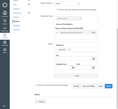
New ButtonsNew Buttons

Cancel/Save/Publish/Build action buttons for a Quiz Editor:

Button Label

Previous

New

Cancel

Does not save any new edits to page, transports user to Quizzes Index page

Does not save any new edits to page, transports user to the last page they visited

Save

Saves page, transports user to the New Quiz Builder

Saves page, transports user to the last page they visited

Save & Publish

Save & Publish, transports a user to the New Quiz Builder and Publishes the Quiz after exiting the Builder. Save & Publish button is not displayed when quiz is published

Save & Publish, Saves page, Publishes the quiz then transports user to the last page they visited. Save & Publish button is not displayed when quiz is published

Build

n/a

Saves page, transports user to the New Quiz Builder


Also worth noting is that we have addressed the Return button behavior in the New Quiz Builder (LTI) so that it accurately takes the user back to the previous page if that specific user last visited Assignment, Quizzes or Modules prior to New Quizzes. 


Feedback time!

  • Will you and your faculty understand the button labels and does the behavior match what would be most useful? 
  • What do you think about timing? Even though this work could be released now, the deploy cycle we follow is to provide updates in the release notes one month in advance of the release. As release notes went out for April, following the normal process would get this to users in May. I’m looking for your help to evaluate those trade offs between early communication and immediately solving user pain. I can understand both sides, but to be candid, the pain of knowing users are struggling right now makes me want to intervene right away! I would love to hear your perspectives!
Tags (2)

The content in this blog is over six months old, and the comments are closed. For the most recent product updates and discussions, you're encouraged to explore newer posts from Instructure's Product Managers.

39 Comments
amyslack
Community Participant

So I like this ALOT better since the Build button makes it clearer to the teacher that they are going to start building the quiz on the next screen, magically taking them there before when they clicked the save button was not intuitive or clear. This was a huge barrier to teaching teachers how to create new quizzes and then if they ever needed to make a change to due dates or anything from that settings page it was often extremely cumbersome for them to find their way back to this page. I have veteran Canvas teachers who still get mixed up on how to get back to that page in the current set up frequently and come to me for support to remind them how to get there. 

For your Feedback:

Yes these buttons make so much more sense. I would suggest putting the Build button as the far right button instead since that is the most likely user behavior and putting it there makes more sense, personally. Otherwise these buttons are very clear and would be a helpful change! 
Timeline:

I would say ASAP! I don't think a change like this would be disruptive and at this point the current configuration is disruptive so changing it would help not hinder. 


Additional Feedback you didn't ask for but needs to be heard: 

While I like this I wonder if something can be done to help students as well in a similar navigation confusion. New Quizzes don't have Next buttons on them when they are in a modules and this often confuses students who are mid module and want to continue working but don't know where to go when they suddenly complete a new quiz and the Next button is not there like it is with all other Canvas native things that are placed within a module. This is a huge navigation limitation for the students just as the issue you are fixing here for teachers. 

jessica_gutierr
Community Coach
Community Coach

Love the build button idea.

My concern -why would save take then back to the last page they visited instead of to the build.question section of the quiz? When you click save on anything right now it keeps you on the current page you are editing/viewing not direct you back to the last visited page.

As for deployment ASAP would be great!

Thank you!

mt243
Community Member

When you create a new quiz, it makes sense to see the Assignment setup page with the link to "Build" quiz. However, when you want to continue creating quiz question or edit questions and quiz settings, it doesn't make sense to have to click "Build". It also doesn't make sense to have to click through the Assignment page setup.

Could there be two separate options from the Quiz index page that allows instructors to select either "Edit Quiz", "Edit Assignment Settings"?

Thank you for considering our feedback.

milesl
Community Contributor

The proposed improvements make sense to me, but they seem like a bandaid for the root issue, which is that New Quizzes splits settings into two different locations (points and due dates on one page / time limits, shuffle answers, etc. on another page). This is a step backward from classic quizzes, which centralized all settings in a single page.

Can we get a unified settings page for New Quizzes?

SuSorensen
Instructure Alumni
Instructure Alumni
Author

I love all these comments. Thank you so much, it is amazing to have a community so available to add your perspectives!

@amyslack YES! We definitely will be looking into a change so that the previous/ next buttons help guide the user through the navigation as it does in other areas of canvas. We did do some design sessions with the Build to the right -- so I'll review and perhaps we can make modifications. 

@jessica_gutierr Save often transports the user from the edit page back to an index page, ex in Pages, Discussions... etc. We considered doing the same, but we're supporting a variety of workflows in that teachers are accessing the Quiz from a variety of other pages (currently Assignments and Modules). Continuing the workflow under those circumstances would make it seem more desirable to go back to that entry place. 

@mt243 & @milesl I agree. You're comments definitely represent a desired state of where we aim to arrive. We should have a unified settings page and make it easier and more transparent to navigate to both the quiz and quiz settings. Under those circumstances, we will want to do a lot of design iterations and usability testing. We're not quite at a time where we can focus on this. I've heard there are larger pain points around needs to expand functionality.  If this changes, we will certainly adjust accordingly!


jessica_gutierr
Community Coach
Community Coach

@milesl I completely agree with one centralized setting location. All of my districts teachers ask for the same.

cms_hickss
Community Coach
Community Coach

It would be wonderful if all the settings for a Quiz were on the same.

I am a little confused with the "Save" button when it says "transports user to the last page they visited" does this mean it just keeps the person on the page they are saving (as technically, I guess, it is the last page visited) or does it take them to the page before that?

I like the idea of the "Build" button for being the button faculty need to push to start building (and editing) their quizzes.

RobDitto
Community Champion

@SuSorensen, thank you  very much for the opportunity to provide feedback. Our institution would prefer any change to happen with the May release, rather than April which would coincide with the run-up to final exams here.

Internally, we've discussed that the Build button (as shown above) will be helpful in that New Quizzes authoring always begins in the Build mode of that LTI tool. 

However, for most users, the Build button will be initially scrolled out of view; a more discoverable location would be preferred for the planned Band-Aid until it's possible to further unify the various tasks and locations of settings.

Finally, for others in the Community reading these comments, here's a link to an active idea conversation about what would be more ideal, medium-term:

DanBurgess
Community Participant

@SuSorensen , thumbs up for the proposed addition of the Build button. 

As a Canvas Admin, I often have to look at a quiz when assisting instructors. Having to click Save on the settings page to pass through to the quiz makes me nervous; I'm always afraid I might inadvertently change something!  A prime directive for a Canvas Admin is first do no harm. 

If Build would indeed save any changes made to the settings page, then it could be useful in include a "are you sure you want to..." message.  Again the point here is that as an admin, I want to be able to access the quiz without having to risk saving a unintended change. 

Steven_S
Community Champion

@DanBurgess  I agree, and that does not only apply to admins.  Instructors in a hurry have reasons to worry about the same issue.  Most canvas pages open in a view only mode, with a button at the top right to open the page for editing.  Why not use the same model for the assignment settings page? And @RobDitto  that would be a great place for the Build button that goes directly to the quiz.  That way "buiild" does not need to save anything, and a "save and build" button could still be available at the bottom after editing, as shown above.

rhenri24
Community Participant

@SuSorensen Yes! The build button is going to be much clearer in terms of knowing how to begin creating the quiz. Thank you!

In terms of the Save button, I would prefer if it were consistent with how the Save button functions everywhere else in Canvas. In other words, sends users to a summary page of the assignment description, settings, etc. I know a lot of instructors who want to change the settings, save it, check to make sure they are set the way they want, then go in and build.

In terms of release, I think May would be ideal to implement since any change mid-semester, even a positive one, will likely frustrate instructors. If we could change it between semesters.... But maybe added to Beta as soon as it's ready so we can test it out for a few weeks. 

olden043
Community Participant

I agree with many of the comments here. The preferred experience would be to have quiz details and question building available in a single location. 

The Build button is an improvement but would be better if it did not include a save. One of the challenges we currently run into with Classic Quizzes is the version history that is updated with any save. I'm not sure how this will eventually work with the New Quizzes API, but I am thinking the same issue will present itself. 

Lastly, this should be pushed to Prod ASAP. The current workflow is confusing and this would alleviate some of that.

petern
Community Contributor

Great idea. I agree with @olden043 that the quiz details and questions should be editable in the same place. However, this is good for the time being.

Why not "edit questions" instead of "build"? 

MichaelClarkson
Community Novice

I teach large classes (400-600 students) with large course staffs (20-60 TAs).  The "Save" button confused me and the half dozens TAs who work on creating quizzes for me.  None of us could figure it out for two days, and even our local Canvas support team thought it was a New Quizzes bug until they contacted you.  So putting the Build button into production ASAP seems like a win.

But like others above, I want to strongly advocate for not forcing us to click past editing the quiz details every time we want to edit the quiz questions.  In our workflow, we spend far more time editing questions as an instructional team rather than granting extensions.  

DeletedUser
Not applicable

I think having the edit page as a part of the build page would be a better option.  The New Quizzes are super slow to load to begin with.  So to open the edit page, then wait for the build page to load just adds in that additional step that wasn’t there in the classic quizzes.

snugent
Community Champion

This will be better; however, new quizzes is external tool and it doesn't behave like the other external tools we have at our institution so this will still be confusing for our faculty. For example, we use TurnItIn as LTI external tool. As you can see in the example below, the edit button is on the same page as the TurnItIn settings. This makes more sense. I would prefer that new quizzes behave like this as well as this is what our faculty are used to. 

turnitinexample-2021-04-05_16-37-42.png

mpfaff1
Community Participant

Consistency is important. My hunch is that "Build" will be more confusing compared to other standard terminology used in Canvas, i.e. "Edit". 

I also think having the save function hidden behind the "Build" button is problematic; what if I'm a faculty member who changes a due date and wants to "undo" that change, so I click "Build" thinking it will ignore my changes ("It doesn't say 'save' so I should be fine...right?"). I witness users making  assumptions like that out of the blue all the time; the less we have to ask users to memorize or look up or ask about functions, the better. 

So, my suggestion is: "Save and Edit" or (if it's not too wordy): "Save and Edit Quiz". This is a lot more in line with a button people are already familiar with: "Save and Publish". 

Also, +1 for all New Quiz settings being in one spot if at all possible.

aclark2
Community Explorer

I was asked to share comments I made on a new thread on the Idea Conversation page here.  I LOVE the idea of a "Build" button.  Frankly, the abrupt switch to "click Save to start making your quiz" was PARALYZING to me.  I couldn't figure out how to move forward until the colleague I was co-teaching with explained it to me.  I would fully support rushing this fix out rather than waiting till the next update.  I am still trepidatious about clicking "Save" when I begin looking at a Quiz.  

Copy/paste begins here:  

I should click something other than "Save" to begin editing a New Quiz.

That's it, that's the idea.

The first time I ran into this, my colleague had already begun creating the quiz. I thought I was locked out. There was no way I was going to click "Save"! All of my prior experience with buttons labeled "Save" is that doing so would erase all of my colleague's work!

Why on earth would anyone think clicking "Save" is the way to begin editing?!

stephen_michaud
Community Explorer

Since April is exam month for a lot of institutions, I would very much like to see this change to quizzing come AFTER April.  Stability is the key for the next 3-4 weeks and I would be very much concerned about a change in quizzing, especially if it is being fast-tracked.

cpadavano
Community Contributor

I am glad you are considering the intuitiveness of instructors understanding how to go to the question editor/builder page as that was my concern with the initial change to clicking on the NQ title. I had thought it was a glitch and then finally found the guides saying it wasn't. 

Some additional suggestions/questions I have:

  • Is the "Build" button just going to show when creating the NQ for the first time or does it show up again if the instructor goes to edit it?
  • Can a notice be provided at the top of the assignment details letting them know "how" they can continue to the question editor. I feel like buttons are not always intuitive with their actions. 
  • If it's just a button change I do not see too many issues with changing it now, but note that universities are in Spring semester now and instructors freak out when things change on them in the middle of the semester so after first week of May would be their preference (though not sure the summer start times for other regions, I'm in Arizona).

Thank you! 

shaneros
Community Participant

Glad to hear that this in the works. I do think a change is needed and I think we'd be better off making the change quickly. The additional buttons help clarify the different parts of the New Quiz editing process.

Ideally, the "Save," "Save and Publish," and "Cancel" button would return users to an overview of assignments settings where due/availability dates are visible, but I know that New Quizzes are just built differently. Returning to the last point of entry is much better than getting kicked back to the Quiz index by default.

After requesting feedback from our district team of coaches, the response was clear: add the button as soon as possible because teachers are currently confused.

SuSorensen
Instructure Alumni
Instructure Alumni
Author

Update: We've enabled this change to beta instances to expose those who are interested with the opportunity to play and see how this would work.  Our current plan is to deploy the change end of April or early May.  Please continue to add your comments below. 

RobDitto
Community Champion

@SuSorensen, thank you - I just found it in our instiution's beta instance.  Just as promised, the Build button is there and takes the teacher/quiz builder to the New Quiz editing tools; Save returns to the assignment list. 

This will help us a lot in preparing for the summer. I look forward to any additional improvements which might further improve discoverability of these functionality areas. 

DL1919___
Community Explorer

Build Button: I think separating Build from Save is a benefit overall and the Build button is the highlighted, yellow button at the bottom of the assignment settings page to indicate “click on me next” in both create and edit modes so emphasizing that may be helpful when delivering staff development.     

The workflow is still not ideal as there is nothing to stop someone clicking “Save and Publish” without actually building the quiz.  A student gets an error message when they try to launch the published but empty quiz in that situation (see below), but a warning message when the tutor tries to Publish straight from the create screen would be a better solution. That said, I don’t think I’d want to delay the release of the build button for that.

mdthomas
Community Contributor

As we are just beginning our planning to introduce New Quizzes, the Build button or even Create/Edit will be useful to distinguish that the tool will be going to the area where faculty will create and moderate the exam. We are just about to introduce New Quizzes as an upcoming change for next summer, the April/May timeframe to release this will work for our institution.

@DL1919___ make a great point about there is nothing to stop someone from creating a assessment without actually building the quiz - but I believe that is the same for classic quizzes as well.

SuSorensen
Instructure Alumni
Instructure Alumni
Author

I understand that generally we don't want changes in the middle of exam periods. 

I'm able to track user progression in a disambiguated way, and see only about 20% of users making it through the funnel to editing quiz questions. We will push the fix to production with the next deploy canvas deploy in April . In this circumstance, an intervention is actually more of a bug fix than new feature.


BethCrook
Community Coach
Community Coach

@SuSorensen thank you for sending over to this thread! This is helpful and I will jump into beta and screenshot what is coming to share with my faculty who are already using New Quizzes so that they are feeling better after this week's confusion.  Thank you for the fast action!

amg10k
Community Participant

Is there a way to have the New Quizzes revert back to opening the quiz content page, but also add a tab/link in the top line that directs users to the Assignment/assign window page?

amg10k_1-1618586449643.png

This seems like it would make both pages a little more streamlined and/or intuitive in the immediate future until Canvas developers finish with the current New Quizzes priorities.

hesspe
Community Champion

I'm surprised no one has mentioned this yet, or perhaps they have, and I've missed it, but the Build button is going to be what you need to click to get to Settings, Moderate, and Reports too.  After I've built and deployed my quiz and want to moderate it or generate reports, having to click on a Build button to get there is hardly intuitive.  I have to sadly repeat that people have years of experience and muscle memory invested in Classic Quizzes and even a small tripping-stone like this is going to throw a lot of people off as they form their first impressions of New Quizzes.  I know from years of support experience that such things really get some people's dander up.  When it comes to New Quizzes, it seems to me Instructure has been either very naive about, or willfully ignorant of human psychology, and I expect it to come back to bite them, and us support folks, in due time.  Hope I'm wrong, cuz if not, I'll be among those paying the price.

LuciaSalgueiro
Community Explorer

Good morning!
In one hand, as a colleague says in one of the answers of the post thank you for the improvement that are being made in New Exams, but in our institution we think this is a half improvement. The configurations should be all in one location. In the other hand it would be very crutial for us to prioritize other improvements in this tool such as:

  1. Ability to uncheck answers in multiple-answer exams
  2. Displaying the answers of the exam on a certain date
  3. Ability to download the exam answers as in classic exams

Thank you

chriscas
Community Coach
Community Coach

For consistency and clarity sake, I feel that the "Build" button should be "Save & Build" instead.  It should be very clear to users that any changes they made are going to be saves if they click the build button, just like "Save & Publish".

-Chris

DanBurgess
Community Participant

Completely agree with @hesspe

I'll leave it to others to work out button labels. What I think the core issue is the disjointed experience of NQs. Why can't we have the same look-&-feel as Classic Quizzes but with all the goodness of NQs?  Yes, we Canvas Admins know it is a LTI, but end users don't care about that. 

@SuSorensen, thanks for engaging the community. Anything we can do to shorten the gap between the Classic and New Quizzes workflow is my preference. I like the Build button but has been pointed out, getting to something like the Moderation or Reports functionality in particular is not intuitive when compared to what most folks are use to with the Classic Quiz experience. 


CarlaD07
Community Explorer

I agree, the workflow for New Quizzes is not intuitive and can be very challenging to navigate.

I appreciate the addition of the "Build" button versus clicking "Save", which normally indicates you are done creating the Quiz. It is a step in the right direction. I agree with others who stated it would be even better if you could access the questions directly on the Assignment Details/Edit page similar to how it is done in Classic Quizzes, but understand this might not be possible. 

When in the "Build" side of New Quizzes, the fact that clicking on "Return" takes you back to the course navigation tab of assignments, quiz or modules is very confusing as well. When I think "Return", I feel like it should return you to the Assignment Details/Edit page for the quiz you were building questions for. My understanding is that it is important the total question point value in the "Build" side of the quiz MUST match the point value listed in the Assignment Details for the quiz. If this is the case, I feel it is even more important that "Return" returns teachers back to the Assignment Details so they can update the point value to match the questions they just built. Then they can click "Save" or "Save and Publish" like they normally would for any other assignment to say they are done editing the quiz. Currently, if the instructor isn't sure of the total point value, they create the quiz, click "Build", write the quiz questions, click "Return", are taken back to the course navigation tab they were last in, they must find and click on the quiz to go back in to it, change the point value to match the questions they built, and then click "Save" or "Save and Publish". This is extremely non intuitive and a very cumbersome workflow just to create a quiz.

The good news is that once a teacher finally figures out how to get to the point of building questions, our teachers are loving the question types and settings available.

@SuSorensen To clarify, will the "Build" button be live on April 28 for sure? Or is it possible this change will not take place until a later time. We are in the process of onboarding with Canvas and have training scheduled for May 5/6, and we have chosen to train our teachers to use only use New Quizzes. I want to make sure I have the correct workflow established before dispersing the information to our trainers. 

SuSorensen
Instructure Alumni
Instructure Alumni
Author

Yes, you should plan for the Build button process on your May 6th training. 

The team will work on continued improvement to both the quiz editor and quiz taker workflows, based on the feedback in this conversation. However for the short term,  in the April deploy, the only change is the Build button as outlined above.

twalther
Community Participant

So glad to see this being implemented to add clarity to the new quizzes editing process. What I really want though is a way to easily navigate back to the due date settings from the build view. I really liked the way the old quizzes had two tabs, one for settings and one for questions. Made it so easy to go back to the due date/assignment settings while working on this quiz- I frequently find myself making mistakes on the due dates/availability dates and I would love the flexibility to easily go back and check them while I am working on creating the quiz. I also frequently have students with special testing accommodations that need to start the quiz at a different time, so having ready access to the due date settings from within the quiz building and moderating environment would be excellent. 

SuSorensen
Instructure Alumni
Instructure Alumni
Author

2021-04-28 Update: Confirming released in the 2021-04-28 Canvas Deploy. We'll continue making improvements to the workflow in the near term with your worfkflow suggestions in mind. 

schachernp
Community Contributor

I also agree with @hesspe.  Those features under the Build button will be confusing to the teachers.  In addition, now the only way a teacher can Preview a New Quizzes is to 'click' or 'select' the Build button.  This seems like a lot of extra work to just Preview or even Moderate a quiz.  Can we add the Preview button back? 

danaleeling
Community Participant

Now that I have used the Build button for a while I am certainly adjusting to the workflow. That said, for many instructors using "Build" to access Moderate will be non-obvious. I can see a good deal of help desk hand-holding around confusion as to how to access the Moderate tab of the external tool with less tech comfortable instructors saying, "But I do not want to Build my test, I want to see how the students did." Although my own workflow is to moderate submissions from my To Do list (where NQ submissions do not surface), and not the Gradebook, perhaps training faculty to use Speedgrader to moderate New Quizzes will be a better workflow for those of us who train other faculty.

SuSorensen
Instructure Alumni
Instructure Alumni
Author

A shortcut from Modules to New Quizzes will be coming soon. You can find the preview here.