Start here!

The content in this blog is over six months old, and the comments are closed. For the most recent product updates and discussions, you're encouraged to explore newer posts from Instructure's Product Managers.

jozsefdavid
Instructure Alumni
Instructure Alumni
11
3452

Before you continue reading this post, please recall when you just launched one of the Canvas mobile apps (Student, Teacher, or Parent), and you were not so happy with how much time it takes (or how complex it is) to reach the screen or function you wanted to see or use. If the question resonates with you, just drop a comment and tell us about it.

Even without knowing all your contexts, I can maybe safely say that this happens in cases that you repeat frequently, like checking the new grades, submitting assignments, and grading.

Hypothesis

My hypothesis is that we, regular users, want to have quick access to the frequently used features and specific links, and we would like to see summarized/aggregated information.

That is why the title: “Start here”. What if there is a place where you have all the needed actions/links/etc. in one place? Shortcuts that save you time in repeating the same actions over and over. So, we brainstormed a new feature called “Start here” where all the relevant info and links are collected for you. 

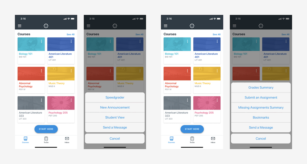
One picture is worth a thousand words, so let’s see what I am talking about:

jozsefdavid_0-1622622890678.png


As you see on the screenshot the new feature would take place as a floating button on the bottom. This button would be visible right after the app starts and logged in. As we tap on the button, the “action sheet” appears where you have quick access to the features through the list items. This list might contain the following items:

Teacher:

  • SpeedGrader
  • New announcement
  • Student view
  • Send a message

Student:

  • Grades summary
  • Submit an assignment
  • Missing assignments summary
  • Bookmarks
  • Send a message

We assume these features are important; please share if you think differently. 

Note: Don’t worry if you can’t find any of the features above in the apps. Some of them do not exist on both platforms yet. Some of them do not exist at all yet.

I must emphasize this is a feature idea, which might be implemented based on your feedback too, so please be active and share what you think.

The content in this blog is over six months old, and the comments are closed. For the most recent product updates and discussions, you're encouraged to explore newer posts from Instructure's Product Managers.

11 Comments
jsowalsk
Community Coach
Community Coach

Hi jozsefdavid, this is great!! When does this plan to be enabled and are there going to be any API endpoints for this feature?

jozsefdavid
Instructure Alumni
Instructure Alumni
Author

Thank you @jsowalsk. We have just started to validate this idea. This post is one step in the process. If it proved to be helpful for the users, we will start thinking of the technical implementation. 

rake_9
Community Champion

My feelings are mixed. 

Mostly, with shortcuts, I wonder two things: 1) why not just make the original navigation easier? and 2) are the shortcuts I need the same as the shortcuts that someone else needs?


jsowalsk
Community Coach
Community Coach

Great, thank you @jozsefdavid. This will definitely be beneficial for our end users since it is an easier workflow to get the information they need quickly.

jozsefdavid
Instructure Alumni
Instructure Alumni
Author

Thank you @rake_9. I absolutely agree. Your both points are valid. Do you have suggestions on how you would solve these problems? I have some ideas too, but I'd like to hear yours as my ones might be too biased.

rake_9
Community Champion

I don't have particular suggestions, in part because I'm sort of thinking this is a solution to a problem that doesn't really need solving. 

There are already action buttons at the bottom of the apps for most items that people need fast access to - if you have feedback that these aren't adequate, improve how those work and/or add additional buttons for other needed "fast functions."

In general, I'm not opposed to multiple ways to accomplish a thing, but my initial reaction to this proposal is really that the Start Here button takes up screen space and provides a menu that is as likely to frustrate as it is to help.  

venitk
Community Champion

Having recently experienced my son using the Canvas app for his school work, I do understand trying to save the multiple clicks to get places. Unlike my daughter's SeeSaw app, which helpfully had red numbered badges saying how many assignments she had due in each of her courses each day, with my son we had to hunt and peck through multiple Canvas courses because his teachers didn't put due dates on the assignments (for what I'm sure were good reasons). So I get the rationale behind this.

On the student side, Grades Summary, Missing Assignment Summary, and Bookmarks might be helpful. Send a message is redundant to the Inbox, which is right there. 

As for Submit an Assignment, and most things on the instructor view, it may initially be confusing to access this from the home screen rather than in a course. For example, if I had never used this feature before, I might think "if I click New Announcement, which course would that announcement go to? Will it allow me to choose? Better not click it in case I accidentally post a universal announcement."  Or "if I click submit an assignment, which assignment am I submitting to which class?" I'm guessing after the user clicks that button, there would be an opportunity to select which class and which assignment... but would the user end up saving clicks in the end, rather than going to through course? Just a Devil's Advocate question. 

If I understand this correctly, this would make the app function differently from the desktop version, which can be confusing for people who go back and forth. 

When I think of a "Start Here" feature in an app, it's something I use once, when I first open it, to get to know the software, and never use again. This seems more like "quicklinks" or "shortcuts."

As an instructional designer in higher ed, we're doing all we can to get students to access assignments in the context of the course, through the modules. In other words, we want them to have to go through the course to submit an assignment, so they see the assignment in the context of the learning materials included in the modules. We're stymied by the Calendar and the To-Do Lists, which already allow students to bypass the modules. This seems like yet another way for students to bypass the learning materials and the modules. 

jozsefdavid
Instructure Alumni
Instructure Alumni
Author

@venitk. Thank you for this very valuable feedback!
@rake_9 Thanks for your thoughts!
@jsowalsk I am glad that you like it!

We are still waiting for feedback and thank you in advance.

swind
Community Participant

+1 to the above comments.

I also think of "Start Here" language as something for new users that is dismissed after mobile app onboarding is completed.

Button labeling aside, looking at the screenshots my initial reaction is that the "action sheet" list feels disconnected from courses. When selecting Speedgrader (for teachers) or Submit an Assignment (for students), which course is this for? -will I have to select from a course list next?

In general, I support efforts to reduce the number of actions required by the user to get to their desired screen but, based on the mockup, I'm not convinced that a Start Here button accomplishes this goal. I agree with @rake_9 that making improvements to the original navigation would be worthwhile.

Having said that, I like the student grades/assignments "Summary" options. I'm not sure if something like that already exists in the mobile app (I haven't opened it in a while), but I suspect those are the most frequently accessed features.

akinsey
Community Contributor

I like the idea, but I'm stuck on the language. The idea of a "start here" button would typically be considered for a user's first time in the app--like a general place for users to begin accessing the things they need. If the features in the start here toggle could be personalized by the user, that would be incredibly beneficial over time. That way, an instructor who uses the app frequently and knows what they want quick access to could then add those pieces (say up to 5) to the Start Here toggle.

Also, since those features are course-specific, I'm wondering if having the start here on the dashboard is helpful. Would it better to have this appear after a user chooses a course? Or would the ability to "favorite" features from within courses help mitigate that?

Just spitballing some ideas here--but I really like the concept!

Steven_S
Community Champion

The biggest "start here" issue with the dashboard is that there is always a string of announcements made out of images that often are each longer than a normal computer screen... One could close each announcement manually... or one could ignore the much more useful dashboard features and go directly to a course...  Your example pictures come from the mobile app, but the same is relevant to access through a computer if "start here" can be in front of the string of announcements and include a "jump to course cards" option. 

(IMO announcements would be more effective, and less of a distraction, if there was a single, updating card that flipped through the announcements without changing from the set size of that card.)