Enhancing Collaboration: Re-introducing the New Canvas LMS Discussions Redesign

The content in this blog is over six months old, and the comments are closed. For the most recent product updates and discussions, you're encouraged to explore newer posts from Instructure's Product Managers.

SamGarza1
Instructure
Instructure
46
15831

Canvas.png

We're thrilled to unveil the next evolution of Canvas’s Discussion feature, representing a significant step forward in our ongoing mission to empower educators and students with seamless communication and collaboration tools. I'm excited to introduce you to our latest redesign, which incorporates your feedback and seeks to improve the discussion experience for students and teachers.

First and foremost, we want to address the past challenges we faced with this redesign. We heard your concerns, and we've taken every bit of feedback to heart. Your patience and commitment to improving the Canvas experience for all help us to continuously improve, and your insights have been pivotal in shaping the features we're about to introduce.

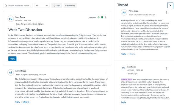
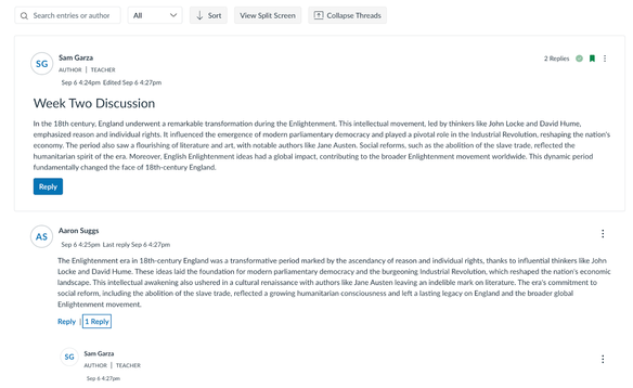
With your feedback, we’ve added the ability for users to switch between an inline and split experience. Whether you prefer viewing threaded replies separately or in an inline flow, the choice is yours.
 

SamGarza1_0-1694039484258.png

Isolated View

SamGarza1_1-1694039484240.png

Split View

So, what else is new in the Discussions Redesign? With our last update being a while ago we're sharing a comprehensive list of updates that are included in this redesign. 

Flexible Viewing Options: We're introducing a choice between a split-screen view and an inline view for discussion threads.

Fully Responsive: Our redesigned Discussions feature is fully responsive and mobile-friendly, ensuring that you can engage in discussions across devices.

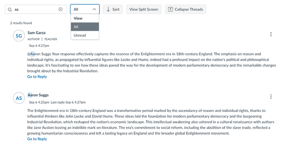
Sort and Filter Options: We understand the importance of quickly finding relevant discussions. By adding sorting options such as "Newest to Oldest" and "Oldest to Newest," and filtering choices including "All," "Unread," and "Read," we’re giving you tools to quickly and efficiently manage your discussions. 

Enhanced Search: We've revamped the search functionality to make finding specific discussions and topics easier than ever before. This includes highlighting text that matches the search query. 
SamGarza1_2-1694039503786.png

Role Pills for Faculty Recognition: We value the contributions of educators and have introduced role pills to highlight faculty members, creating a more visible and engaging discussion environment.

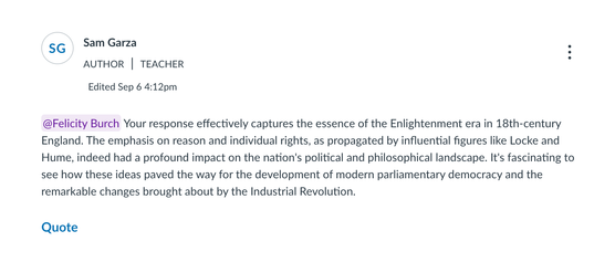
@ Mention Classmates/Faculty: Collaboration is key, and now you can directly mention classmates and faculty members in discussions using the "@" symbol, making conversations more dynamic and interactive.
SamGarza1_3-1694039503739.png

Anonymous Discussions: We recognize the importance of fostering open dialogues. The option for anonymous discussions, both fully and optionally anonymous, allows for ungraded discussions that encourage candid participation.

Full Accessibility Audit: Like all new features that we release, this feature has undergone a full accessibility audit. 

As you begin to explore the revamped Discussions feature, which is available as a feature preview, we invite you to share your thoughts and experiences with us. Your feedback continues to be invaluable, guiding our ongoing efforts to refine and improve the Canvas LMS experience and we're committed to being your partner in education, providing the tools and features that empower you to succeed. 

Tags (1)

The content in this blog is over six months old, and the comments are closed. For the most recent product updates and discussions, you're encouraged to explore newer posts from Instructure's Product Managers.

46 Comments
chriscas
Community Coach
Community Coach

Hi @SamGarza1,

This sounds great!  Is this already in beta/prod, or when can we expect to see these new options become available (of course assuming we enable the feature option)?

-Chris

canvas_admin
Community Champion

Thank you for bringing back the "isolated" (what I call threaded) view. Making it an option via a button is brilliant!  Now we can comfortably switch over to New Discussions which makes me excited! We had been asking for sorting ability for over a decade but then the new "split view" made us unable to switch which was disappointing.  Thank you for taking the time not only to hear back from your clients, but also to listen and find a way that is a good solution for the variety of needs that are out there. 

venitk
Community Champion

@SamGarza1, thanks for this update. I'm glad to see users will still be able to have the isolated view if they wish. Two questions:

  1. When you @ someone, will they receive a notification? Mentioning was a feature in the previous New Discussions rollout, but the user did not receive a notification, which completely dimmed our enthusiasm for this feature. Mentioning someone if they don't receive a notification, either through email or through the app, doesn't seem to have a point. Please add this notification if it's not already planned. 
  2. Are multiple due dates something you all are working on? In other words, have the first post due by one date, and a response post due by another date. We have a clunky workaround by having pages with to-do dates, but we don't love it. 
gpillsbury
Community Contributor

I'll second venitk's question about multiple due dates.  We currently pay for an entirely different discussion product because it offers multiple due dates.  We'd rather not have to do that anymore...

JamesSekcienski
Community Coach
Community Coach

@SamGarza1 

Thank you for sharing these updates with Discussion Boards.  It is nice to see that work is continuing on this.  I'm also glad to see the flexible viewing options as I personally was in the boat of preferring the in-line threads.

I saw in the prioritized theme there are other features that are being worked on that weren't mentioned here.  Will you be providing an update on them soon too?  https://community.canvaslms.com/t5/Canvas-Prioritized-Themes/Improve-the-user-experience-with-discus... 

snugent
Community Champion

It nice to see some updates to discussions. When will this be in production? 

SamGarza1
Instructure
Instructure
Author

@chriscas @snugent @JamesSekcienski The Discussions Re-design is available now as a feature preview on beta and production. Split/isolated view will be available in the feature preview soon and you can watch the deploy notes for updates. I'll also be sharing additional updates in the coming months about checkpoints and other great things that are coming to discussions!

tori_sifantonak
Instructure
Instructure

Hi @venitk

Great questions. I'm happy to report that mentions will generate a notification. If you review your user notification settings, you will see an item under the Discussions heading for "New Mentions."

Also, in @SamGarza1's last comment, she mentioned "Checkpoints." That is another feature we are working on to accommodate the multiple due dates requests. We understand the need to develop a solution for discussions that require interactions at different dates/times. 

I hope this is helpful! In the meantime, keep an eye out for more information shared in the upcoming deploy/release notes. 


AndreaChang
Community Explorer

Thank you for keeping us in the loop with the update, this is exciting! I'm especially looking forward to the role pills and the @mention capability.

When we @mention someone will they receive a notification even if they haven't changed their default notification settings? I'm particularly enthused to know about this, I think a notification via the app or email would be perfect.

dbrace
Community Coach
Community Coach

For a variety of reasons my institution has yet to take a deep dive into the discussion redesign but I do have three questions:

  1. related to the pills for faculty ... how will custom roles be displayed?
  2. related to the two AIs, academic integrity and artificial intelligence and checkers ... are you able to publicly say anything about integrating with external tools or are you leaving that up to them to develop and announce on their own?
  3. does this also impact announcements? 
mlabbett
Community Participant

Is there talk about Multiple Due Dates for Discussions?  For example if I have an initial post due on Wednesday and then all post due Sunday.  It would be nice to be able to grade on Wednesday and then again on Sunday.

dlyons
Instructure Alumni
Instructure Alumni

@mlabbett that item is on the public roadmap! The term we've been using for it is "checkpoints" so keep your eyes open for that in future release notes and blog posts.

mlabbett
Community Participant

@dlyons are you able to direct me to any recent topics for this, i would like to make sure that I am added to the list of people that really would benefit form multiple due dates. I do not see anything recent on this topic.

dlyons
Instructure Alumni
Instructure Alumni

@mlabbett there haven't been many recent discussions. This need was settled on with lots of public discussions some months ago, but we had to pivot to address the UX issues above first. The checkpoints work is on the roadmap under "Deepening Student Engagement" and reads "Students engage in deeper, more meaningful discussion with classmates with clear checkpoints to guide their way."

Screenshot 2023-09-12 at 09.28.46.png

NikHunn
Community Member

Is there any talk of adding the possibility of TurnItIn capability to the new discussion boards?  Every few weeks I hear from a faculty member asking why they can't use TurnItIn for discussions so any movement in that direction would be greatly appreciated!  Judging from this discussion board it seems there is quite a bit of interest in this: https://community.canvaslms.com/t5/Discussions-Announcements/Turnitin-for-Discussions/m-p/478233.  

mwolfenstein
Community Participant

I wanted to reiterate the replies from everyone else here that it's really great to see our feedback folded into the design process. I'm eagerly looking forward to both the update for this feature so that I can encourage faculty to try using it, and of course the implementation of those milestones which I know are on the roadmap.

Since @venitk and @AndreaChang were asking about @ notifications, I also wanted to add a note.  I know it's a big ask in relation to this project, but one thing I wanted to resurface in relation to @ notifications is the issue of deep linking. For @ notifications to work effectively. the notification really needs to take you to the comment/reply where the @ occurred. It's a current problem with replies in general since the current workflow brings you to the discussion, but then if it's a busy discussion you need to search it to find where the activity was that you were notified about.

leward
Community Contributor

Should I be seeing the new view options on Beta?  New Discussions has been enabled as an opt-in feature in our production and beta instances for a long time.  When I turn it on in a course, I don't see the option to toggle between split screen and inline view.

b_w_reid
Community Participant

Similarly to @klew I can't get some of the features to work on our beta instance either. I'm particularly interested in split view, but it doesn't appear on the main discussions page for a particular discussion.

DR-BRZ
Community Explorer

The look and feel of the updated 'discussions' is amazing, though it was discovered in a recent course offering that rich content editor options, such as formatting (bolded lettering and font choices), as well as hyperlinked information is not saved appropriately in original posts or replies. As such, we reverted back to the classic discussions option so students would be able to retain formatting and linkage preferences in posts and replies.

Has anyone else encountered the aforementioned formatting issue?

SamGarza1
Instructure
Instructure
Author

@b_w_reid and @leward Apologies for any confusion! Split-screen and inline views will be available in the feature preview soon. It will be included in the deploy notes when it goes to beta and production. 

SamGarza1
Instructure
Instructure
Author

Hi @DR-BRZ, thank you for bringing this to my attention. I wasn't able to reproduce this issue, but have you tried contacting our support team with this issue?

DR-BRZ
Community Explorer

Hello @SamGarza1 ,

The issue does appear to be resolved at my institution as well. We did notice the issue would appear if a message was created in the 'classic' discussion instance, with formatting lost when we applied the new FEATURE option for discussions to the course. Any original posts or replies submitted under the classic thread design lost their formatting within their posts. If the feature was applied prior to any posts or replies, the formatting issue disappeared.

That being said, I believe everything is working as intended now.

Thank you for the prompt reply and feedback.


Cirrus
Community Participant

Hey Sam, 

Thanks for the update! I like the look and feel of the new layout, but I'd love to see more work done with the settings and functionality. We have a ton of issues with having to make repeated discussions for each section, even when students are limited to only interacting with their own section. I would love to see the discussion topic as an assignment to the whole course, but an individual dropdown "instance" of each section for any sections that are restricted to their own groups, and then a bulk everyone discussion for any students who are allowed to see all sections. 

Every other gradable Canvas object can do this - you don't need to make individual assignments for each section, or quiz duplicates to keep them within their section.  The fact that discussions don't honor the "limit students to their section" flag is frustrating. We have clients who pay specifically to have training only with other members of their learning centers, or sections in different languages or with different state requirements. Dumping them all together in a 800 person discussion board would be awful, so right now we just have 25 different discussions, each with an identical prompt, each assigned to a section or two. It's a hot mess and I'd love to see it fixed.

The other issue we have is moving learners between sections. The discussion completion sticks, but to the wrong section. It reads them as having completed the discussion module requirement (the separate one from their old section, so it's not complete in the new one), which means they move on without redoing it. That's a problem because our SIS reads a course as complete when *all* assignments are done, so learners move on without redoing those assignments (and the module requirements incorrectly allow them to do so) and get to the end of their training, but they have no idea their professional development is not complete.


Thanks!

Charles_Barbour
Community Participant

Those are great points @Cirrus. This is one of those situations where I feel like the people developing the functionality may not have thought broadly enough about the ways the tools are used. In part because they don't use them at the same scale or in the same contexts as their clients.

I feel like Instructure needs some very broad design goals and standards when developing tools and functionality.

  • Tools should be able to be used and deployed at the course, section, or group level without having to replicate the work.
  • If students move between sections or groups, their grade or completion status should be accurately reflected in the destination.
  • Changes to tools and workflows should never make work harder or more cumbersome for users. (See the recent changes to Enhanced Gradebook Filters)
  • Changes to tools and workflows should never be enforced on users until they have achieved feature and efficiency parity. (Does the new item everything the old one did and is it as easy to do so?)

I'm sure other people have better and more ideas, but I feel like a broad set of "Instructure will always" and "Instructure never will" statements would help produce better outcomes.

hesspe
Community Champion

I've been testing the redesign in Beta and so far I'm liking all of the changes, including the Split view, but also that users who prefer the traditional presentation are free to choose that, or even switch back and forth.

I had been thinking that people could switch to the redesign after starting out with the traditional design in a course and not lose anything, but that doesn't seem to be true for group discussions.  I'm wondering if you can confirm that observation, and if so, is that a temporary or a permanent situation?  It's not a big deal, but I want to be sure if I tell people that group discussions won't "migrate" that I'm giving them accurate information.

And to sneak in one more questions, people are asking me if there is a date set for enforced transition.  I feel pretty sure that date hasn't been set yet, but if there is anything to report back on that, I'd like to know.  It's a little off-balancing that some enforced changes, like the new gradebook format, seem to come about almost overnight, and others like Assignment Enhancements take years and years (and it still hasn't happened).

SarahNKWilliams
Community Novice

Hi,

I have been using the pop-up box feature of Discussions Redesign in my discussions ahead of the latest roll-out (10/25/23).  I feel like in the new release, the split screen end has lost some of its functionality.  It takes more clicking to open the new posts (where before they were visible as unread), and you now have to click to close the threaded box rather than simply clicking back on the main discussion.  Is there a way to get back to the previous design for the pop-up box, where the visibility of conversation was better?

Thanks!

Sarah

birger_eriksson
Community Participant

Anonymous Discussions still is marked as ”Not supported” in the student app. Do you have a time line for when anonymous discussions will function in the app?

At least half of our students access Canvas in the app.

SamGarza1
Instructure
Instructure
Author

Hi All! 

I've answered some common questions below.

Roll Pills: At this time the roll pills only show for the standard faculty roles. 

@ Mention: For users who have default settings a notification is sent immediately and links back to the specific mention. 

Checkpoints (multiple due dates): Our team is hard at work on this feature and it's currently on our roadmap for Q1. I'll ensure more information is shared before the release. 

Announcements: UI updates have also been made to announcements and are included in this redesign.

Plagiarism/AI checker: This is a feature I hear about often and is a complex one. We're evaluating all options to ensure we implement the best solution. 

Enforcement timeline: I recently posted here about the timeline. The tldr is that we're taking our time with this and set the enforcement date as July 20, 2024. This gives our users nine months to test, ask questions, and gain confidence in this change. 

Jeff_F
Community Coach
Community Coach

Hello - Here I am adding a few notes about the update.

For the inline view (threaded) - 

  • Replies are collapsed by default. To expand these one selects the new Expand Threads button.
  • Replies are threaded/ indented for the 1st level, 2nd level, and 3rd level replies. 
  • Additional replies at the 4th, 5th level, etc. appear at the same indent position as the 3rd level replies. The replies at these levels automatically include a mention to the author of the post you are replying to. 
reply depthsreply depths


Split Screen - 

  • To view a 2nd level reply it is necessary to click twice.


venitk
Community Champion

@SamGarza1  I understand about wanting to enforce this over the summer--that makes complete sense. However, if I may correct your statement, we won't have 9 months to train because the features we would be training on (including multiple checkpoints, but also whatever else might be coming?) won't be available until 2024. So that's less than 6 months to do the training, and it's really the worst 6 months of the year to do training. It works so much better for us to have a full year from when a tool is DONE done (meaning, all the things that we might be training faculty on are done) until it's enforced. 

To see how this plays out in my unit:

Our best time to train faculty for any new tool is in our annual professional development meeting in early January. If checkpoints won't be out until sometime in Q1, we won't have time to create the training materials for that tool before the meeting. Which means there will likely be complaining and assumptions that Canvas is making a change for change's sake (most won't care about the responsiveness or accessibility enhancements as much as they care about extra clicks and the cognitive load of learning something new--although some will love the @mentions).

In short, we won't be able to train faculty on checkpoints before the tool is enforced in July. 

For many other orgs, it's best to do PD in the fall when faculty are fresh (or even brand new). Faculty tend to do less PD in the spring, and almost none over the summer--I am lucky if they read our emails over the summer.  

Why this affects Canvas: faculty will be VERY excited about checkpoints, if they work the way I think they'll work. Checkpoints will be the major appeal to faculty for this new tool. And getting faculty buy-in on changes greatly increases their satisfaction with Canvas. So this is a "help me help you" situation. 🙂 

The tl;dr of this is, it's best for us when a tool is done done (and Discussions is not done yet) for at least full year (longer is better) to give us time to hype the change, get faculty excited, and design and deliver training. Higher ed works on a much slower timeline than tech development cycles. 

Thank you so much for responding to folks and answering our questions. I don't need a response, as I'm just sharing my thoughts on the timing. I am curious as to why Canvas is pushing what feels like an aggressive enforcement timeline, but I'm guessing it doesn't feel as aggressive to Canvas as it does to us.

venitk
Community Champion

@SamGarza1 , the guides on new discussions are not up-to-date. I was looking for information to share with our faculty in our January training that I just mentioned, and none of the guides that I looked at matched what I see when I look at new discussions (I didn't look at all of them). I did leave feedback on a couple of the pages, but I don't have time to comb through all of them to tell the documentation team which ones are outdated and I'm guessing they just haven't gotten around to updating them yet? 

Will these guides be updated by January 1? If not, we will have to create our own guides for our training so we need to budget that into our workplan to get ready for our January PD.  I'm a little concerned that anything we create now will be outdated by January, since you're still working on GUI, checkpoints, and edit/delete history. 

Please advise as to Instructure's timeline for updating the documentation. 

SamGarza1
Instructure
Instructure
Author

Hi @venitk thanks for bringing this to my attention!

I checked with our documentation team and it will be updated by the end of the week to include information on Inline/Split View and Edit History. Generally, we try to have guide updates done within a week of the production release. 

For create/edit, our team is wrapping up the work now and once it's through our accessibility review we will set a specific release date; it's currently expected by January though. 

Checkpoints is a separate feature that will only be available in the new UI of the redesign and will have separate documentation.

Sharing for everyone, links to community guides on the redesign can be found here.

venitk
Community Champion

@SamGarza1 Thanks for the update! I'm not sure I understand what you mean by 

"Checkpoints is a separate feature that will only be available in the new UI of the redesign and will have separate documentation."

I thought inline/split view, etc., were also features of the redesign? 

Do you mean that when checkpoints are finished, they'll have their own page in the community guides on the redesign? 


SamGarza1
Instructure
Instructure
Author

Hi @venitk,

Checkpoints are an enhancement to the way instructors can assign discussions and provide greater clarity to students on expectations. It's an optional feature that will be available for all discussions in the redesign discussion experience. This feature enhancement won't be available in the legacy. This is unlike the inline/split view which is a primary component of the redesign. 

hesspe
Community Champion

>> This feature enhancement won't be available in the legacy. This is unlike the inline/split view which is a primary component of the redesign.

@SamGarza1 @venitk I wonder if I am the only one who does not understand what this means.  I thought I understood the first sentence, but my confidence in that understanding crumbled with the second.

SamGarza1
Instructure
Instructure
Author

Hi @hesspe @venitk,

The introduction of checkpoints as an enhancement to the discussion experience was added after the original redesign plans were put in place. The original plans consisted largely of UI changes such as the split view/inline functionality and minor functionality changes such as @mentions, quoting, and searching.

We consistently heard from the community that checkpoints are a necessity to ensure teachers want to make the transition so additional development plans were put in place to include them into the redesign before enforcement to bring the most value for our educators and students.

Lsheehy7
Community Participant

Hello @SamGarza1,

I'm excited about the improvements for discussions; however, I'm not finding something anywhere that would be very helpful. Is there a way to view all posts created by student? We recently switched from Blackboard, and, using their Performance Dashboard, an instructor can see all posts that a student has submitted. Is there a "aggregator" that is available? I found directions for using a discussion aggregator from Wayne State University. However, the link to it is under Course Tools which we don't have in our environment. Having this functionality would be extremely useful.

Thank you!

dbrace
Community Coach
Community Coach

Hi @Lsheehy7

I do not work for Canvas but have been a Canvas user for about 6 years. I do not believe the functionality that you are looking for is natively available to all institutions using Canvas but I could be wrong.

I looked at the Wayne State University webpage that you shared and found https://tech.wayne.edu/kb/academic-services/canvas/500150. This webpage talks about custom tools that they have developed, one of them being "Discussion Post Aggregator".

Since these are custom tools that Wayne State University has developed, it is only available to their courses and users.

It might be possible (whether it be you or the appropriate person at your institution) to contact Wayne State University's Computing & Information Technology team (313-577-4357 or helpdesk@wayne.edu, another option is 313-577-9457 or lmsadmin@wayne.edu) and ask them for the code.

- Doug

Lsheehy7
Community Participant

Hi Doug, @dbrace 

Thank you for that information! I am hoping that it's on the plate for Canvas to provide a solution. In the meantime, I'll follow your idea.

Thank you!
Laura

SamGarza1
Instructure
Instructure
Author

Hi @Lsheehy7, our team is currently working on improvements to the grading experience for discussions. We expect these to be available with the Checkpoints release in Q1. 

Lsheehy7
Community Participant

Hi @SamGarza1,

Do we have a release date for this improvement?

Thanks!
Laura

SamGarza1
Instructure
Instructure
Author

Hi @Lsheehy7 , a specific release date hasn't been set yet. I'll be posting an update in Q1 once we've decided on a release date. 

DanielLUnowsky
Community Explorer

Will this redesign allow instructors to pin a specific post to the top of a discussion? This allows the instructor to write a final post in the discussion period and have that remain at the top so everyone sees it instead of having it buried. 

SamGarza1
Instructure
Instructure
Author

Hi @DanielLUnowsky, that functionality isn't part of the Discussion Redesign but it is something we can look at adding in the future. If you haven't already submitted an idea to the community I recommend doing so as it helps us track customer requests. You can submit ideas here https://community.canvaslms.com/t5/Canvas-Ideas/idb-p/canvas-ideas.

mwolfenstein
Community Participant

@SamGarza1 @DanielLUnowsky this idea was posted by @jg-cal in 2021 and is currently archived:

Pin Discussion Posts from Instructor

My work around for this is using an announcement to follow-up on a discussion, but I know that doesn't fit every use case where the concept of a pinned post is desirable.

DanielLUnowsky
Community Explorer

Sam: you wrote this to me: Hi @DanielLUnowsky, that functionality isn't part of the Discussion Redesign but it is something we can look at adding in the future. If you haven't already submitted an idea to the community I recommend doing so as it helps us track customer requests. You can submit ideas here https://community.canvaslms.com/t5/Canvas-Ideas/idb-p/canvas-ideas.

However, I did that, it was pushed up into this theme and led me here, so I was hoping that in fact my suggestion--the restoration of functionality that Canvas had just a year ago and was removed for some reason or other was part of this redesign. I do not want to do this again as an idea etc etc when I already did that and it went through this process. This is a very frustrating system. It seems no one at Canvas directly helps customers with the functions they want to have, but only push us toward this process which it now appears can be little more than a loop--putting up questions, doing an idea, that going into a theme, and then someone saying I should do this as an idea again.