Dark Mode on Mobile
- Subscribe to RSS Feed
- Mark as New
- Mark as Read
- Bookmark
- Subscribe
- Printer Friendly Page
- Report Inappropriate Content
|
UPDATE (2022.08.30): Based on the comments and feedback we received regarding to this topic we would like to continue the discussion with our users. Please take a look at the survey we have created and fill it in and let us know what you think. Thank you. |
I hope this post will make many of you happy. Well, more accurately not the post itself, but the feature which we are releasing for the Android and iOS Canvas applications. There were tons of incoming requests asking us to let the users decide between dark and light themes according to their needs. I don’t think I need to explain the reasons why it is important but to name a few:
- Your eyes are light sensitive
- Reading in the bed at night
- Some brand colors are not visible correctly in one of the modes
- Dark mode looks nicer than the light mode
- Light mode looks nicer than the dark mode
- etc.
Accessibility
The colors we are using are fulfilling the accessibility requirements of the guide: WCAG 2.1 AA, but I must highlight that it only applies to those colors we - the creators - can control. When your institution has a custom theme and branding those colors cannot be controlled by us so there might be unexpected results if the admins don’t test the brand colors in both light and dark modes. I must repeat it: If you want to have a system which looks right in light and dark modes too, you should always test your custom colors in both modes in the mobile apps! There is no golden rule and the goal of this post is not to explain accessibility guides, but here are some resources you can start with:
- https://webaim.org/resources/contrastchecker/ (make sure your text color contrast is at least 4.5:1)
- https://www.w3.org/TR/WCAG21/ (The W3C guideline as of today)
- https://www.instructure.com/products/canvas/accessibility (Instructure’s Accessibility Statement)
Scope
As we clarified in the beginning of this post, the described settings are only for the Canvas Mobile Apps including:
- Canvas iOS Student app (v6.16.0)
- Canvas iOS Teacher app (v1.16.0)
- Canvas iOS Parent app (v3.6.0)
- Canvas Android Student app (v6.18.1)
- Canvas Android Teacher app (v1.18.2)
- Canvas Android Parent app (already released a few years ago)
And a few more information that is useful to know:
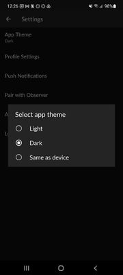
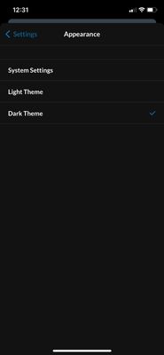
- There is a possibility to follow the operating system and automatically select the mode according to the OS setting
- There will be an extra popup window advertising the feature right after the app is upgraded to the new version. This popup will not be displayed again, but the setting will be available through a regular setting.
- The setting can be easily managed from the settings menu
Android:
iOS:
If you have any questions, please comment here or reach out to our support team.
The content in this blog is over six months old, and the comments are closed. For the most recent product updates and discussions, you're encouraged to explore newer posts from Instructure's Product Managers.


The content in this blog is over six months old, and the comments are closed. For the most recent product updates and discussions, you're encouraged to explore newer posts from Instructure's Product Managers.