Reply Navigation Update in Discussions Redesign

Katrina-Hess
Instructure Alumni
Instructure Alumni
12
3538

Hello user group! When we started our discovery for updating Discussions these reply navigation issues and feature requests quickly surfaced:

  1. Modern digital conversation tools follow a vertical format vs. horizontal
  2. Discussions with many replies sometimes took too long to load or timed out
  3. You cannot tag another person with an @mention
  4. You cannot quote the person you are replying to
  5. There were too many clicks to see and respond to unread replies from the Discussion index page

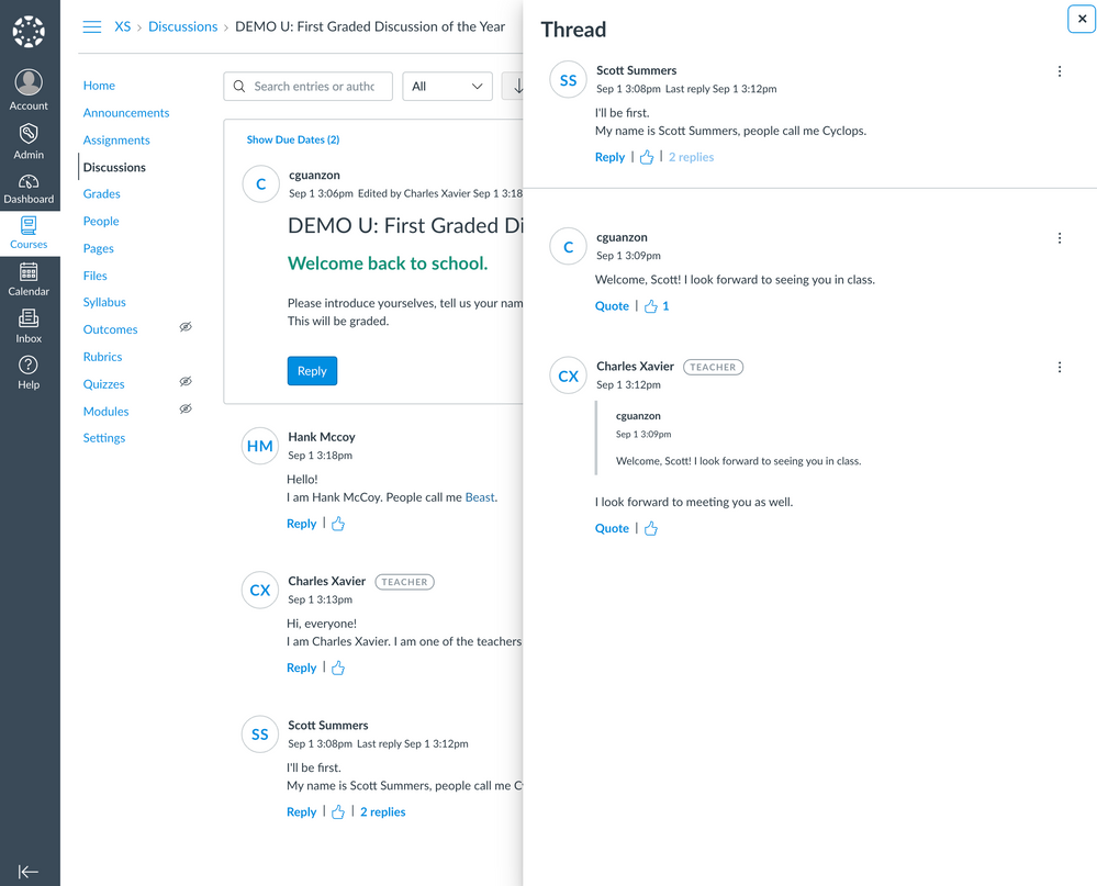
Thread Tray

To address items 1 and 2, we decided to introduce the Thread tray. This feature will be available behind the Discussions/Announcements Feature Preview flag starting Sep 15th. This release will also include items 3 and 4, @mentions and quoting a reply! 

We know this is a huge change in how you have used Discussions in the past. After Sep 15th, please test this navigation out and provide feedback by commenting below. This is only the beginning of the improvements we are exploring for the Topic page and Thread tray. Your feedback and feature requests will help shape our direction. Canvas Discussion Topic Thread TrayCanvas Discussion Topic Thread Tray
Direct Replies Tab

To address item 5, we are hoping to improve your workflow with an actionable drawer in the Discussions index page. The Direct Replies tab will surface your unread replies when:

  • you receive an @mention
  • someone replies to your Topic
  • someone replies to your parent reply
  • someone quotes your reply
  • someone replies to a Topic you have subscribed to

You will be able to see all of your unread replies, as well as, be able to reply without leaving the page. We are still in discovery so these designs may change. 
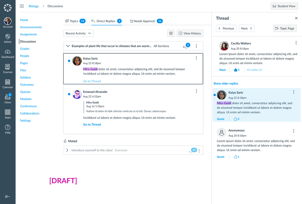
Canvas Discussion Index Page, Direct Replies TabCanvas Discussion Index Page, Direct Replies Tab

Of course, this tab might get super noisy for topic authors (hello, teachers!) so you will be able to modify which replies you would like to see in this tab, as well as, mute individual topics.
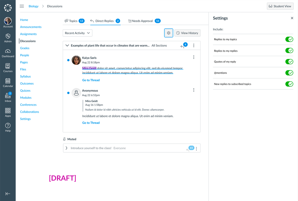
Canvas Discussion Index Page, Direct Replies SettingsCanvas Discussion Index Page, Direct Replies Settings

Our team is committed to improving Discussions and we look forward to your feedback and feature requests!

Best, Katrina

12 Comments
valentinesking
Community Coach
Community Coach

@Katrina-Hess Are these updates for Sept. 15th for Beta or Production?

snugent
Community Champion

@valentinesking I just checked in beta and the update is there so I am assuming 9/15 is for production. 

Katrina-Hess
Instructure Alumni
Instructure Alumni
Author

@valentinesking Yes that's correct, the updates for 9/15 production release are already in beta.

Thanks @snugent!

Best, Katrina 

venitk
Community Champion

@Katrina-Hess Which of these actions will trigger a notification? I think it would be helpful if anything that ended up in the direct replies tab (based on the user's settings) also triggered a notification so people knew to log into the course. 

venitk
Community Champion

What's the reason behind the tray vs. something like facebook, where when you click on "View more replies" or whatever and see the replies to the replies without going to a different screen/tray? 

EG this thread from We Rate Dogs:

collapsed replies.pngexpanded replies.png

I'm asking because our first reaction to this design with the tray was that it looks busier and/or fancier than it needs to be to get the job done, and if faculty react that way, too, I'd like to have a response for them. 

Nancy_Webb_CCSF
Community Champion

I'll be very interested to see the Direct Replies Tab, I don't see it in Beta. That could solve some problems, excellent idea!  @mentions is there, very good feature too.  

Not sure about the Replies Tray, like you @venitk .

  1. The tray feels a little cramped, and it runs in the right-side area of the screen where we have the Impact help tool, and I have the Impact administrator tool too which is immovable.
  2. It's necessary to open each level of replies separately, they don't all open automatically.  You can't see the complete thread at once. A lot of extra clicking.
  3. My mouse's scroll wheel starts scrolling the main discussion when I scroll to the top or bottom of the tray even though my focus is still in the tray.

I guess the tray is to answer the problem of slow loading replies.  I don't really like the View More Replies option used in Facebook and other places.  I also don't like scrolling down to reveal more.  What is a good solution?

It would help to have the view/collapse all option, both in the tray and for the whole discussion. 

Thanks for giving the community a place to respond @Katrina-Hess !

Jeff_F
Community Coach
Community Coach

I've posted the feedback to the wrong thread. Reposting here.

--------------

@Katrina-Hess  & the development team - 

A little feedback on the redesign with the flyout panel for replies…

  1. Instructors cannot easily identify the students they have not replied to. Each time I came to the board I felt compelled to click through each student reply to ensure I was doing a thorough job.  I was compelled to do so because of #2 below.  

  2. The redesigned board is configured so the newest posts show first. The sort order is based on the initial reply and apparently all subsequent replies to that post. As configured, the sequence is continuously changing so instructors cannot assume that they have replied to a set of earlier initial replies based on the date posted and relative positioning on the board.

  3. An 'expand all' option to reveal all posts is not a possibility as the replies are now contained separately in the flyout panel. 

  4. While entering a reply, if I were to click off the fly out elsewhere on the screen, the flyout panel disappears and the content I’ve entered is irretrievably lost. 

  5. The text box and toolbar in the fly out is much smaller. If I were to expand to Fullscreen, the text box increases in size, but does not widen more than the existing fly out. The toolbar does display more of the menu options when expanded. At Fullscreen the text box is set to wrap at about 313 characters but only displays the first 115 characters. Anything more than 115 characters or so is off the screen. Note: I use the Chrome browser. 

  6. After students reply to the discussion prompt, others can reply to that student. But then if someone wishes to post a 2nd level reply (or greater) such replies are not threaded. Instead, there is a ‘Quote’ response option. I am unsure how this works with notifications, etc.

  7. Viewing unread replies via the list does not auto mark them ‘read’. Currently it is necessary to manually mark replies as read. However, if you instead filter for Unread you will see the full list of Unread replies. Then select ‘Go to Reply’ to see the post in context of the original post and all replies to that student post. When replies are displayed after filtering for Unread replies, they do automatically update to Read. However, the count of unread replies on the main discussions page does not appear to update to reflect you having read all discussions.


2 cents:   My sense is that students and instructors are likely less apt to read as many posts and replies. This is because accessing the post requires a manual click to open the reply or replies. While one can filter for Unread, doing so means they then need to click again to view the context of the post. 


So which is better - a discussion list that involves scrolling or sets of posts that require multiple clicks to access with a new fly out panel?  

Katrina-Hess
Instructure Alumni
Instructure Alumni
Author

Ii @venitk, you will get to control which notifications you receive like you can today. For the Direct Replies tab specifically, you will be notified with whatever you have enabled in that Settings tray, in the frequency you set in the Notifications Settings page. 

@venitk@Nancy_Webb_CCSF and @Jeff_F, we are considering all the feedback we've received around the thread tray vs. scrolling/expanded replies... will update everyone here as we get further along in our discovery. The comments in this user group are very helpful. We appreciate your feedback!

stimme
Community Coach
Community Coach

When viewing a thread tray, you can either compose your reply or view existing replies, but you can't see the replies while composing yours. I think it would benefit students replying in the context of a lively thread tray to be able to refer to all the existing replies while composing their own. (The new quotation feature only shows one other reply, not all.)

Jeff_F
Community Coach
Community Coach

@Katrina-Hess 

Additional observations:

  • After I reply to a student I must first click the x in the upper right to close the Thread fly out panel prior to selecting reply for another student in the list of initial replies.  If I do not, or do not first click in the white area of the left (main ) page, and instead click reply, the page on the left scrolls elsewhere in the discussion list and I lose where I was in the sea of posts.  

  • After reading the content of the Thread fly out panel to read the next set of replies for the next student I must first close the fly out or click onto the left side outside of the fly out to close it.  Then I can click on the next replies link to read those.

In brief, lots of clicking.... more than is desired.  🖱🖱🖱🖱


And feedback from students:

  • not too enthused with having lost work by clicking outside the flyout panel and then seeing it disappear.
  • disliked not being able to refer back to other student's posts while writing their response.
  • observed an oddity when adjusting the Resize for the RCE window.  If they pull it down too far they observed odd behavior where the resize auto adjusted downward and then the panel closed.  Thus again losing the work.
  • the order keeps changing so they are losing track
  • the unread filter applies to both the initial replies as well as successive replies


JCavelos1
Community Member

I hate the way the new discussion threads show replies. It inhibits discussion.  It is clearly a bad change.  It used to be easy to see what people said.  Now, it is cumbersome and no one bothers, especially my students.  We can't get a good discussion going, when we used to have energetic discussions.  Change it back!

DrVic
Community Novice

Has there been any progress on the direct mentions tab in the tray? The last mention was 9/21. Our program adopted the new Beta design and it is TERRIBLE in practice. I cannot follow students threads, nor can they. It is undermining my ability to support instructor presence for individual students. It increases everyone's cognitive load. Please help!