Community Updates 2024-01-29: Canvas Release Notes

nathanatkinson
Community Team
Community Team
9
3477

We refreshed and updated the Canvas LMS Release Notes pages with a clean design, added functionality, and easier back-end management. We also created a new Release Notes Archives page to let users easily browse and search older release notes. For now, these changes only apply to Canvas LMS Release Notes. Other product release notes will be updated in the coming months. These changes will go into effect on Thursday February 1, 2024.

Release Notes Page

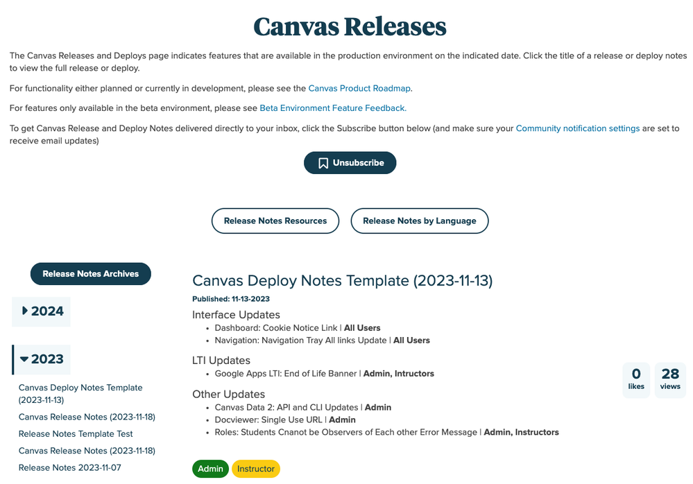
The Release Notes page has been updated with an all-new design to make browsing current release notes even easier. The design is familiar but completely refreshed to match updates we’ve made throughout the Community.

nathanatkinson_0-1706544210300.png

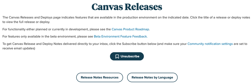
The new page features a unified header with a basic overview of Release Notes, additional information about release notes, and an easy way to subscribe to all release notes. Beneath the header are two new buttons that open modals for resources related to release notes and links to view release notes in other languages.

nathanatkinson_1-1706544210270.png

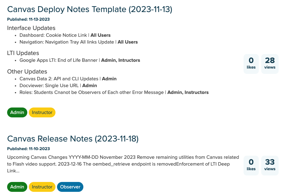
In the main section of the page, you can view the Release Notes feed with additional information about the release, including the number of likes and views, the date the notes were published, and labels showing the affected user roles.

nathanatkinson_2-1706544210301.png

In the sidebar, there is a new Year browser that allows users to browse release notes by year. You can also access the Release Notes Archives page by clicking the Release Notes Archives button.

nathanatkinson_3-1706544210255.png

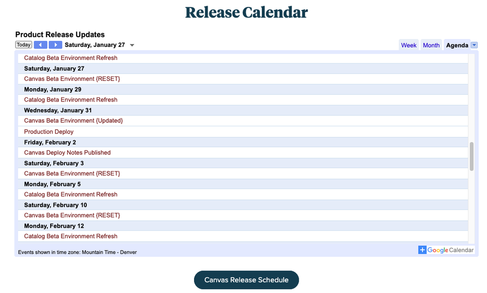
At the bottom of the page, you can view the Release Calendar for an overview of upcoming Canvas releases and deploys.

nathanatkinson_4-1706544210302.png

Release Notes Articles

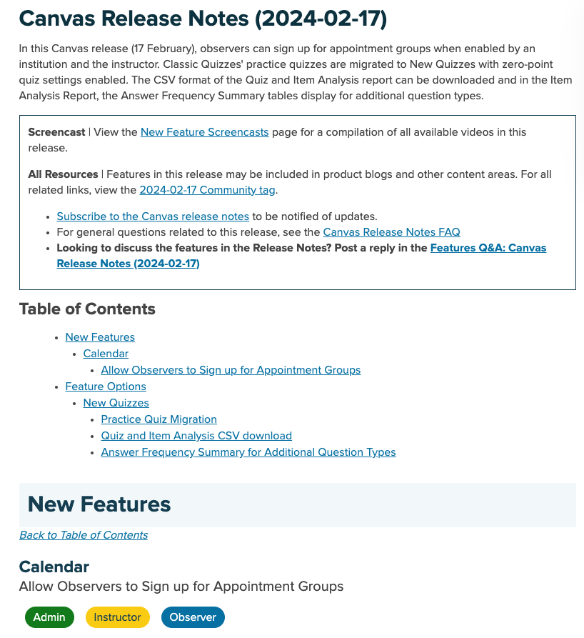
The Release Notes articles have also been updated with a new design and new user-role labels to better indicate the affected user roles for each feature update. The updates improve accessibility when viewing the release notes and better aligns with Instructure branding guidelines. The user-role labels provide a quick and easy way to visually see which Canvas user roles are impacted by a particular new or updated feature.

Release Notes will also be updated to remove individual user summaries. With the addition of the user-role labels, these summaries will become redundant. New Feature Screencasts will now be embedded in the release notes articles instead of featured separately in individual articles. This will make these summary videos easier to find and share.

nathanatkinson_5-1706544210296.png

Release Notes Archives Page

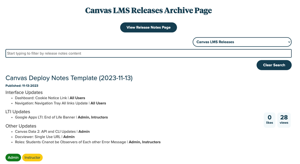
The newly created Release Notes Archives page provides one place to browse and search all previous releases for all products. This replaces the current Release Archives documents that were being manually updated by our release specialists.

nathanatkinson_6-1706544210299.png

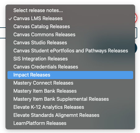
To view releases for a specific product, select a product from the Select release notes drop-down menu.

nathanatkinson_7-1706544210263.png

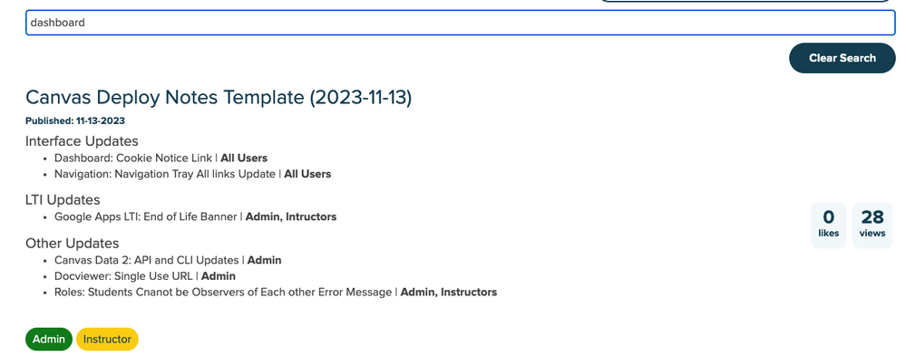
To search text within the release notes visible on the page, type your search query in the “Start typing to filter…” field. The search field will filter release notes as you type based on text available in the release notes summary for each release. Older release notes may not have updated summary text. Search results only display for release notes already visible on the page. To clear your search filter, click the Clear Search button.

nathanatkinson_8-1706544210303.png

To view the full release notes, click the title of the release notes article.

9 Comments
LisaRajnik
Community Explorer

Thank you for understanding this technology stuff. I appreciate you !

BethCrook
Community Coach
Community Coach

Thank you, Nathan!

jsowalsk
Community Coach
Community Coach
nathanatkinson
Community Team
Community Team
Author

@jsowalsk thanks for the suggestion! The problem with the main Releases page is we're showing a very limited number of items so a similar search bar would be limited to only searching those items due to the way the pagination works on the platform. I'm afraid it wouldn't be a very good user experience. We are looking at modifying the main search bar at the top so it defaults to only search through release notes.

AM_Learning
Community Explorer

Thank you for the updates! Some of the changes have improved navigation considerably: the side menu, the coloured indicators of roles impacted, and additional details of when release notes are updated. 

What is a bit confusing is the different ways the dates are presented. The release and deployment dates are in different formats. And then the releases themselves seem to reorder on the page by edit dates (which isn't visible on the release menu). 

Could the date formatting be consistent - and the ordering be done on the release date? 

And if there is an edit to an already published release note then perhaps stick with the text you have added next to the feature affected - rather than changing the order on the release page. 

nathanatkinson
Community Team
Community Team
Author

Hi @AM_Learning 

Thanks for the feedback! I'm a bit confused about your feedback about the dates being different, though. Deploy and Release notes dates are formatted in the same way (YYYY-MM-DD) and I looked back through a few years and they're all formatted in this way. And I checked the underlying code behind these new feeds and they are ordered by first publish date, so the most recently published item is at the top of the feed. Any revisions to the articles after that initial publication date will have no impact on neither the feed nor the sidebar. There should be no impact to the order on the Releases page feed at all. However, if you're seeing an example where this is happening, please let us know and we can investigate further.

The only place where the date formatting is a bit different is where the publish date is displayed, but that date follows the "friendly date" format that's shown elsewhere in the Community in order to maintain consistency across message feeds.

DaGIFT222
Community Participant

shout out to IT!


GIFT

AM_Learning
Community Explorer

@nathanatkinson the formatting is different between release title and publish date. The release title is YYYY-MM-DD and the publish date is MM-DD-YYYY. Then the order of the releases on the page is ordered by publish date - rather than impact (release) date. e.g. As an Admin I am reviewing the releases and want to quickly look at what releases will impact our environment next. 
As it currently stands, we need to switch between release notes to review them in the order of release into the environment. 


nathanatkinson
Community Team
Community Team
Author

@AM_Learning yes, you are correct and I mentioned that in the last paragraph of my previous comment, and this is historically how it has always displayed. The date format in the title is historically how we've always formatted the date and the date displayed in the feed (the "Published" date) is the "Friendly" date, which is a default date format pulled from our Community platform.

The release and deploy notes are published in that order because deploys happen more frequently than full releases (as noted in the Releases FAQs). Canvas LMS release notes are published on the third Monday of every month while deploy notes are published on the second and fourth Friday of every month, with some potential variance due to product delays. This does cause some unfortunate overlaps in the dates where, like you mentioned, there are articles published out of the order in which they're released. However, this is how it's always been displayed and this new feed hasn't changed any of that ordering on the releases page.

We hear your feedback and we're always looking for ways to improve these pages to make them easier for our users to find the information they need.