Celebrate Excellence in Education: Nominate Outstanding Educators by April 15!
Turn on suggestions
Auto-suggest helps you quickly narrow down your search results by suggesting possible matches as you type.
- Community
- Canvas
- Canvas LMS
- Canvas Question Forum
- Mobile app text size and color
Options
- Subscribe to RSS Feed
- Mark Topic as New
- Mark Topic as Read
- Float this Topic for Current User
- Bookmark
- Subscribe
- Mute
- Printer Friendly Page
Found this content helpful? Log in or sign up to leave a like!
Mobile app text size and color
- Mark as New
- Bookmark
- Subscribe
- Mute
- Subscribe to RSS Feed
- Permalink
- Report Inappropriate Content
02-06-2024
09:25 AM
I am excited to see support for the Discussions/Announcements Redesign came to the iOS versions of Canvas Student and Canvas Teacher yesterday. That said, I want to suggest a couple of changes to its mobile implementation.
- The iOS system setting for larger text should affect the text size in Discussions in the mobile apps. In my initial testing, it appeared to have no effect. (That system setting does affect text in courses using the original Discussions UI, tool indexes, etc.)
- The Canvas user account setting for high contrast UI should cause the text in Discussions to be black, not gray.
If there's a different place I should post these suggestions, please just let me know. Thank you!
7 Replies
- Mark as New
- Bookmark
- Subscribe
- Mute
- Subscribe to RSS Feed
- Permalink
- Report Inappropriate Content
04-05-2024
11:07 AM
I want to second this. I've been a teacher and admin in Canvas for the last 12 years or so. Right now, I'm taking a class where the discussions redesign has been turned on. Generally, I use the app to stay engaged with classes I'm taking--I use it a lot to check in on discussions. Data I've seen seems to support this as a common use behavior for the app.
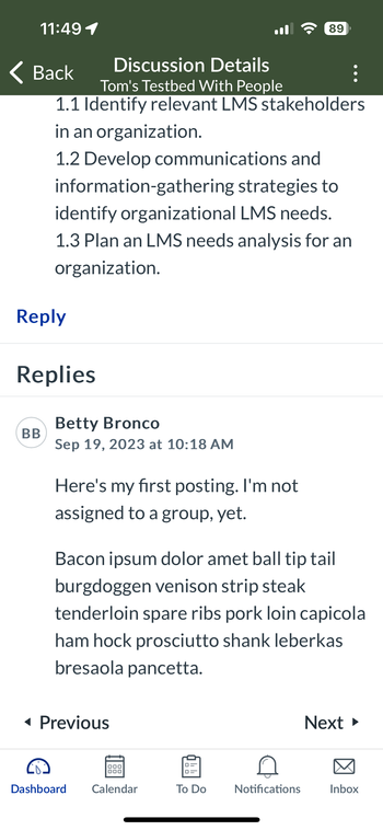
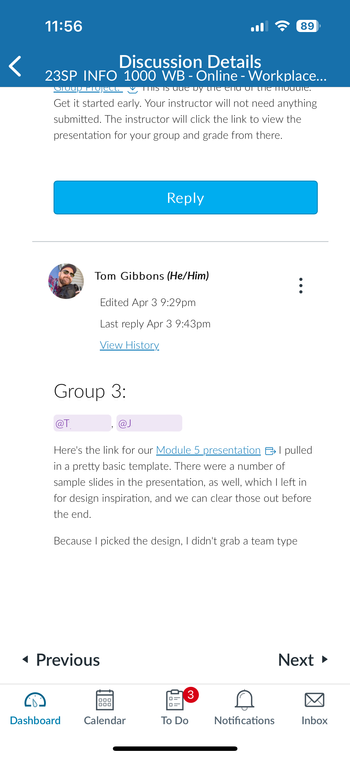
There's a lot of wasted space between the text and the controls. The font on the redesign in the app is incredibly small. Reading through 48 responses was just exhausting. I've also tried on an iPad and an Android tablet. The user experience wasn't fun.
Here is a discussion from the class I'm taking, side-by-side with a discussion from a test course using OG discussions, from the iOS app, running on an iPhone 14 Pro.


- Mark as New
- Bookmark
- Subscribe
- Mute
- Subscribe to RSS Feed
- Permalink
- Report Inappropriate Content
04-11-2024
12:25 PM
I voted for this twice. 🙂
- Mark as New
- Bookmark
- Subscribe
- Mute
- Subscribe to RSS Feed
- Permalink
- Report Inappropriate Content
06-15-2024
08:11 PM
Agreed – I would also like to see improvements to the iOS apps. Discussions have been a big part of my online courses for more than a decade and I've always longed for a usable and accessible mobile version of Canvas. Users should have more control over their experience. The discussion posts on my iPhone default to a size that stretches beyond the width of the screen. I must scroll horizontally from side to side on a line by line basis. If the window is squeezed with a two finger pinch, it shrinks to a size that is too small to read. I am also not able to squeeze to pinch because of a mobility issue. Attempting to increase the size with a Zoom will not affect the text within the discussion even though it affects text on other locations on Canvas, such as the courses menu.
Further, the gray text on the black background has insufficient contrast... "very poor" according to a contrast checker online. I am not visually impaired and do not require glasses/contacts. Is the LMS not required to create accessible interfaces for people with disabilities?
I propose providing a responsive interface that adheres to overall user settings for zoom on the device or an interface that has the option to increase or decrease the size of the text and allows it to reflow within the window on the specific mobility device, which I would think would be a requirement regardless of platform.
- Mark as New
- Bookmark
- Subscribe
- Mute
- Subscribe to RSS Feed
- Permalink
- Report Inappropriate Content
06-16-2024
02:55 PM
Hi @james_peth ,
What mobile app are you using? Student or Teacher? Maybe there is some idiosyncrasy with the iOS mobile app, but for me using Android Student mobile app, I do not have the same issues as you. But I've also added some custom CSS for the Discussions Redesign as well.
IMPORTANT NOTE: Discussions Redesign for mobile uses the regular desktop CSS. You CANNOT make changes to the mobile css and get results in the mobile discussions.
All this is to say that you have to add CSS for desktop, tablet (landscape), and phone sizes for the discussion redesign in your main CSS. You can test it out in your desktop browser Inspect mode changing the viewport to see the results.
First, I'll share screenshots and then I'll share the code. I am still waiting for things to improve with the Discussions Redesigned because July 20 is getting closer and closer. But I switched the Discussions Redesigned early with a pilot course so that I could start working things out.


It takes more space to view Discussions Redesigned because of the menu area top of page and more information in the reply block about the reply/replies.

I added customized our Discussions Redesign to put borders around the text in tablet landscape and desktop mode (borders show in split-screen too) and borders around the enter reply with name, date, text in mobile and tablet portrait mode (borders do not show in split-screen).
I know that @cesbrandt also shared some CSS with border and padding, but I haven't tried it yet. So I'll just share what I have and remember it all goes in the main CSS file and you can change colors as needed.
For regular desktop browser:
/* border on first reply text in thread */
.css-8rac1c-view-flexItem {
	border-width: 0.0625rem;
	border-radius: 0.25rem;
	border-style: solid;
	border-color: var(--ic-brand-primary);
}

/* border on thread reply text */
.css-1hatz2-view-flexItem	{
	border-width: 0.0625rem;
	border-radius: 0.25rem;
	border-style: solid;
	border-color: darkorchid;
}

/* font size on thread reply text */
.css-138gh4t-view .user_content {
	font-size: 1rem;
}
For Tablet:
/** Tablet Discussions Redesigned **/
/* border on reply text only */
.css-1hcnpfq-view-flexItem {
	border: medium solid darkgoldenrod;
}
I admit that when I realized that tablet had different CSS selector, I was frustrated and just put in the darkgoldenrod color too check it and then decided to leave that color. 😅
For Mobile:
/*** For Mobile Discussions Redesigned ***/
/* discussion header and prompt space */
.css-16umzoa-view--block {
	padding: 0.5rem !important;
}

/* remove left and bottom padding around header, prompt, and all replies */
.css-3qn3vl-view--flex-flex {
	padding: 0 !important;
}

/* border on thread reply block */
.css-1wzf0w1-view--flex-flex {
	border-width: 0.15rem;
	border-style: solid;
	padding-left: 0.75rem;
	border-radius: 4px;
	margin-bottom: 0.25rem;
	margin-left: 15px;
	border-color: var(--ic-brand-primary-lightened-15);
	position: relative;
}

/* remove mobile border around reply text for phone screens */
.css-1wzf0w1-view--flex-flex .css-1hcnpfq-view-flexItem {
	border: none;
}
/**** end Mobile Discussions ****/
And yes it's a lot to customize, but maybe it'll be not needed for full launch. I'm still hopeful. 🤞
Cheers - Shar ⭐
- Mark as New
- Bookmark
- Subscribe
- Mute
- Subscribe to RSS Feed
- Permalink
- Report Inappropriate Content
06-30-2024
02:47 PM
Hello Shar, and thank you for your reply. I am using the teacher app on iOS. How are you able to modify your CSS file? Are you an admin? I do not believe I have such privileges as a professor.
What is Discussions Redesign? Is this the name of an official iteration of software?
Thanks, James
- Mark as New
- Bookmark
- Subscribe
- Mute
- Subscribe to RSS Feed
- Permalink
- Report Inappropriate Content
07-01-2024
07:37 AM
"What is discussion redesign"??? You must be new to Canvas. Past 4 years they have been revamping the way discussions work within course sites. As ongoing discussion here shows, many long time users don't like many things about it. Up until now, using it has been an option. Many instructor users have had the option to continue to use the old discussion format.
Maybe your own institution chose not to turn it on by default so you never saw it in action. If you go to your "course settings" "feature options" tab, you may find you can toggle the "discussion redesign" on and off.
- Mark as New
- Bookmark
- Subscribe
- Mute
- Subscribe to RSS Feed
- Permalink
- Report Inappropriate Content
07-01-2024
12:47 PM
Hi @james_peth ,
Yes, I do have admin access to my Canvas subaccount; point your Canvas admins/IT to this thread. And I have made those CSS updates because we tried out Discussions Redesign since this January on a live class of about 25 students and 1 instructor with active use of discussions - mostly group but a few whole class discussions.
I don't think that any of the students necessarily used the mobile app, but I do use the Teacher App when I'm checking on the course so for me it was very important that the mobile display also perform correctly. When all courses switch to Discussions Redesign on July 20, I don't want to there to be disruptions. Of course, July 20 is after the big Canvas convention next week July 9-11. So I'm also hopeful that there will be some happy surprises unveiled at the convention.
And as Linda explained, Discussions Redesign is the official name, versus Classic Discussions. Here's the Instructor Guide on Discussions Redesign. And here's at little change to the Discussions Redesigned workflow that is also coming July 20: Canvas Release Notes for 2024-07-20.
Hopeful,
Cheers - Shar ⭐
 Community Help
View our top guides and resources:
Find My Canvas URL Help Logging into Canvas Generate a Pairing Code Canvas Browser and Computer Requirements Change Canvas Notification Settings Submit a Peer Review AssignmentTo participate in the Instructure Community, you need to sign up or log in:
Sign In