How to wrap text around an image using the Rich Content Editor

Stef_retired
Instructure Alumni
Instructure Alumni
73
130691

Here's some HTML code that will allow you to use the Rich Content Editor to wrap text around an image on a Canvas page.

Using a Flicker link (this image will appear to the right of the text):

<p><img style="padding: 0 15px; float: right;" src="https://farm8.static.flickr.com/7141/6526425801_5910bfc4a1.jpg" alt="Books" width="164" height="218" />This is an example of how you can use code to wrap text around an image. This uses the "float: right" attribute. Lorem ipsum dolor sit amet, ...

Using an image file of your own (this image will appear to the left of the text):

<p><img style="padding: 0 15px; float: left;" src="/courses/309008/files/48398934/preview" alt="P1010123.JPG" width="204" height="154" data-api-endpoint="https://fsw.instructure.com/api/v1/files/48398934" data-api-returntype="File" />This uses the "float: left" attribute. Lorem ipsum dolor sit amet, in eu amet, quis at dapibus, phasellus porta...

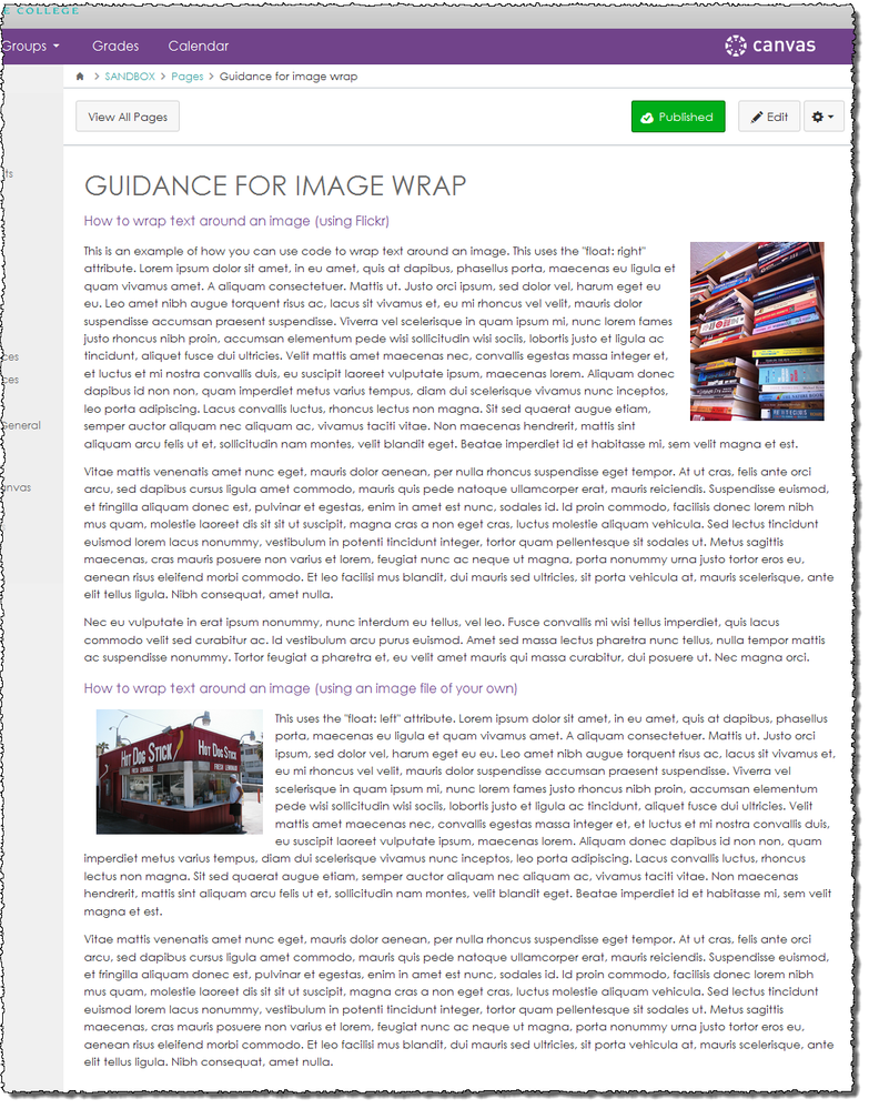
This is how the images will appear in context on the finished page:

image-wrap-finished.png

[Note: Need help with HTML? Read snugent​'s awesome blog, Rich Content Editor HTML Cheatsheet]

73 Comments
G_Petruzella
Community Champion

Hi  @finneyvm ​ - no worries! The code above is just an example or illustration - you don't have to paste it as-is. (And in fact it wouldn't work for you as-is. 🙂

The short version: "regular text" is represented, in HTML, as book-ended by <p> tags, as below:

<p>This is how regular text appears in the HTML code.</p>

To wrap text around an image, basically you insert the image (represented by <img />) inside the "bookend" <p> tags, making sure that the <img /> object includes the style attribute with the float property, either left or right (as in one of the examples above, style="padding: 0 15px; float: right;" )

The Canvas Guides are indeed a great resource to search for students, faculty, and admins, and I heartily recommend 'em (and use 'em myself)! My general sense is that they are primarily meant to help users do the "usual" things with/in Canvas. For digging into code and tweaking and other 'fun' stuff, you're not going to find a Guide; but you're often likely to find a Discussion happening in the Community! For questions like this one, I often search at Find Answers . The user community is fantastic at developing and sharing resources.

Hope this helps, and welcome aboard!

arieff_diane
Community Novice

This is so helpful, I rely on it. Does the same code work with wrapping text around a table?

arieff_diane
Community Novice

A follow-up question: Does anyone have a bit of easy-to-use code for wrapping text around an embedded video? As a complete novice with html, none of this is quite intuitive for me, but I've been relying heavily on the tips (above) for text-wrapping around images.

denise_kreiger
Community Novice

Thanks, Stephanie! I just tried using the HTML code and it worked fine. This is very helpful.

Moving forward, I hope Canvas adds a feature enhancement to be able to format an image and wrap text, etc., on a page without having to go into HTML code. Other LMSs I've used have this feature/tool as part of the RCE. IDs might be able to do the HTML code, but I don't think the average instructor will be going into HTML to make changes.

Stef_retired
Instructure Alumni
Instructure Alumni
Author

 @denise_kreiger , you, and I, and lots of other people, wholeheartedly agree! Please add your feedback and vote to

denise_kreiger
Community Novice

Hi Stefani,

I just voted and added feedback. The enhancement is moving up!

Best,

Denise

tmp06a
Community Novice

stefaniesanders​: this was somewhat helpful. I finally got one image lined up to my satisfaction. Then I started working on the next: should be easier right? Not so much. The TE is eating the html when I save...what's up with that?

Stef_retired
Instructure Alumni
Instructure Alumni
Author

 @tina_powers ​, I don't know! If you've successfully used the HTML for one image, it should certainly work for subsequent ones. Sometimes that happens to me when I leave out just one important tag or attribute; leave one thing out, and when you save, the Canvas RCE will just wipe it all out. So first, try copying the existing HTML (the code that is working) into a different Canvas page; if it works--and it should--scrutinize your new code very carefully to make sure you haven't left something significant off.

tmp06a
Community Novice

stefaniesanders​, thank you. I kept working and got another image to settle in pretty well. Don't love the barriers, but feel sure this is on someone's radar for future improvements. I did vote towards that end.

Thanks, T

Stef_retired
Instructure Alumni
Instructure Alumni
Author

For anyone who wants to get more comfortable with HTML and <iframes> and the behind-the-scenes code that helps with image wrapping, be sure to RSVP to the CanvasLIVE event Cracking the Code: HTML for Humans! which is coming up this Monday, November 7, 2016. If you're able to attend, RSVP "Yes"--and if you're interested but your schedule doesn’t allow you to attend in real time, RSVP "No" or "Maybe" to receive any post-event updates.

QC99_tsilvius
Community Champion

Hi  @denise_kreiger ​. When I want to wrap text around an image in Canvas I just click on the inserted image turning it blue once it's selected them click a left-align, middle align, or right-align button in the WYSIWYG tools as if it were text. This does the trick for me with no tables needed. See pics below.


Inserted Picture, Selected and mouse hovering over the right-align button in WYSIWYG tools.

afteragain.PNG


The picture is now right-aligned and the text is wrapped...around the wrap...**n'yuck**

finalafter.PNG

Does this wrap trick work for you, too?

QC99_tsilvius
Community Champion

 @arieff_diane ​, I tried wrapping text around an embedded video using the text align trick above for still images and had some success. Canvas does some great things with youtube videos already. Simply by pasting the YouTube  URL on the page and clicking enter Canvas creates an embedded video on the page, so my trick uses the provided iframe embed from YouTube which most video embed codes from other video services would provide anyway  🙂


Video Text Wrapping with No Border

wrapnopadding.PNGWhen I pasted in the embed code for the video, left HTML view, clicked the gray video placeholder (as I do with a still image mentioned above), and then click the left-align button I was able to wrap the text around the video. The only problem to my eyes was that the text was right up against the video wall.

The Code

vidwrapcode.PNG1. The original Youtube embed code I used was this:

<iframe width="560" height="315" src="https://www.youtube.com/embed/TiNtS6wrgsk" frameborder="0" allowfullscreen></iframe>

2. The left-align trick (treating the video placeholder like a regular image by selecting it and clicking left-align button in the WYSIWYG editor) added a style="float:left" to the iframe and moved the width and height dimensions to the end.

<iframe style="float: left" src="https://www.youtube.com/embed/TiNtS6wrgsk" frameborder="0" allowfullscreen></iframe>

3. Inside the style quotations I added the following: padding: 15px; winding up with <iframe style="padding: 15px; float: left" src="https://www.youtube.com/embed/TiNtS6wrgsk" frameborder="0" allowfullscreen></iframe>


vidwrap1.PNGOnce this was done I wound up with a video that looked like this at left. Although it might look complicated in this text explanation I only

-- clicked the left-align button

-- and typed in "padding: 15px" to wrap this with a border.

And I only added the padding because the text wrapped tight to the video looked like it needed some white space 🙂

Let me know if this helps you wrap text around videos.

Stef_retired
Instructure Alumni
Instructure Alumni
Author

QC99.tsilvius​, that's a great tip, and it's the one we demonstrate in our trainings for teachers. But: it doesn't pad the image. (By the way, yours looks great on the page--and that's partly a function of its inherent white space.) To put padding around the image, you have to dive into the HTML.

QC99_tsilvius
Community Champion

HI completely understand, stefaniesanders​. When it comes to still pics there are some systems that I still work with that are wonky and don't "like" or retain padding code edits even when they follow web standards and align with ADA guidelines. I also have some friends who aren't too comfortable on editing code but are looking for a solution to do padding. So I provide them with some optical illusion solution. Based on their comfort level with screen shot tools I'll point them down one of these two option illusion paths to avoid the appearance of text rubbing up against the image on a Canvas or any other stubborn web page.

snipwrap.PNGScreenshot'ing to Include White Background

Placing the original image on a white background such as a word document or a blank PowerPoint slide or even inside of a Paint program --- something with a white background --- a screenshot of the image can be taken so that some of the white background is selected as part of the screenshot capture. What program do you use?  For Macs, Command+Shift+4 does the trick to capture anything on the screen. For Windows, there are many that allow you to select a specific area of the screen such as the Snip Tool. I also have found regardless of the OS, Skitch has never let me down.

  1. Position the original image on the white background.
  2. Use your screenshot tool to select some of the white space from the background as well as the image itself.
  3. You can see against the maroon you now have a pic that has shields up! from your wrapped text bumping against it.

It's certainly not a perfect solution, but this keeps text away from the graphic's edge and hopefully prevents you from having to dive into the code.


pptwrap.pngPowerPoint Solution
Sometimes people aren't comfortable with screenshot tools. However, many are familiar with PowerPoint. 

  1. Bring the original image onto a PowerPoint slide.
  2. Draw a white square shape slightly larger than the original image and move the original image on top of it.
  3. Select both the original image and the white square shape with your mouse, and then right click on the two selected graphics.
  4. From the drop menu click the Save as Picture... option, and from the Save as Picture window select your format such as jpeg.

This is one of those things where if people are comfortable manipulating images in PowerPoint this can be a breeze. And naturally, Keynote for iWork Apple users and GoogleSlides up in G-Suite will have slightly different graphic export work-around options) If not, perhaps I would point them towards learning a screenshot tool.

Again, neither are a perfect solution especially since resizing the image once uploaded the Canvas or web page also resizes the artificial "padding." (The perfect solution would be easier padding tools for graphics as well as videos.) However, until there are more padding options available either of these work-arounds will

  • save your original graphic with a white border around it,
  • keep your wrapped text from touching the graphic,
  • and save you from having to go code-diving.

Maybe one of these solutions can help people who don't want to go near code but who don't like the look of text bumping up against graphics. If you try either of these crazy-but--just-might-work work-arounds, be sure to share back!

Shar
Community Champion

Hi QC99.tsilvius​,

I really love your PowerPoint solution to this space around the image issue, and I think it could be even easier by just using the Picture Tools > Picture Border > White, Weight 6 pts (or higher) or one of the Picture Styles - Beveled Matte White (if ya don't mind losing the edges of the image). Then folks can just right-click > Save as Picture and tada!

Students-PicBorder.jpgThis one is the  White Picture Border. Pictures have been floated left, in these examples and no inline styling for extra margin or padding added to the HTML.

Students-BevelMatteWhite.jpgThis one is the Beveled Matte White Picture Style - hmm now that I see it with a background color there's an extra border around my border.:smileylaugh:

You give great tips for users familiar with their regular office tools.

Cheers - Shar

QC99_tsilvius
Community Champion

ishar-uw​, I LOVE this idea. Adding a picture border and exporting that is a great idea! Even easier! And I see what you're talking about there with the background on the background. On my ride home from work I was thinking maybe this is because you exported a jpg, which doesn't support transparency like PNG (as well as GIF) does in order to show off that nice drop-shadow that comes along with the pre-formatted bevel style. Just remove the drop shadow effect and you'll be fine.


bevel5.PNGAnother option would be use the bevel and keep the drop shadow effect (because it does look cool!) by right-clicking and selecting PNG for the Save as Type your drop shadow should be preserved and not have any white filled behind it like the JPG format does with transparency.

  • If you look at the image to the right the top left image is an original I snipped from your example without any borders.
  • The top right is the pre-formatted bevel with drop shadow in PowerPoint that I applied. But for the purposes of this smaller screenshot here in the Community I tweaked the shadow settings manually to exaggerate the illustration so it's a bit stronger, more blurred and distanced from the original. But you might notice the bounding box and handles are directly on top of the "original" picture dimension, half-way through the white border.
  • The bottom left is the JPG export using the right-click, Save Picture feature in PowerPoint. See where the selection handles and bounding box dimensions shifted to capture the blur of the shadow and the transparency was filled in with white.
  • The bottom right is the PNG export using the same process. It's handles are still in the same location but because it's PNG and support transparency there is no ugly white this time.


badgePNGs.PNGI work with teachers helping them set up badging suites in their Canvas classes, and they don't always like the limited design options in the Badge Designer component of the Badge system. I will help get their ideas in the computer using Photoshop and then create the template for their badging system in PowerPoint. I bring the Photoshop design into a PowerPoint file for them, place it in the background and overlay a text box for them to type the name of the badge on. From there they select Save as Picture and select PNG then upload that to their badging system.  I also secretly pre-set the design to a 1:1 aspect ratio as most badge systems stipulate. This way, teachers don't need to learn Photoshop (unless they really want to and then we have more fun together!) in order to continue to rename and produce as many unique badges as they need only using PowerPoint. This way, when earned badges are shared their Badgr badges or Canvabadges outside of Canvas to OpenBackpack or even to social media, regardless of the destination background, they will look a bit nicer against the background of their sharing destination instead of looking like they're on mounted on square patches of white. The Save as Type/PNG works so well in PowerPoint in retaining shadow effects and transparency.

Shar
Community Champion

Heya QC99.tsilvius​,

Thanks for catching the JPGversus PNG on the image; I totally didn't notice and it does make a difference!:smileyblush: I was thinking in addition to adding borders, what if folks just cropped bigger than the picture itself to give some padding to the image. I've run into instructors doing this technique accidentally rather than intentionally in their PowerPoint slideshows and I usually thought it was because they were grabbing images willy-nilly off the Internet, which would mean there are some images intentionally using a wider cropped-border trick.

So I thought I'd see the difference between JPG(left) and PNG(right) with this wider than the picture border effect. I see what you mean about JPG filling in white where PNG left it nice and transparent. Hmm. I think I may leave most images JPG as the file size is also smaller at 11kb versus 86kb on the PNG-- unless the image is like super important to be able to see the details and what not.:smileycool:

Students-CropBorder.jpgStudents-CropBorder.png

And I totally like want a copy of your Badge-maker PPT please, pretty please. Smiley Happy

Cheers - Shar

QC99_tsilvius
Community Champion

LOL. Sure thing, ishar-uw​. Glad to share. Grab a copy here to see how I've been approaching this to help teachers out. I add a square (size 1:1, no fill, no border color) tight behind the badge. When the badge elements are selected and the Save as Picture process exports the badge using the largest shape: that hidden square in the back, everything is contained in an invisible-to-humans-but-recognized-by-computer square, transparent shape. This was for a music teacher who wanted to design badges to motivate kids to use the SCORM games we created that kids can play again and again to practice skills before taking the quizzes (in lieu of practicing with traditional paper flash cards).

  • 10 digital badges for Marking Period 1 as well as multiple digbadges for MP2 ,3, and 4.
    • MP2, 3 and 4 all have a similar but unique badge design so if these are shared out the students can identify the shape to the course and associate the design to a marking period.
  • If you scroll down to slide 5+ you'll see a Guido Arezzo badge for MP1 -- it's for those who pass the MP1 summative assessment.
    • Because the MP1 summative recycles, random-draws new questions, and shuffles the Question Banks from the 10 digital badge modules, Guido Aerezzo badge is awarded for passing with a certain points-earned threshold.
    • For the MP2 Guido Arezzo summative assessment badge I added some bling. MP3 and 4 he gets shades and a hip hop hat.
    • The last Guido Arezzo badge is fully decked out. Not that bad of a look for the Father of Modern Music Notation, huh?
    • The middle school kids love their Guido Arezzo badges. Why not have some fun, right? Plus, we use Badgr for student badging systems due to its leaderboard feature where kids can anonymously see how they rank with badges earned with each other.
kdickso
Community Participant

Is there a reason not to do it in the way outlined here (other than it not working consistently, lol): How to wrap the text around your images: Images on Canvas

BTW, I am not sure how I originally found that link, but I cannot find it again through the Canvas Community...I had to dig through my browser history (because I had forgotten to bookmark it!).

Thanks!

Katrina

Stef_retired
Instructure Alumni
Instructure Alumni
Author

 @kdickso , the way it's outlined in the link you provided is fine--and that's the method I demonstrate all the time to learners who don't have the time or the proficiency to use the HTML Editor--but the problem with the result is that it wraps the image without any padding, so it's not as visually appealing as the HTML code method provided here.

kdickso
Community Participant

Stefanie,

Thanks! That is what I hoped your answer was going to be (that it was okay, but not as pretty), but I had to ask in case there was more to it than that. It is now on my list of HTML to practice, but I can make do safely with the other in the interim without messing other things up!

murphy_1527
Community Contributor

What about text wrapping for an uploaded video (not embedded). Is that possible?

J_Levin
Community Explorer

I don't know how to use HTML. What, exactly, do I put before the image, and what, exactly, do I put after it? How do I get the image itself in there? Is there a way to do this without using HTML?