Creating an inviting course home page

Stef_retired
Instructure Alumni
Instructure Alumni
192
103000

The course home page is a critical navigation waypoint for students. As course designers, we can choose from numerous style ideas to make the course home page inviting and intuitive for our students.

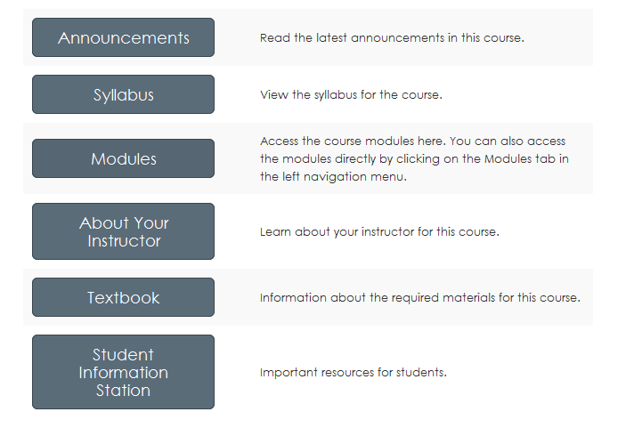
This is a stripped-down version of a course home page I'm currently using.

Buttons-for-home-page.png

I created this home page using a table, and I used the "btn btn-info btn-large" attribute for the buttons.

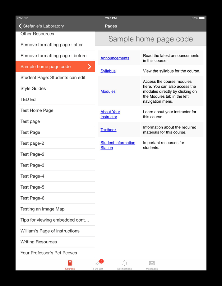
The functionality of this home page style is compatible with mobile devices, but the buttons themselves won't appear in the app. This is how the same home page looks in the Canvas App on an iPad.

Home-page-code-in-Canvas-iOS-app-resized.png

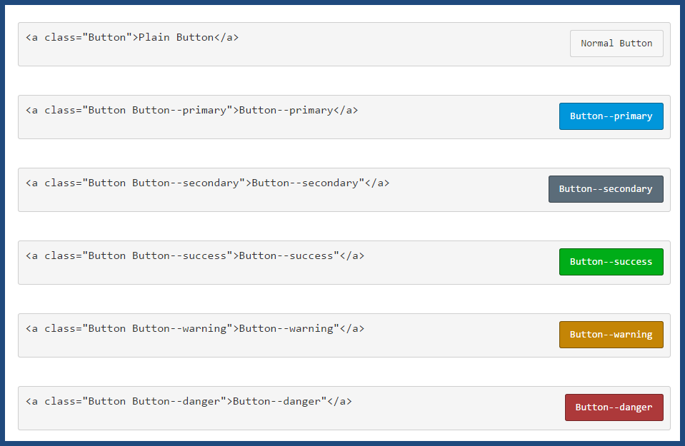
The image below shows examples of other button styles.

button-codes.png

The button code is inherently versatile. For example, using this code:

<p><a class="btn-large btn-block btn btn-danger btn" style="width: 100%;" title="Click here to view the Course Announcements" href="https://community.canvaslms.com/courses/[insert-course-number]/announcements" target="_blank"><strong>Course Announcements</strong></a></p>

...I can create a clickable button across the top of my home page to direct students to announcements:
Button-for-course-announcements.png

At many schools, teachers are tasked with creating their courses and course home pages. I'm currently training a cohort of teachers, and more often than not, when they create their syllabus page, they simply insert a link to their own syllabus file at the top of the page. The result is neither pretty nor inviting--so I've been teaching them the method of having the syllabus file auto-open for inline preview.

How do you create your course home pages? Do you have a standard template that is used across all of the courses at your institution? Do instructional designers create the pages, or are your teachers given instructions on how to create their own, and what they must include on them?

[Note: Need help with HTML? Read snugent​'s awesome blog, Rich Content Editor HTML Cheatsheet]

192 Comments
Stef_retired
Instructure Alumni
Instructure Alumni
Author

Deactivated user​ posted this link to a button creator (Da Button Factory) in the previous community.

cfierro
Community Contributor

Is this table accessible?  Does it work for a screen reader?  For someone that won't be using a mouse?

jordan
Instructure Alumni
Instructure Alumni

While http://dabuttonfactory.com is a great place for the average instructor (b/c they don't have to mess with html), the approach that stefaniesanders​ has suggested (using the Canvas Style guide attributes) are ideal for course design as the button responds to a mouse hover and the mouse click.

You can copy the code for Canvas buttons from our Style guide, here: Canvas LMS Style Guide (Then click Style > Buttons)

cfierro​ I would assume that Stefanie's usage of these buttons would work perfectly with a screenreader. Another benefit to designing buttons using html.

Another downside of adding static images (like those from dabuttonfactory) as "buttons" is that you would also need to add some alt txt to make it accessible.

1.png?shared_name=ax1yx2hhwtlhj5tblqw2nte5csdk3loq

kate_hill
Community Contributor

For those of us new to Canvas, but have experience with coding/style sheets, can you give me a step-by-step on how to use these buttons for my site?

brueckert
Community Champion

I'll echo Kate's comment. I'd like to use the styles/classes in the style guide, but can't. Do these need to be loaded into our institutional CSS document first?There doesn't seem to be any documentation on how to implement the elements in the style guide. Does anyone know of a resource?

Stef_retired
Instructure Alumni
Instructure Alumni
Author

 @brueckert ​, I'll tag Deactivated user​ on your question about implementation of the style guide.

Stef_retired
Instructure Alumni
Instructure Alumni
Author

 @kate_hill ​, rather than a step-by-step (since the procedures will vary depending on the elements you want to incorporate on your page), I'll reproduce the HTML code behind the image above:

<p> </p>

<table style="width: 100%; max-width: 640px; border: none; margin-left: auto; margin-right: auto;" border="0">

<tbody>

<tr>

<td style="width: 40%; padding: 10px; background: #f9f9f9;"><a class="btn-large btn-info btn" style="width: 70%;" href="/courses/309008/announcements">Announcements</a></td>

<td style="width: 60%; padding: 10px; background: #f9f9f9;">Read the latest announcements in this course.</td>

</tr>

<tr>

<td style="width: 40%; padding: 10px;"><a id="" class="btn-large btn-info btn" style="width: 70%;" title="" href="/courses/895862/pages/teaching-online" data-api-endpoint="https://fsw.instructure.com/api/v1/courses/895862/pages/teaching-online" data-api-returntype="Page">Syllabus</a></td>

<td style="width: 60%; padding: 10px;">View the syllabus for the course.</td>

</tr>

<tr>

<td style="width: 40%; padding: 10px; background: #f9f9f9;"><a class="btn-large btn-info btn" style="width: 70%;" href="https://community.canvaslms.com/courses/309008/pages/submit-your-proctored-testing-request-form-fall..." data-api-endpoint="https://fsw.instructure.com/api/v1/courses/309008/pages/submit-your-proctored-testing-request-form-f..." data-api-returntype="Page">Modules</a></td>

<td style="width: 60%; padding: 10px; background: #f9f9f9;">Access the course modules here. You can also access the modules directly by clicking on the Modules tab in the left navigation menu.</td>

</tr>

<tr>

<td style="width: 40%; padding: 10px;"><a class="btn btn-info btn-large" style="width: 70%;" href="/courses/154025/assignments/1495574?module_item_id=3326090">About Your Instructor</a></td>

<td style="width: 60%; padding: 10px;">Learn about your instructor for this course.</td>

</tr>

<tr>

<td style="width: 40%; padding: 10px; background: #f9f9f9;"><a class="btn btn-info btn-large" style="width: 70%;" href="/courses/895862">Textbook</a></td>

<td style="width: 60%; padding: 10px; background: #f9f9f9;">Information about the required materials for this course.</td>

</tr>

<tr>

<td style="width: 40%; padding: 10px;"><a class="btn btn-info btn-large" style="width: 70%;" href="/courses/309008/pages/contact-fsw-online?module_item_id=6353412" data-api-endpoint="https://fsw.instructure.com/api/v1/courses/309008/pages/contact-fsw-online" data-api-returntype="Page">Student Information Station</a></td>

<td style="width: 60%; padding: 10px;">Important resources for students.</td>

</tr>

</tbody>

</table>

Of course, you'll need to replace all of the URLs (I've marked them with boldface) and descriptions (in italics) with links and verbiage specific to your course.

john_morris
Community Participant

stefaniesanders​, thanks for providing your source code... now, for those of us with little experience working with HTML in Canvas, can you describe how you find the "href" statements (the bold face portion of what you listed above)?

Stef_retired
Instructure Alumni
Instructure Alumni
Author

Ah,  @john_morris ​, that's the beauty of this. If you have this copied basic code into a page, you can do all of your editing from the Rich Content Editor, using the Insert Content into the Page feature.

Try this in a sandbox course or an unpublished page: Switch to the HTML Editor, copy and paste the code I've provided above, switch back to the Rich Content Editor view, and use the Insert Content into the Page panel to insert the appropriate links for your course. You can easily edit the text from there as well. I've made a short screencast of the process:

How to edit Course Home Page code from the Rich Content Editor

The screencast covers the process for using the Insert Content panel to provide course links. If you want to insert a link to an external page, copy and paste the link over the entire bolded area between the quotation marks in the HTML code view I've provided. For example, in this little piece of code:

<td style="width: 40%; padding: 10px;"><a class="btn btn-info btn-large" style="width: 70%;" href="/courses/154025/assignments/1495574?module_item_id=3326090">About Your Instructor</a></td>

...replace everything that is underlined (between the quotation marks) with the external URL you've copied from the address bar of the page to which you want the link to direct.

Remember to save your work. Smiley Happy

rich content editor​  insert content tab​

Chris_Hofer
Community Coach
Community Coach

This is pretty cool, stefaniesanders​...thanks for sharing!

john_morris
Community Participant

Thank you stefaniesanders​! I had figured out the Rich Text Editor step, but for some reason it was not working. Now it does. I'm all set to make inviting course home pages!

jordan
Instructure Alumni
Instructure Alumni

Thank you Stefanie! I'm going to pull in  @jperkins ​ as he is a master at how to best leverage the Canvas Style guide (including the limitations or constraints). I know he has some resources, like a slide deck, or potentially even a screencast that illustrates the best way to leverage the styleguide.

Jeremy, could you speak to  @brueckert ​ and  @kate_hill ​ on this matter?

In fact, I think it would be a great idea for you (Jeremy) to create a blog post on "Leveraging the Canvas Style Guide" (Maybe throw in a screencast or two, as well 😉

kate_hill
Community Contributor

Thank you very much!!!

kate_hill
Community Contributor

Thanks so much, Stefanie! You've been very helpful!!

canvas_admin
Community Champion

This is our standard template that we use for our distance education courses. We have an in-house graphic artist create the custom banner and use the same buttons. For our residential courses, we customize the banner image as well to something relevant to the content of the course.

2015-05-01 01.38.03 pm.png

All of these images appear on the mobile app as well.

IMG_0025.PNG

scottdennis
Instructure
Instructure

Speaking of graphics in case anyone is wondering where the creative content that are in all the badges and place (hex) images here in the community, they come from: https://icons8.com/web-app/new-icons/all

john_morris
Community Participant

stefaniesanders​, I'm turning into a real pill here! I followed your instructions, but when I change the links in the manner you showed, Canvas overwrites the button code and changes it into text. See screen capture. The link works, but the button is lost.

Buttons.png

In order to keep the button like you created, I have to:

  1. Create a link using Rich text
  2. Switch to HTML editor, find the link and copy the course number -- in your example it is "309008"
  3. Then find each time that number is referenced and replace it with mine "1524109"
  4. Save

It creates the desired effect, but not quite as easy as your screencast suggested. Also, if I want to have a different button than you are using, I have to do something similar but use the entire path instead of just switching the course number. This feels a lot like writing HTML code! Am I missing something here, is there an easier way?

awilliams
Instructure Alumni
Instructure Alumni

First off, thanks stefaniesanders​ for this great document. But the topic of style guide buttons is a bit of a tough one for me. I have struggled to find the single best way to approach home page design as I work on templates that are (in order of importance) A) Accessible B) Easy for faculty to modify C) Functional on mobile. Some of the trade-offs I struggle with can be summed up in this pros/cons list:

Style Guide Buttons

Pros:

Accessible

Attractive and Consistent

Cons:

Difficult for faculty to modify (if they change something in the RTE it breaks the button and just leaves text)

Difficult for faculty to add (we have a general principle of not designing anything that would require faculty to use the HTML editor)

Not displayed in mobile

Images used as Buttons

Pros:

Easy to work with in the RTE

Displayed in mobile

Cons:

Require extra work to be made accessible

Inconsistent across the institution

I long for the day when the cons of style guide buttons are addressed so that can be the obvious solution. I will get around to making feature request ideas eventually.

Stef_retired
Instructure Alumni
Instructure Alumni
Author

 @john_morris ​, at the end of the day, inasmuch as this blog appears in the Instructional Designers​ group, it's intended for users who have a passing knowledge of HTML (which, honestly, is all I have), so I don't have an immediate response to your plea. Perhaps someone has come up with a design widget that will allow non-instructional-designers to plug in their button titles and links, and if so, I invite him/her to join the conversation. In the meantime, I'll keep plugging away at it. Smiley Happy

Stef_retired
Instructure Alumni
Instructure Alumni
Author

awilliams​, thanks for this helpful breakdown of the pros and cons of using style guide buttons versus images used as buttons.

On a related note, I know that some schools create a standard table that incorporates all of the institutionally-required elements (e.g. links to an online orientation, a student resources page, ADA requirements) of the course home page; they host that file on their own server and put a link to it in every course. In other words, none of the elements in the table can be touched by the faculty member, and as necessary the instructional design team can make the changes to the file, upload the revised file to their server, and populate every course with the updates.

This leaves space over and under the table for the faculty member to customize the page by adding a banner, a syllabus, and a bio, for example.

I'd love to hear feedback from someone whose school uses this hosted solution.

Stef_retired
Instructure Alumni
Instructure Alumni
Author

Here's an example from the Canvas Course Collections of another way to present a course home page using tables and images. (Note that the link still directs to the old community; I'll update the link as soon as the Canvas Course Collections are moved.) This particular style of page can be created without ever having to switch views to the HTML Editor. Smiley Happy

Edited 6/13/2015 to add: The courses that were formerly known as the Canvas Course Collections now reside in the searchable Canvas Resources area under Explore Canvas.

Stef_retired
Instructure Alumni
Instructure Alumni
Author

This course in the Canvas Course Collections features a simple, streamlined course home page. The template is available for download. To obtain it, email ccc@instructure.com 
and reference the template name and number in the email: CCC4-005

Edited 6/13/2015 to add: The courses that were formerly known as the Canvas Course Collections now reside in the searchable Canvas Resources area under Explore Canvas.

Stef_retired
Instructure Alumni
Instructure Alumni
Author

HUM2250-Spr15-home-page-complete.png

I had mentioned in the introduction to this blog that the image is of a stripped-down version of the home page I'm currently using. For the sake of completeness, I'll reproduce here the actual home page for this course. This home page meets the requirements the school has set forth as to what information must appear on a course home page (thus far, the school has afforded individual instructors considerable latitude as to design--i.e., there is no standard design template, only guidance for standard content.) Note that I've opted to set the Syllabus page as my course home page; this makes it a handy, albeit busy, landing pad for one-stop shoppers.

The banner at the top and the textbook cover images are .png files; everything else on the page is generated with HTML. I've saved the HTML code that underlies this page as a Word document and will happily provide it to anyone who would like to play with it. Just ping me here in Jive if you'd like me to send it to you.

[Sorry that the image is reproducing so oddly in this post; if you'd like the .png image file I can send you that as well.]

anthonem
Community Contributor

awilliams​ -- I'm right there with you. I'd love to find out a way to incorporate CSS buttons AND have them editable without coding. I'll be checking back to this thread with bated breath.

kate_hill
Community Contributor

stefaniesanders​, I LOVE this discussion. However, I have another question, and wondering if you or anyone else has found a way to do this.

One thing I liked about Blackboard that Canvas doesn't have is the ability to edit the navigation buttons/labels on the left side of the page. I would like to be able to get rid (completely) of the things I don't need/want, and be able to add new buttons or navigation tabs as I want.

Is anyone doing this, or know of a way to do this?

awilliams
Instructure Alumni
Instructure Alumni

 @kate_hill ​, you can customize your navigation (add/remove things). Check out

kate_hill
Community Contributor

@Adam Williams, I do understand completely how to do that. I want to be able to rename those buttons, as well as recolor them, and get rid of the "greyed out" look when they're not in use.

awilliams
Instructure Alumni
Instructure Alumni

Ah, sorry I misunderstood. This isn't an option at a course level but it can be changed in the global JavaScript files for an entire institution.

Stef_retired
Instructure Alumni
Instructure Alumni
Author

 @kate_hill ​, I remember well the customization options that Blackboard had available for its left navigation. While Canvas does not afford exactly the same options (for example, you can't rename or recolor a button at the course level), you do have certain features available to you that will accomplish some, if not all, of what you're after.

This is where the Redirect LTI becomes invaluable. This app allows you to add additional links to the course navigation by adding a "re-direct" link that redirects your students to wherever you choose, and you can name the button whatever you'd like. You can use it to add a link to a course blog, a set of course resources, institution-specific pages (library, student services) that fit into the course, learning tools outside of Canvas--and the list of possibilities goes on and on.

To access the Redirect LTI, click on the Settings tab in the left hand navigation menu of your course, then on the Apps tab. You will see the tools that are available to add in. Search for the Redirect tool, and configure it using the instructions in this lesson: How do I add an External App that creates a Course Navigation Link?

I would imagine that you could customize the standard links in your course navigation using this method. For example, if you wanted to change the name of the Quizzes link to Exams, you could disable the standard Quizzes link and, using the Redirect LTI, create a new one called "Exams" that directs to quizzes. A word of caution here: these links could break upon course copy or import, and would probably have to be recreated in each new iteration of the course.

Last, I'm sure you know that the "greyed out" look of the disabled navigation buttons only occurs in the teacher view; students don't see disabled buttons at all, resulting in a nice streamlined navigation experience.

Hope this helps!

scottdennis
Instructure
Instructure

Hi Kate,

Right or wrong; (I can see both sides) I can tell you that Canvas was specifically designed not to let the button colors and names be edited at the course level.  The idea being that a persistent navigation system from one course to another would benefit students as they took more that one class.  Many students in the initial research phases that the Canvas founders contacted said they found the changes from one class to a next within the same institution confusing.

That being said, keep an eye out for big UI changes coming soon.

Stef_retired
Instructure Alumni
Instructure Alumni
Author

A must-see from  @clong   : Sweet Home Pages Without Tables​.

Chris_Hofer
Community Coach
Community Coach

When I click on the link, it says I'm unauthorized to view it.  Anyone else having this issue?

kona
Community Coach
Community Coach

Yep, me too! I did a search for it and it seems like it was taken down. Yet, I remember seeing it yesterday... strange...

Stef_retired
Instructure Alumni
Instructure Alumni
Author

Yes,  @Chris_Hofer and  @kona ​, I can no longer view the page either. I'll tag  @clong ​ on this.

clong
Community Champion

I made some improvements last night and added some design notes. I think no one but me can see it because communityteam​ needs to approve it before it's live? Maybe ( @Renee_Carney ​,  @scottdennis ​ or  @biray ​ ) can do approve?

kona
Community Coach
Community Coach

Yay! It's back!

kmeeusen
Community Champion

Da Button Factory is a great tool that I have used many times, but you need to remember to save your projects to your local drive so that you can later recreate or modify buttons you have created. Also keep in mind that if you use buttons in templates or courses taught by other instructors, they will not be able to modify your buttons when the need arises.

Another problem I have noted is that when you copy a course into a new section shell, the buttons still point to a location in the original shell, and this can be problematic.

Kelley

Stef_retired
Instructure Alumni
Instructure Alumni
Author

​Thanks,  @clong ​. I've been caught up in the "blog v doc" dilemma in Jive too.

clong
Community Champion

Yeah...  Smiley Wink Do docs have the same requirement as blogs? What's the advantage of using one or the other?

scottdennis
Instructure
Instructure

One of the key differences is versioning.  Documents have versions.  If you are creating content that you will update a lot or especially if there will be a group contributing and it is important to be able to see progress later, using a document is a great way to go.

clong
Community Champion

49642_pastedImage_0.png

Stef_retired
Instructure Alumni
Instructure Alumni
Author

I haven't made up my mind yet on doc v blog. So far my working philosophy is that if it's meant to foster sharing of ideas, it's going to be a blog, but if it's intended as a (largely) one-way conveyance of an idea or procedure, it will be a doc. ​

biray
Instructure Alumni
Instructure Alumni

 @clong ​ Everything in the community is social, both a blog and document welcome feedback and generate conversation. But in addition to what  @scottdennis ​ pointed out about versioning, documents are also much more collaborative in that you can add people to be authors on a doc -- whereas you can't add contributors to a blog post. In other words, I can create a document and specifically add you to edit the doc with me. Smiley Happy

I think you also have to look at how blogs and docs are used in the community as a whole, too. Currently, we're using blogs to share more timely news and editorial. Scott Dennis's Blog​ and Join Groups blog, etc. And docs tend to be more like resources (Canvas Guides​, Canvas Release Notes​, etc.)

That said, this doesn't mean that there are right/wrong ways to leveraging these tools. We've made these content authoring features available to everyone in the groups so you can use them in ways that you see fit.

At the end of the day - as long as people are sharing ideas and collaborating on resources, engaging in discussions and offering feedback... then it doesn't really matter if it's a blog, document, discussion... right?

Just my $0.02

 @Renee_Carney ​ Deactivated user​

scottdennis
Instructure
Instructure

Several good points there, Biray.  Thank you.

scottdennis
Instructure
Instructure

I think this screenshot highlights another collaboration feature of documents.  Not only is there versioning but you can see in real time who else has a document, in effect, checked out:

Screen Shot 2015-05-29 at 1.38.50 PM.png

GideonWilliams
Community Champion

My current role is to look at Canvas as a possible VLE for our British School in the Netherlands. As a long time user of Moodle I was often very critical of the forums and how they supported teachers (who may only have developing digital skills but were more interested in pedagogy).

Just a brief note to say that my initial feelings are that the Community setup here is very strong and you get a real sense that everyone who contributes are putting the needs of others before themselves. I have really enjoyed this particular discussion and the range of support and links offered by all contributors - especially Stefanie.

Course design I think is the hardest thing to get right but probably the most critical - especially for younger students. Some fantastic ideas and examples shared here.

I particularly liked the American History setup and am intrigued how they managed to remove the right hand menu. As to the text, I do think the opportunity to include additional (limited) font types would have quite an impact. Although developed in Moodle, we tried to move to a more visual approach similar to the American History model using clickable icons with brief comments, all of which was done using tables the VLE Menubar and very very little HTML knowledge, I can assure you!

A couple of videos to give you a flavour: New GCSE Science grid format - YouTube and Screenr - gideonwilliams: Moodle Course Design for the South East Hants Headteachers and the SSAT (T...

With some ideas that could be developed perhaps?

Stef_retired
Instructure Alumni
Instructure Alumni
Author

Thank you for the mention, Gideon, and for sharing the screencasts. I particularly like that "jump to" dropdown. ​

biray
Instructure Alumni
Instructure Alumni

Also, for anyone else looking for more design ideas, Deactivated user​ and Deactivated user​ provided some excellent examples in the CanvasLIVE session ​. Actually, they shared some of their page design templates to Commons (for those of you who have them at their institutions and would like to import... just use key word 'template' or 'canvasLIVE' to search.)

Other templates can be viewed here: Sample Course Templates​. Smiley Happy

deonne_johnson
Instructure Alumni
Instructure Alumni

Shout out to  @jperkins ​ and Deactivated user​. Both are rockstars in my book. Smiley Happy

GideonWilliams
Community Champion

@

image.jpg

although this is not a cover page I love the idea of board designs as a more visual way of seeing your courses. This from a different LMS

this his would look great on app layout but would work for any device tbh