[Notifications] email notification formatting
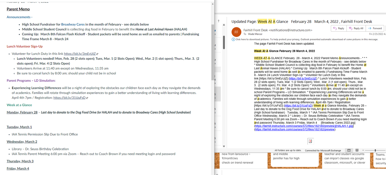
We use Canvas for all of our classes, and also for parent communication. We have a "Week at a Glance" page that contains information and reminders for the upcoming week. The notification that is sent for this looks AWFUL! Not just these.. but all notifications. Check this out:
The image on the left is the actual "Week at a Glance" page we created in Canvas.
The image to the right is the email notification.

It is terrible. Do you know anyone who would even take the time to try to decipher the information in this email? As a parent, what would be your thoughts about your child's school if/when you receive this kind of email?
We MUST have a way to format the email text a little better... at the very least, mirror line breaks and spacing.
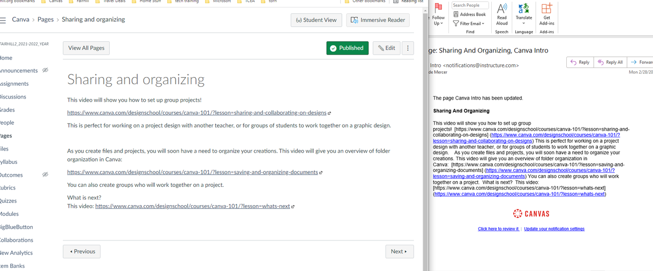
Another example:
A canvas page I created and the email notification:

Please look into what is involved with modifying the page interpreter to include line breaks and spaces when generating the email. The email as it is looks horrible, and is pretty much useless when any amount of content is included.
