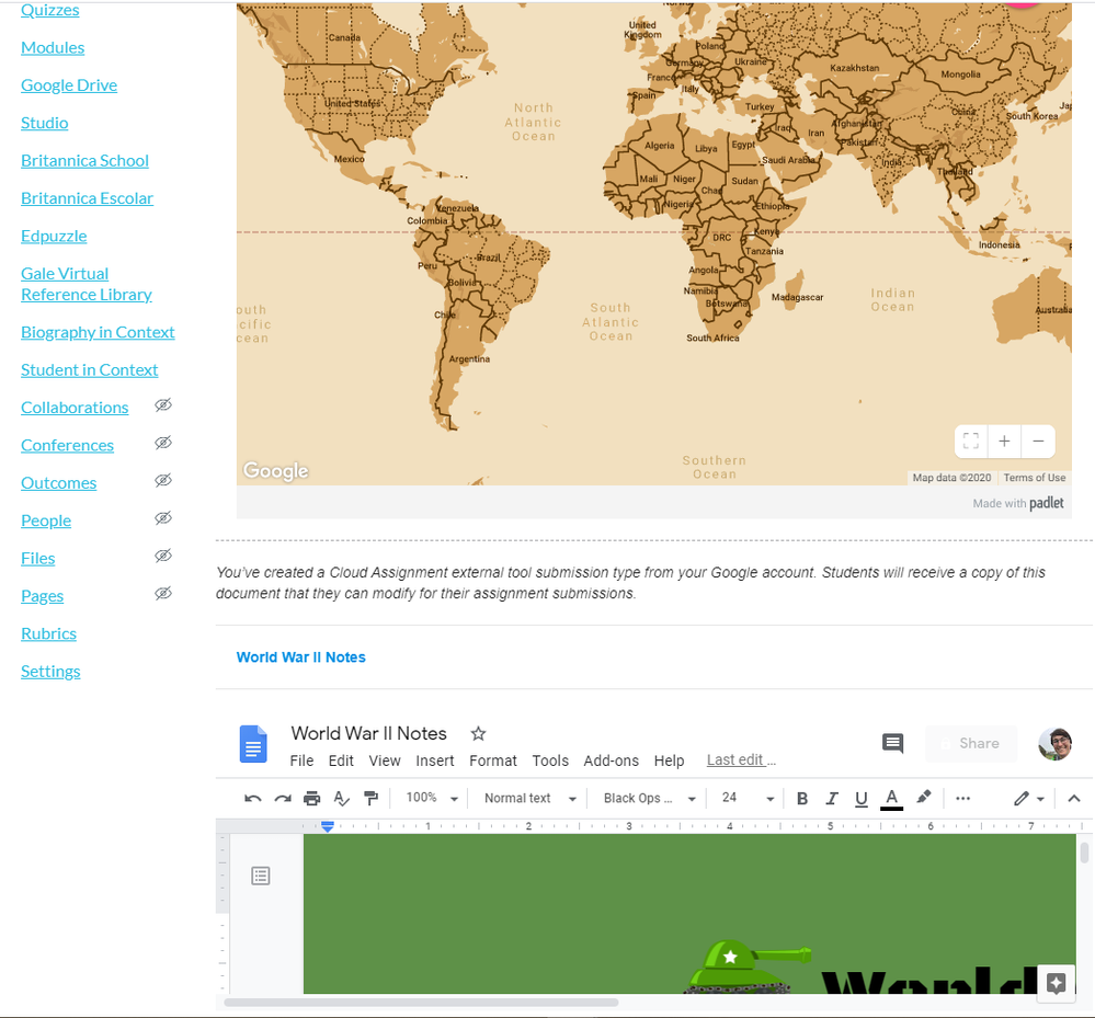
This image shows the exact layout of an assignment when using Google Doc Cloud assignments when you are trying to embed or add other needed information in a page. As you can see it gets very cut off and cumbersome for students to navigate. I love using this external tool otherwise to help cut down on the need to navigate to other web pages but that purpose is null and void when it looks like this. Is there any way we could make this tool fit more to the page? If not could we at least have the option to make it longer so that students can see at least the length of a full page? I know that students can open it into another window but once again, that negates the purpose of trying to make it all navigable on one assignment page and cut down on the need to open new tabs.