Allow for compression of Course Menu and Right Sidebar

This idea has been developed and deployed to Canvas
It seems as if the course menu and right sidebar take up too much space on the pages, in some cases even covering the content if the users screen size is small (tablets, notebooks, small screen laptops). It would be really great, if these menus could be compressed or hidden in some way so as to give the user greater flexibility in viewing the content. Or if the interface was designed to be more responsive.


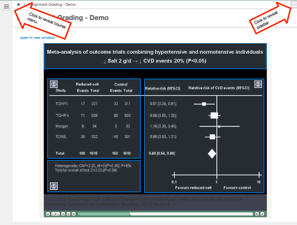
How it currently looksIdea for how it could look
39066_canvasissue1.pngcanvasissue1.png39067_canvasidea1.pngcanvasidea1.png

Comments from Instructure

We were just reviewing a few older ideas in Cold Storage and discovered this one and realized it was completed!  Canvas Production Release Notes (2016-08-27) 

22 Comments
G_Petruzella
Community Champion

 @Amanda_L_Albrig ​, cool suggestion. I will be sharing this one and voting it up when we can.

Amanda_L_Albrig
Community Contributor
Author

Thanks Gerol.

SHEBENE
Community Champion

Our programmer is looking at doing that via a hack, Canvas has a series of icons for the different course tools so it could collapse but still be accessible. He had it to where if you hover over the icons the menu expands which was nice.

G_Petruzella
Community Champion

SHEBENE​, that sounds spiffy!

James
Community Champion

This would be very helpful.

In the classroom, my monitor width is limited to 1024 pixels because it's hooked to an overhead video projector. The left and right sidebars take up so much room that there is very little space in the middle for me to actually show students the assignment instructions. Factor in the eyesight problems I was having this spring where I had to zoom the browser window to read anything and it was very unusable.

RobDitto
Community Champion

Is this feature idea considered to be solely about web browsers, such that a different one will be needed to take the place of the 65-vote-garnering Navigation Bar - iPad App feature discussion in the old community?

Amanda_L_Albrig
Community Contributor
Author

I would see the old community discussion related to the iPad as a different and also much needed request. As you noted, this idea is solely regarding the web browsers.

Sent from my iPad

GideonWilliams
Community Champion

This is a much needed feature especially if embedding learning resources on the course. Woould make this far more appealing to younger users. I like the idea of a floating menu that follows you down the page if needed.

rseilham
Community Champion

Good idea. I know not all content will display properly, but can't some of this be solved by using the iPad app? If not, it appears that the Canvas redesign might solve this issue. For now, you got my vote. 

GideonWilliams
Community Champion

Hoping the redesign does this. My issue with the iPad app is that it is very text laden and could be a bit more visually interesting/appealing.