This idea has been developed and deployed to Canvas
|
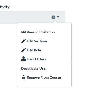
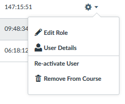
There seems to be a missing icon in the gear menu for members of a course in the People tool. The way the menu is designed, the Deactive User or Re-activate User menu options look more like a section header than an option to click. Confusion has resulted in this design as course coordinators have accidentally removed users under the mistaken impression that "Deactivate User" was the menu heading and the only option is to "Remove From Course". For consistency and clarity, it would be beneficial for all of the menu items to appear with corresponding icons.

