[ARCHIVED] Formatting: indenting a text box
- Mark as New
- Bookmark
- Subscribe
- Mute
- Subscribe to RSS Feed
- Permalink
- Report Inappropriate Content
I'll be happy with a reply that I'm doing this wrong, or just making it more complicated than necessary.
Designing a page, I made a text box using a 1x1 table, and then I indented the whole table by adjusting the table properties to 95% width and Right alignment. However, now other content wants to squeeze into that extra 5% of space to the left of the table. Here's a screenshot:
I suspect the easy solution of inserting returns (to force the text below the table) will look wacky on different size screens.
Ideas?
Thanks,
Duane
Solved! Go to Solution.
- Mark as New
- Bookmark
- Subscribe
- Mute
- Subscribe to RSS Feed
- Permalink
- Report Inappropriate Content
Duane ( @grassedd ),
Using a table for layout purposes is frowned upon by accessibility guidelines. On the other hand, Canvas doesn't support all of the CSS that is needed to make accessibility happen. Fortunately, wrapping the element in a div can make this happen, but you will need to use the HTML editor to accomplish it.
Here is the barebone structure. Tweak the padding and colors to match your needs.
<div style="padding-left: 5%;">
  <p style="overflow: auto; background-color: #cccccc; padding: 0.5em;">
    <img style="float: right; padding-left: 1em;" src="URL to IMAGE" />
    Text goes here
  </p>
</div>
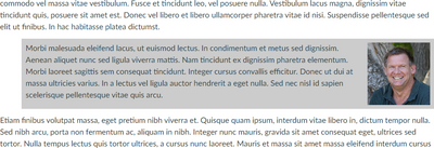
Here's what it looks like (with actual content)
If your text isn't as big as your picture, it looks like this (the forum software shrunk the width of the image, but look at the spacing):


This discussion post is outdated and has been archived. Please use the Community question forums and official documentation for the most current and accurate information.