[ARCHIVED] Five-Star Design: Navigation, Structure and Active Learning
- Mark as New
- Bookmark
- Subscribe
- Mute
- Subscribe to RSS Feed
- Permalink
- Report Inappropriate Content
Name: Galvin Ngo
Institution: Ateneo de Manila University
Course: Creativity and Problem Awareness
Audience: This design is for higher education students.
PROCESS
When your institution or course needed a solution, what were the "must-haves" or goals for its design?
The shift to online learning posed several challenges in teaching and learning, mostly brought about by the distance - both physical and psychological (Moore, 1970). In Ateneo de Manila University, despite this distance, a must-have is still to ensure that instruction continues to be designed to be efficient, effective and appealing.
Is there a review process for course design at your institution? If yes, explain how it impacted your design decisions.
Courses designed by faculty are submitted to the department chairperson for review, although a high level of independence is provided for faculty to discern the best way to design and facilitate learning in their respective course.
In what capacity is this design utilized at your institution? How is it shared, distributed, and/or celebrated?
This design was mainly used by myself as the assigned teacher for the Creativity and Problem Awareness Course, but was shared with 3 other faculty who teach the same course.
Overall, what did you learn in the design-process process?
My key takeaway from this process is that the best way to design asynchronous learning experiences is to constantly be grounded on empathy for your learners. Each of the design decisions featured are rooted in potential learning challenges and opportunities for my students.
SPOTLIGHT
Which aspects of this course design do you identify as the strongest or most effective? Why? Which tools and resources did you use as you created assets for your design?
There are three aspects that I believe contributed the most to effective, efficient and appealing instruction:
1. Easy Navigation
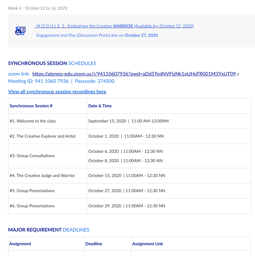
Since this course is highly asynchronous, it was necessary to ensure that it will be easy for students to find what they need - whether it be the deadlines, the order of modules, the schedule of module publishing, or the schedule of our synchronous sessions. In the course on Canvas, these were designed through:
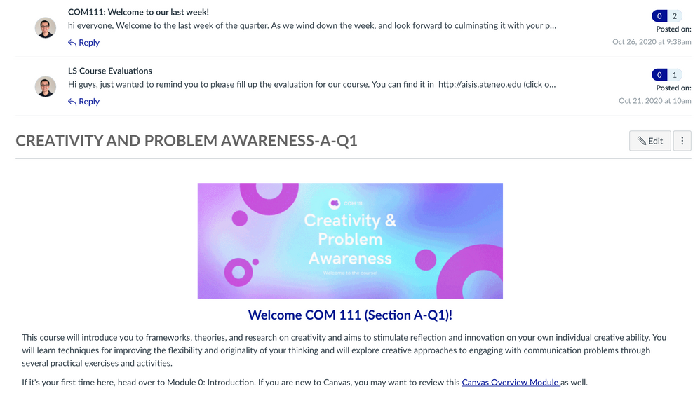
A. The Homepage as a one-stop shop - The home page was designed to be like a class bulletin board, that hosts all of the necessary information that students need to refer to. Announcement previous were also set-up to ensure that students will be able to see the latest announcements.
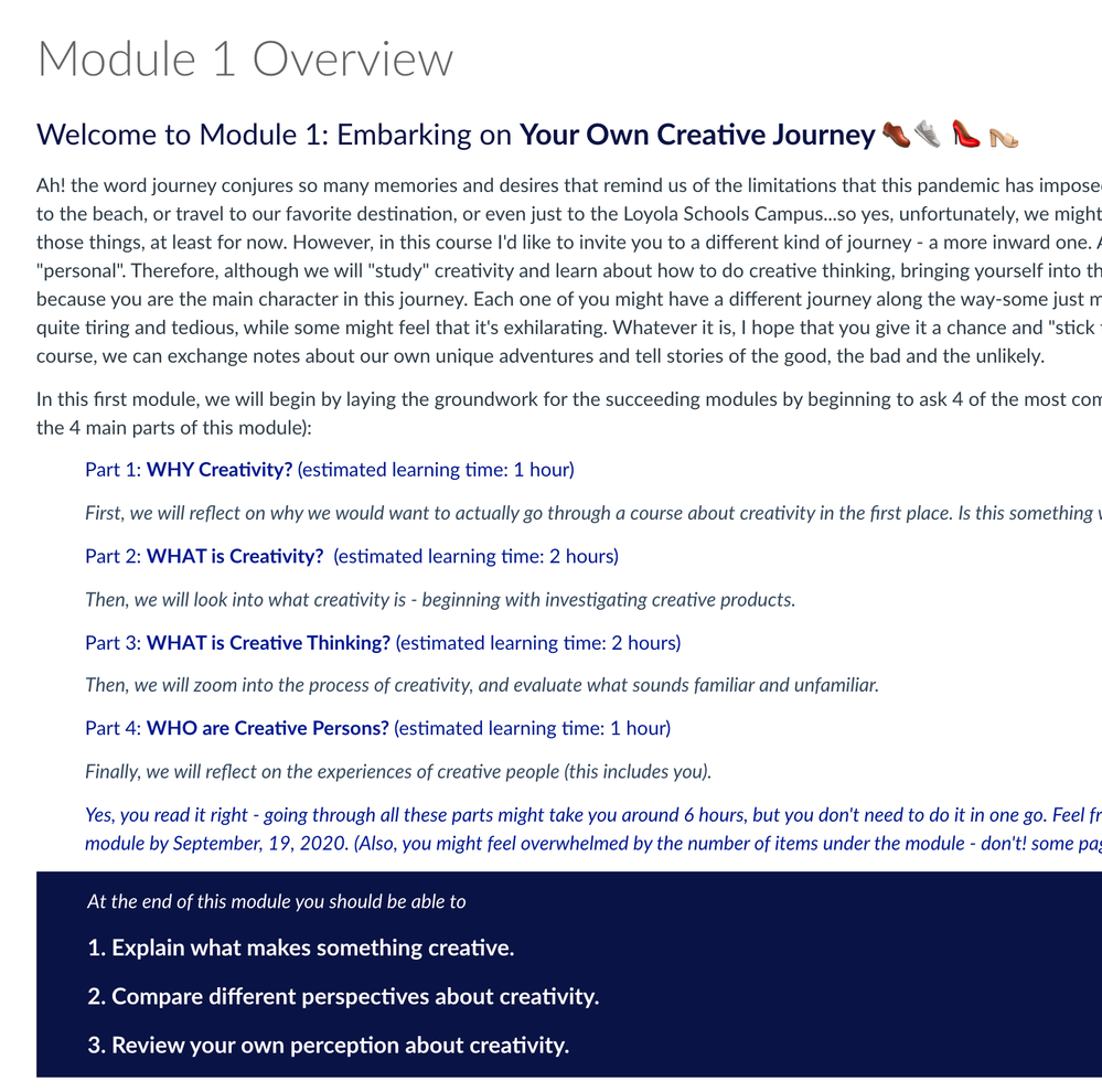
B. Using sections and roman numeral labels - In ensuring that students are able to keep track of the sequence and structure of module contents, section headings and using roman numerals to index the activities under each module was utilized. Completion settings were also set-up so that the green check marks appear when students have gone through the module's activities. To add some "fun" and highlight the module headings, unicode icons were also used.
2. High Structure
As learners go through the module contents, the connection between one activity to another was made explicit. This is to ensure that they need not use cognitive resources to figure out the content structure, and spend more time and resource diving into the content or activities. These led to two design decisions:
A. Module overviews - Each module began with an overview of the module's storyline, or how the module's content/activities are connected to each other.
B. Transition statements - As students move from one page to another, a 1-2 sentences were written to make an explicit connection between the previous content/activity and the current one.
3. Active Learning
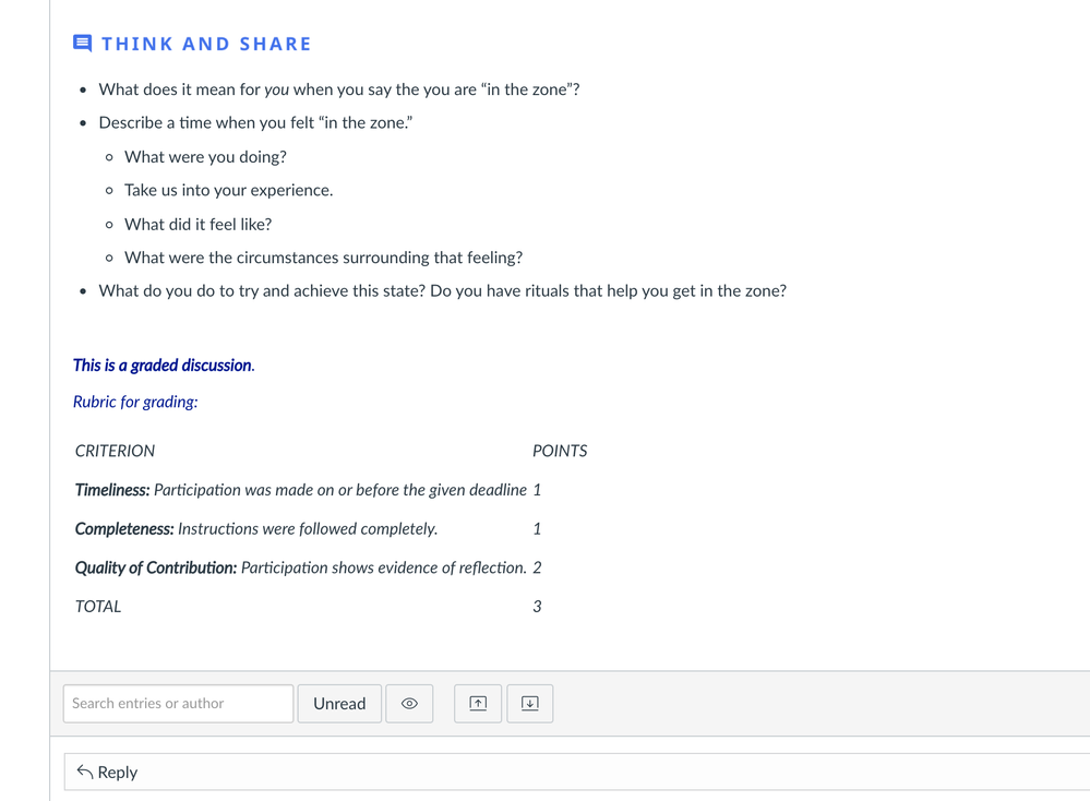
To ensure that content is not just skimmed, but processed, and reflected on, each module was designed to have several "Think and Share" activities, set-up in discussion forums. In these "Think and Share" activities, they are asked to think beyond the content and reflect on how the content presented is connected to various contexts. This actively facilitates connection to learners' prior knowledge and experience. Using more discussion forums than pages, created explicit opportunities for students to pause and process what they are learning, or at least to surface questions or insights. For graded discussion forums, a rubric is provided so that learners will know how their posts will be evaluated (although not all forums are graded, so as not to "over assess").
How did your design decision help you increase the engagement of and/or improve the learning experience for your students?
According to my students, these design features made the course easy to follow and engaging to go through. Focusing on the ease of navigation and structure were design decisions made to ensure that students will spend less time figuring out what to do, and more time actually doing/going through the course. While, the design decision for more active learning was to ensure that students' attention and involvement in the learning process is explicitly elicited and not just assumed.
What do you find to be the most important aspects of Instructional Design or UDL in this course?
In a course, learners will come with a wide range of agency. On one end of the spectrum, there are those who will be fine with less structure and figuring things out on their own, while on the other end, there are those students who would often need a high level of assistance and teacher's presence. The design decisions featured keep the latter in mind - with the notion that what will benefit learners with less agency could benefit most.
ADVICE
When beginning a new design or updating a design, what are three things you recommend designers do to improve the end-product?
1. Lean in - Your course design is only as good as how effectively learners actually learn through it. As much as possible, get feedback from your learners, even on the little things, so you can know what works and what doesn't, and do more of what works and less of what doesn't.
2. Learn to let go - It's easy to make assumptions and to allow our assumptions to drive our design decisions, but the feedback we receive might end up challenging some of them. We should be ready to listen and learn from feedback, if we want to be more effective.
3. Look around - Designing and facilitating online courses is an adventure, and the good news is you are not alone! There are many of us on this boat, so there is much to be learned from the challenges and opportunities shared by others.


This discussion post is outdated and has been archived. Please use the Community question forums and official documentation for the most current and accurate information.