Course Calendar Highlight Current Date
- Mark as New
- Bookmark
- Subscribe
- Mute
- Subscribe to RSS Feed
- Permalink
- Report Inappropriate Content
Hi All,
I suffer from a bit of dyslexia, and I need a better highlight on the course calendar for the current date. Right now, only the number is in bold. It would be helpful to make the current data stand off the page a bit more.
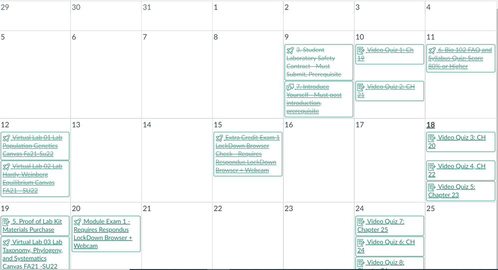
Current view:
As you can see in the image above, the current data does not really stand out. Today is June 18th and only the 18 is in bold.
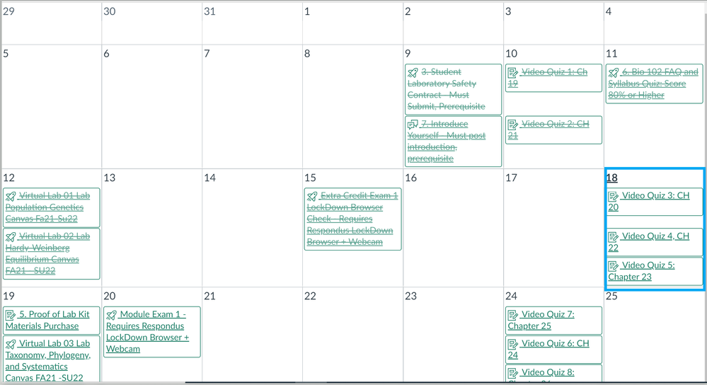
I would be immensely helpful if it were highlighted with a box around it or something similar. See image below:

Lately this has become a real issue for me. I find my eyes shifting to the wrong date in the calendar because it doesn't stand out enough for me. It has to due more with it being on the screen. If this was on a piece of paper, I could place my finger on the date or an object.
Thanks...Joressia

