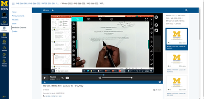
Mediasite Player Window Size Frustrations and Feedback
- Mark as New
- Bookmark
- Subscribe
- Mute
- Subscribe to RSS Feed
- Permalink
- Report Inappropriate Content
Hi all,
I'm an online student that has been using Canvas for about a year. I'd like to give some feedback and start a discussion about the mediasite player.
My experience with mediasite has been frustrating. The main problems I have are the viewing window size, the progress bar, and keyboard shortcuts (pause). I'm unable to maximize the video without losing functionality of the progress bar. The classes I take require a lot of note taking, it helps to have everything full screen and be able to pause and jump around the lecture. The pop-out player is not as user friendly as the regular player.
For example, my professor uses video capture software. If I want to use the regular player, the video capture is inside the media player which is inside a boarder which is inside another boarder... So many windows...
I'm unable to find a solution so my feedback is to improve the pop-out window functionality or improve the window size of the regular player. This would improve my experience.
Thoughts?
Nino,
Solved! Go to Solution.

