New Analytics: How well do you know us?
- Subscribe to RSS Feed
- Mark as New
- Mark as Read
- Bookmark
- Subscribe
- Printer Friendly Page
- Report Inappropriate Content
TLDR New Analytics gives instructors some amazing, detailed course-level information. We want to know: Have you seen it all? How do you use it?
I’m relatively new around here — yes, I’m going to invoke that newbie card for a few more months! — and I recently had the opportunity to watch one of our solutions engineers demo New Analytics for a new customer. WOW, I thought, there’s a ton of data here. Do our users know about everything they can access?
So, I’m going to give you an overview of what data you can find with your New Analytics tools. In the comments, I’d like to hear:
- Did you know you could find all of this?
- How are you using these data visualizations and tables?
- If you aren’t using New Analytics yet, why not?
- If you’re a power user, please point out anything I missed that you love.
A caveat: I'm using a course with demo data. Hopefully, your students are more engaged than "mine."
Course Grade
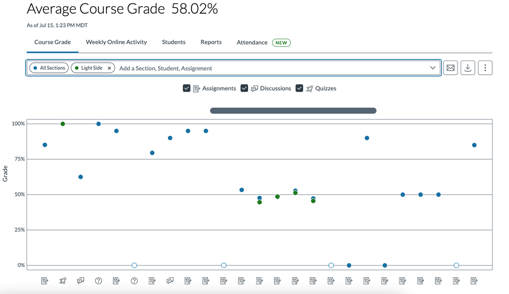
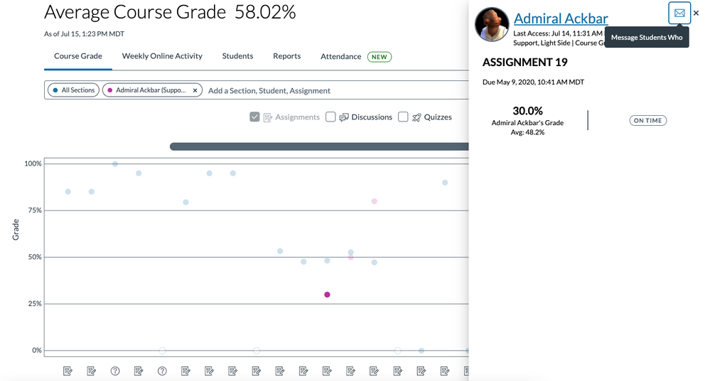
In the Course Grade tab, you see a visualization of average grades for all sections in the course for assignments, discussions or quizzes. You can compare section averages and student grades with course averages for each assignment by using the search bar. You can also select which assignment types to display.
To view a student’s grade summary for an assignment, click the corresponding point on the graph.
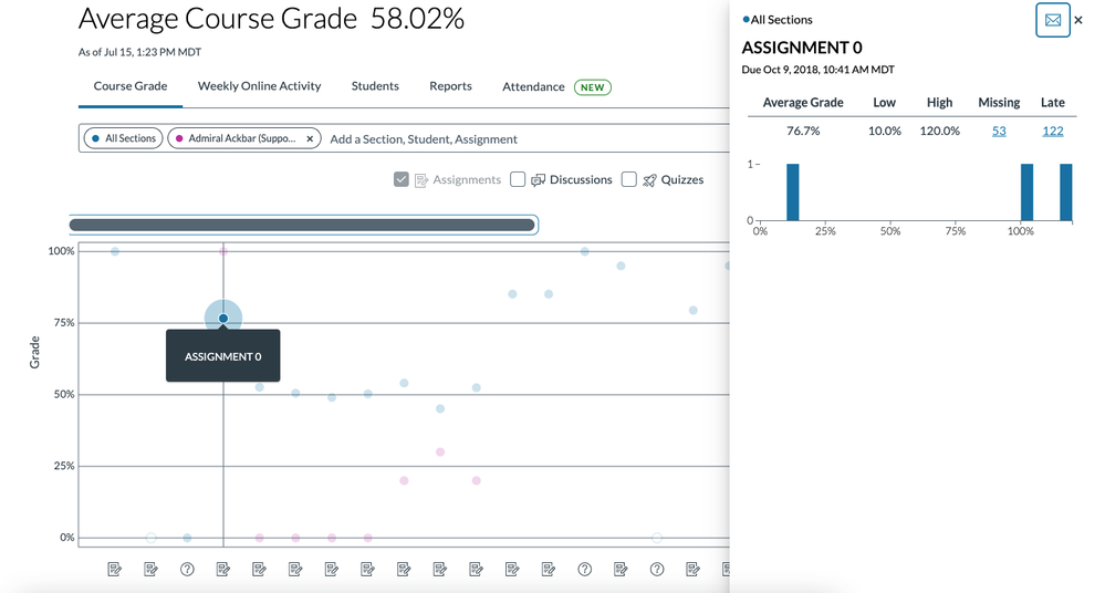
Try searching a specific assignment by typing the name into the search bar. Clicking the corresponding point on the graph will show you the grade distribution for that assignment overall or by section.
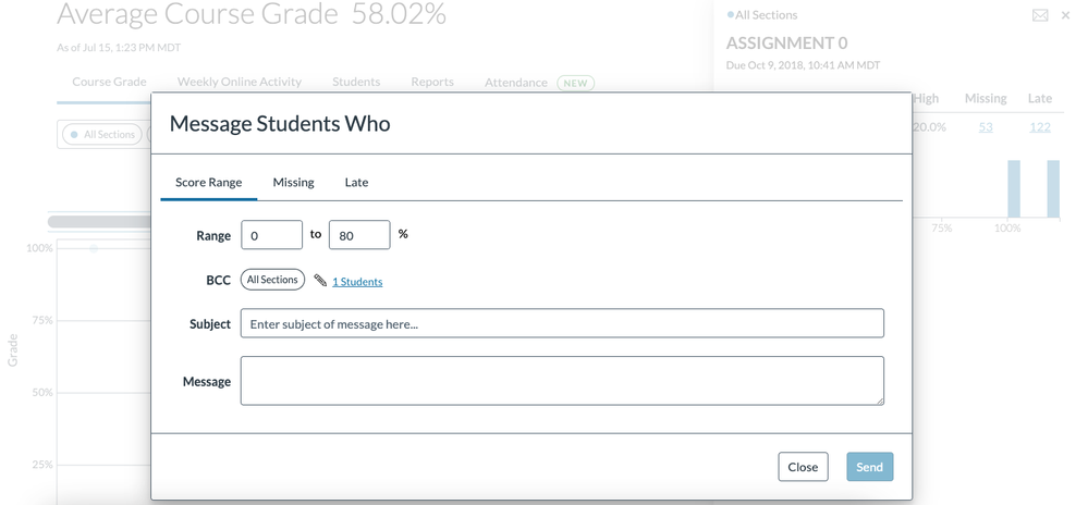
You can also message students who meet certain criteria for the assignment by clicking the message students who button. Note that students will not be able to see other students included in the message.
Weekly Online Activity
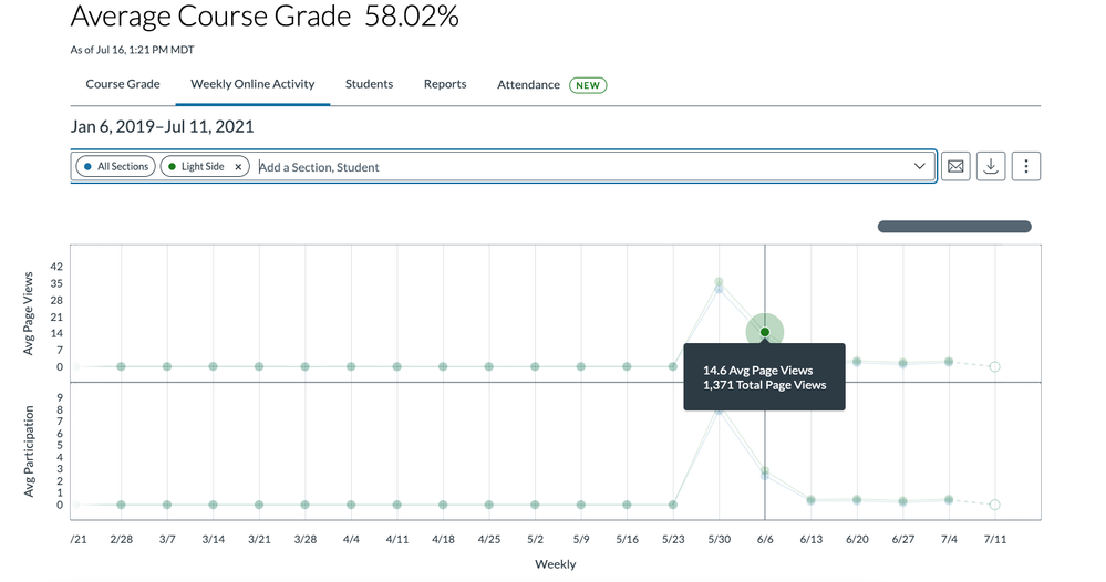
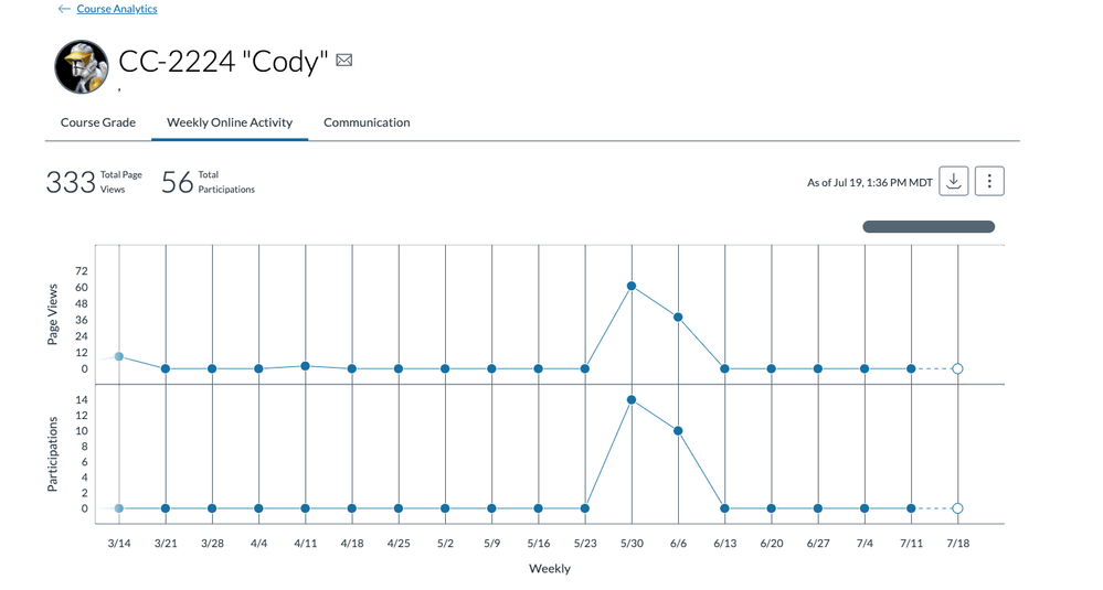
In the Weekly Online activity Tab, you see average page views and average participation on a weekly graph. You can compare sections or students to the course average by typing the section or student name in the search bar. Hover over a point on the graph to view details about the data. To download weekly activity data as a CSV file, click the download button.
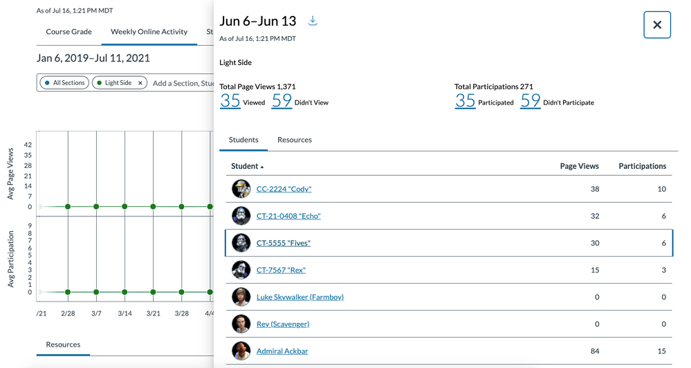
Click on the point for the week to look at total page views and participation, including how many students participated or viewed a resource.
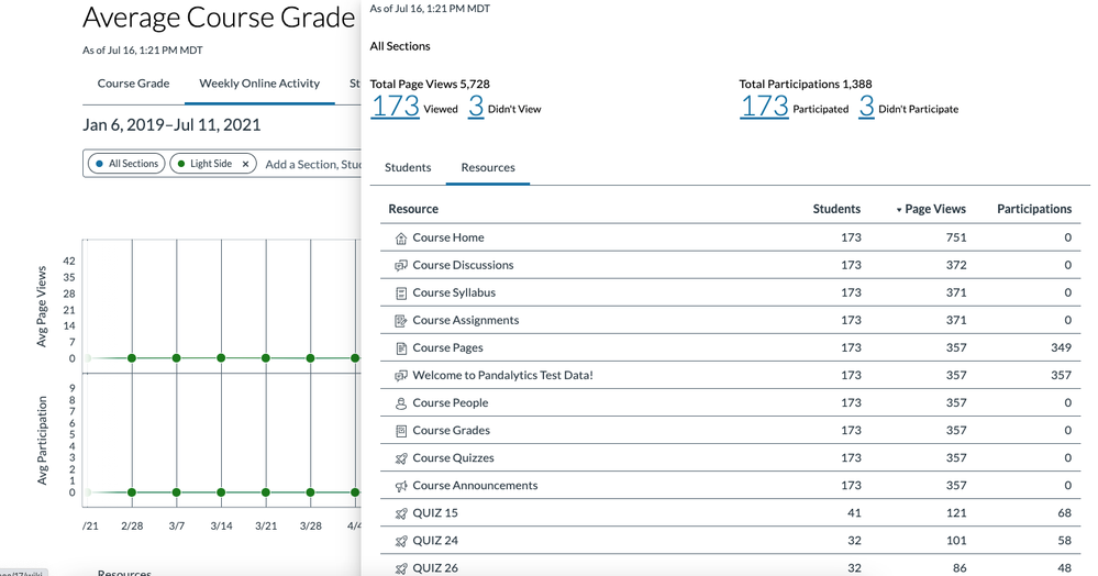
You can also view this weekly activity data by resource. Click on the number of students who viewed or didn’t view to message those students — same goes for participation.
Students
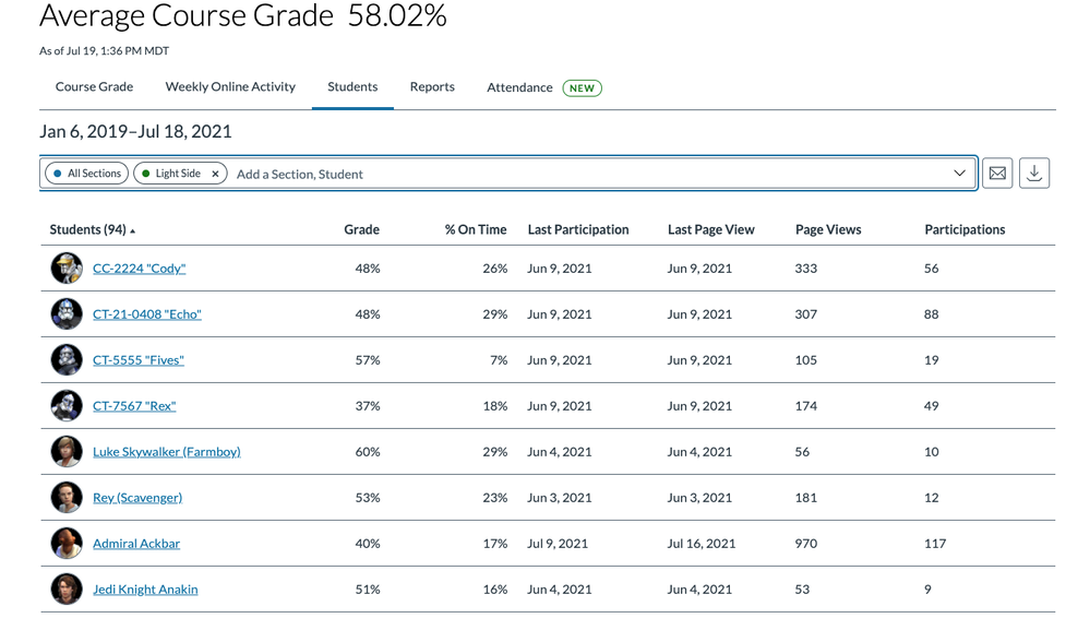
In the Students tab, you can view a table summary of student grades and participation data. This overview gives you an idea of how well students are doing in relation to their activity in the class.
Click on a student’s name to view individual student data, including course grade, weekly online activity, and communication.
Interested in more details about New Analytics and the new Attendance reports we’re rolling out next month? Subscribe to the New Analytics user group. And don’t forget to let me know in the comments how you use these data points.
The content in this blog is over six months old, and the comments are closed. For the most recent product updates and discussions, you're encouraged to explore newer posts from Instructure's Product Managers.


The content in this blog is over six months old, and the comments are closed. For the most recent product updates and discussions, you're encouraged to explore newer posts from Instructure's Product Managers.