Admin Analytics Gets New Navigation

The content in this blog is over six months old, and the comments are closed. For the most recent product updates and discussions, you're encouraged to explore newer posts from Instructure's Product Managers.

carlycurran
Instructure
Instructure
5
2975

Canvas.png

On Wednesday, November 8th, Admin Analytics will release a new navigation. I’m excited to let you know that this is a preview of the updated global navigation framework that we will be using across all products later in 2024 to simplify and streamline the user experience. 

Here are the changes you will see in Admin Analytics:

  • We will move from a tab-based structure to a top-level navigation for each Admin Analytics dashboard: Overview, Courses, Students
  • Admin Analytics will launch the full width of your browser. The admin navigation will go away when viewing Admin Analytics, but you can return to your admin menu using the updated breadcrumb navigation.
  • The Filter button will move to the top right of the screen.
  • The Clear Filters button will be left aligned, next to the Show Filter Details button.
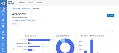
 

Admin Analytics with the updated global navigationAdmin Analytics with the updated global navigation


We look forward to your feedback on the global navigation update!  

Tags (1)

The content in this blog is over six months old, and the comments are closed. For the most recent product updates and discussions, you're encouraged to explore newer posts from Instructure's Product Managers.

5 Comments
chriscas
Community Coach
Community Coach

Hi @carlycurran,

Thanks for keeping the community in the loop on these upcoming changes (and asking for feedback)!

I have mixed feelings about the new design...  On one hand, it's great to have more screen space do display analytics data.  On the other hand, it does make navigating to different pages more difficult...  It's definitely a tradeoff situation.  I'm less concerned about this for Admin Analytics since it's a somewhat niche area, but more concerned about this coming to other areas of Canvas based on your statement "this is a preview of the updated global navigation framework that we will be using across all products later in 2024"...  I'd not like to see this kind of design expand to other areas at this point.  We already get quite a few complaints from faculty about the New Quizzes interface taking away the traditional course menu...

My idea, though I don't know if it's feasible, would be to have something like the interface of the traditional gradebook in a course.  By default, the course navigation menu is not shown there to maximize screen space, but the hamburger button can be clicked to bring that menu up when needed.  That seems to be a better blend of the need for more screen real estate (for some things) and the need to navigate around a course.  The hamburger icon is also consistent with the rest of Canvas where the course menu can be hidden (unlike the "return" button in new quizzes).

Aside from that issue, I like the new proposed structure as shown in the screenshot :).

-Chris

sara_weaver
Community Participant

We have brought this up with our CSM in the past, but this is another example of how it can really be impossible to keep up with all the changes across Instructure. It would have been wonderful if this change had been mentioned in the 11/8 Deploy Notes. Instead, the deploy notes read, "For Feature Preview changes related to this deploy, see the Admin Analytics change log and the Discussion/Announcement Redesign change log." with no links to either change logs. After learning about these new change log areas, here are all the places I need to look to get up-to-date information on releases/changes:

1. Release Notes

2. Deploy Notes

3. New Quizzes Hub

4. Admin Analytics change log

5. Discussion/Announcement Redesign change log

6. Daily digest of all articles, blog posts, and comments posted across the community, as sometimes issues are addressed there, buried in comment threads.

Instructure mentioned a while ago that they would be streamlining this type of communication, but it seems it's only getting more fragmented and difficult to follow.

carlycurran
Instructure
Instructure
Author

@sara_weaver I think this is great feedback! Thanks for your input. It's true that we currently don't publish changes to Feature Previews (which Admin Analytics falls under) in the Deploy/Release notes, but I can absolutely see how this makes your search for updates more difficult. Thanks for laying it out here clearly. It helps our teams to see what your process is now. 

hmcneill
Community Participant

@sara_weaver I very much share your frustration and we have also shared this feedback with our CSM and in user surveys. I am currently ploughing through my regular review of all of the sources of information you list, and additionally checking the Canvas mobile App updates, Commons release notes and the product roadmap pages to try to ensure that we don't miss anything... I then share only relevant items with all of my colleagues who support Canvas, to ensure they are aware of any changes for training and for our running of Canvas. It's a frustrating and unnecessarily complicated task!

It would help greatly to have one single summary page that we could work through more quickly to identify the items impacting on us. It would only need some headings, filters for which tool/feature is impacted, and links to where to find the detailed information.

Also, I'm confused about the statement that feature preview updates are shared elsewhere - updates on New Quizzes are included in the releases and deploys, is it not still in feature preview? 

danaleeling
Community Participant

The chart Interactions over time is able to display monthly and weekly page view totals, but not daily page views. Daily page views are useful to an institution such as ours where many students still access the Internet through campus computers. Knowing the typical daily demand allows the institution to make data driven decisions on when the computer labs should be open. Daily data shows that Saturday is the day with the lowest page views suggesting that the computer labs need not open on Saturdays. Being able to also select daily page view data remains useful. This was available in the Analytics but now is not in the Admin Analytics.

Page views per day by week.png