Issues with New Quiz Workflow
- Mark as New
- Bookmark
- Subscribe
- Mute
- Subscribe to RSS Feed
- Permalink
- Report Inappropriate Content
Our instructional designers and administrators have been exploring New Quiz functionality and there were several details of the workflow that were blockers to being easily adopted by new users.
Quiz Settings Location
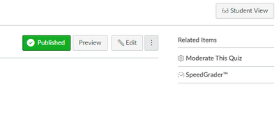
With Classic Quizzes, each individual quiz landing page has an intuitive access point for settings related to the quiz (i.e. student preview, reporting, moderation, and Speedgrader are all accessible from the landing page).
Classic Quiz landing page:
New Quizzes places most of these options within the "Build" screen, which is confusing because these options don't read like building/editing/creating/a quiz. Because of how this is nested, many users will have an issue locating these important features.
Quiz Creation Workflow Issues
- The absence of the course navigation sidebar in the "Build" screen is disorienting and makes navigating away from the screen awkward.
- No save button and lack of feedback about the "current state" of a quiz in the "Build" screen is stressful. If the "Return" button is supposed to snapshot the progress of quiz creation, it is not explicit or intuitive.
- Similarly, there is no way to publish from the "Build" screen, requiring a "go back and switch it on" approach.
- Adding a question to an item bank immediately completes question creation and disrupts the quiz creation workflow as well.
Student Experience Issues
- As with quiz creation, there is no explicit understanding of the "current state" of a quiz attempt, because no save button is present. The "Return" button offers the same ambiguity about the repercussions of navigating away for the student.
- Returning to a quiz after an attempt does not provide significant or meaningful feedback at a glance, when compared to the details provided by the classic quizzes, with information about submitted attempts and answers.

