Impact Release Notes (2022-06-29)
In this Impact release, in the Impact Dashboard drop-down menus display previously selected items at the top of the list. Similarly, in the Inline Editor, Walkthrough drop-down menus display previously selected items at the top of the list. In Messages, if a user has multiple roles, the user will see messages for the highest role only. Additionally in Impact Dashboard, various updates were made to simplify keyboard navigation, improve Screen Reader navigation and display select text and buttons in higher color contrast ratio.
Impact helps institutions improve technology adoption and evaluate the impact of educational technology, while helping faculty and students seamlessly navigate new platforms. Learn more about Impact by Instructure.
Updated Features |
Impact Dashboard
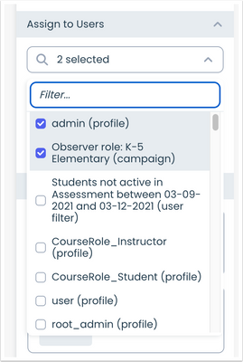
Pinned Drop-down Items
Drop-down menus display previously selected items at the top of the list.
 Impact Dashboard Drop-Down Menu Items
Inline Editor
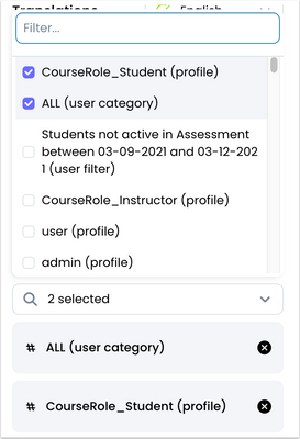
Pinned Walkthrough Drop-down Items
Drop-down menus display previously selected items at the top of the list.
 Inline Editor Walkthrough Drop-Down Items
Messages
User Role Recognition
In Messages, if Canvas users have more than one role, the system recognizes the role that has the max number of enrollments as the primary role and the user will see messaging for that role only.
Other Updates |
Accessibility
Insights Keyboard Navigation
In Insights, chart headers display in Heading 2 formatting. Keyboard-only users can also navigate through User Activity chart drop-down menus.
Impact Dashboard Keyboard Navigation
In the Impact Dashboard, semantic headings display in Heading 2 and improve Keyboard-only user navigation through headings.
Drop-Down Menu Keyboard Navigation
When navigating from a drop-down menu to the next element, drop-down menus close automatically for keyboard-only users.
Alt Text in Messages
In Messages, message type icons include alt text descriptions.
Screen Reader Navigation Updates
Screen Reader users can navigate and use the close button (X) in messages as well as thumbs up and thumbs down icons in Message Feedback.
Screen Reader users can navigate and use the delete (X) button in Assign to Users and Connect to Context sections in Messages.
Screen Reader users can navigate and use the Settings button in the Impact Dashboard.
Screen Readers can navigate and use the trashbin icon button in the Support Center.
Impact Dashboard Color Contrast
In the Impact Dashboard, the Create Support Center and Create Template buttons display in a higher color contrast ratio. Additionally, in the Arrange Support Articles section, text and buttons display in a higher color contrast ratio.
In the Impact Dashboard, the Settings and Edit buttons display in a higher color contrast ratio. Additionally, the Delete button displays in a higher color contrast ratio when hovering over it.
In the Impact Dashboard, Messages, Walkthroughs and Support Articles display in a higher color contrast ratio and text labels have been added.
In the Impact Dashboard, the text “Search”, “Filter”, “Fields” and additional subheaders display in a higher color contrast ratio.
In the Impact Dashboard, the date picker and item settings text display in a higher color contrast ratio.
In the Impact Dashboard, the Apply Filter button displays in a higher contrast ratio. [ADDED 2022-07-01]
Fixed Bugs |
- In the Support Center calendar, users can select dates in the future.
- Impact messages load more quickly in Canvas.
- Canvas sub-account users with Impact access only view Impact user groups for their sub-account.
- The Walkthrough completion message displays accurate language translation based on the user’s selected language.
- In Inline Walkthroughs, button tooltips display accurate language translation based on the user’s selected language.
- In Inline Walkthroughs, headings display accurate language translation based on the user’s selected language.
Change Log
2022-06-28
