Best practices for the creation of Impact messages
- Subscribe to RSS Feed
- Mark as New
- Mark as Read
- Bookmark
- Subscribe
- Printer Friendly Page
- Report Inappropriate Content
Hey Impact user! Did you know Impact messages can be personalized and placed on-demand anywhere within your learning application, targeted at any specific group of users? Messages can be filled with text, and rich content such as images, videos or embedded iframes!
Messages are a great way to:
- inform users about available tools and features and effective ways of using them
- connect users with support resources when and where they need them
- promote new tools and features
- notify them of news and changes at your institution
However, messages not only provide your users with important information, they provide you with valuable insights, such as who saw the message, who voted and/or commented on it , and who accessed support resources linked inside the message. These insights help you to better understand user behavior.
Now, before you start creating your messages from the Impact dashboard or using the Inline Editor, let’s look at some best practices for the basic settings & content of the message to support you in successfully targeting your users.
First, choose the right message type
There are three (3) different types of messages you can choose from. Your message choice is influenced by where you want to place it within the LMS and the content you'd like to convey.
1. Systray
- Placed on page-level context
- Shows in the right hand-corner of your LMS
- Ideal for informative messages
2. Pop-up
- Placed on page-level contexts
- Prominently displayed as a full-page modal layover, graying out the background
- It is by far the most intrusive message type because it prevents users from using their LMS until they close the message → use it for must-read messages and high-stakes content only
3. Hint
- Placed on element-level contexts
- Ideal when the content of the message relates to elements, for instance when you want to make users aware of a new icon, menu or button
💡Tip: More about the technical details of message types
You can find more information on message types and their triggers here.
Then, construct your message content
Consider the following three aspects when designing the content of a message: the (optional) greeting, the body of text and the content structure.
Greeting
Engage users in a direct, and catchy way by personalizing your messages. This is only recommended for systrays and pop-up messages as hint messages should be kept as short as possible.
Body of text
An effective message should include the following:
- What
What do you want to raise the users’ awareness about?
For example, what has changed or is new? - Why
Why would a user change their behavior? ‘What is in it’ for them?
For example, users may save time when switching to a new workflow, or unlock new capabilities etc. - How
How can a user successfully change their behavior?
Succinctly describe what users need to do and/or provide them with support articles.
While writing your message, be conscious of the following:
- Be concise: cut out all superfluous words/content; the clearer and shorter the message, the easier it is for users to understand and process the information
- Be clear: use official terminology when referring to user interface elements. When in doubt, check the Canvas guides
- Make it intelligible: provide users with hyperlinks to support articles for in-depth instructions; to save space, integrate hyperlinks into your running text whenever possible
Content structure
To help your user understand and process the content of your message, clear structure is essential.
It is recommended that you employ a scannable layout. i.e.:
- Structure your text in paragraphs, discuss one topic per paragraph
- Employ bullet points/numbered list for listing items
- Visuals are helpful but make sure not to clutter your message with too many icons/pictures
💡Tip: Collect user feedback
Remember that you can enable the voting option to collect user feedback on messages. Based on the messaging reports, you can then spot messages that need a little improvement.
Set a message title
- Make clear what the message is about
- Align the title length with the message width so that users can read the entire title
Size the message
- Size the message so that no scrolling is needed to read the content
- Make the message as small as possible whilst being conscious of readability
- Make sure the message does not cover any relevant page elements when appearing in your learning application
Find an appropriate message placement
- Place messages on contexts that users will see and that relate to the content of the message
💡Tip: Scheduling messages
- Be aware of how many messages you show to a target audience at any given time. Try to limit the number and spread them out time-wise so that users do not get overwhelmed
- A convenient way to manage messages is to schedule messages using the start/ end date feature- this way you also don't need to remember to manually hide old messages
Examples of messages
Now that we have gone over the best practices, let’s review some examples.
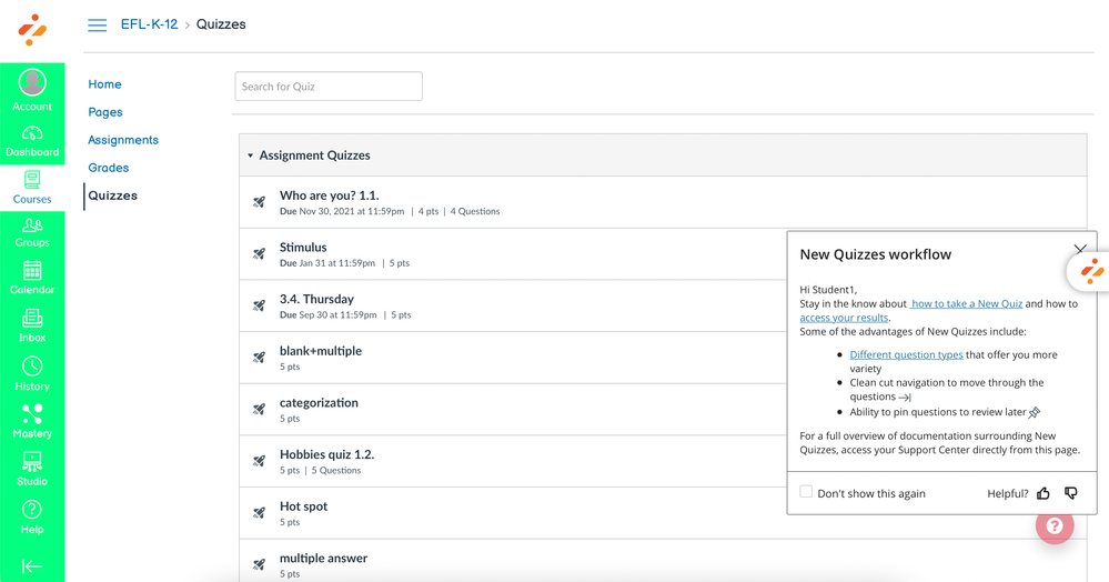
Systray message
This systray message is part of the Canvas Introduction to New Quizzes: Students campaign.
Note that it includes:
- a personalized greeting
- support articles with specific instructions included in the running text
- an easily scannable layout with three paragraphs
- bullets points for listing advantages of New Quizzes
- visual cues in form the actual icons users will encounter in New Quizzes
- a strategic placement on the Quizzes overview page
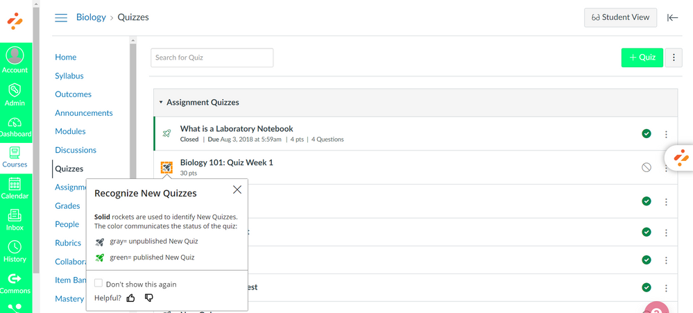
Hint message
This hint message is part of the Introduction to Canvas New Quizzes: Instructors campaign.
Note that it:
- is placed on the New Quizzes icon
- includes a clear, short and informative title
- includes meaningful visuals
- offers users the ability to votes to collect user feedback
Pop-up message
This message is part of the Blackboard Ultra Full-Screen View Of Impact Support Center Side Panel campaign.
Note that it:
- Informs user about an important and much-requested new functionality (full-screen view), which justifies the message choice
- includes relevant visuals of the buttons users need to use to get the full-screen view
- offers users the ability to vote to collect user feedback
💡Need some inspiration, ready-to-use messages, or campaigns?
Check out our campaign templates with numerous examples of messages, made by our educational specialists.
Need some more help using Impact?
Check out our Impact user guides.
You must be a registered user to add a comment. If you've already registered, sign in. Otherwise, register and sign in.


