Community Updates 2023-03-06: Redesigned Guides and Forum Pages
- Subscribe to RSS Feed
- Mark as New
- Mark as Read
- Bookmark
- Subscribe
- Printer Friendly Page
- Report Inappropriate Content
Hi Community friends!
We’ve been hard at work giving a few areas in the Community a new coat of paint, making them easier to use, and we’re excited to finally show them off. Our question forums and product user guides are two of the most popular areas in our Community. When we switched our Community platform to Khoros in 2020, we kept a lot of the default designs and layouts for many of these pages with only minor changes here and there. As the Community has grown, we recognize that each month, millions of people read the user guides and ask or reply to questions in our product question forums. This encouraged us to make some changes and refresh the page designs.
It’s finally time to reveal the updates to our product guides and forum pages. Throughout March, you’ll see fresh looks in the guides spaces and the question forums. For now, these updates only apply to individual guide pages and individual question topics. New designs for landing pages and question feed pages are in progress and will be applied at a later date.
Question Forum Redesign
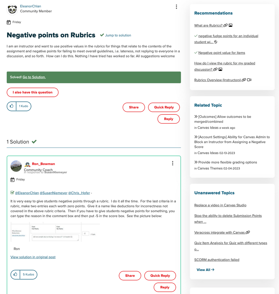
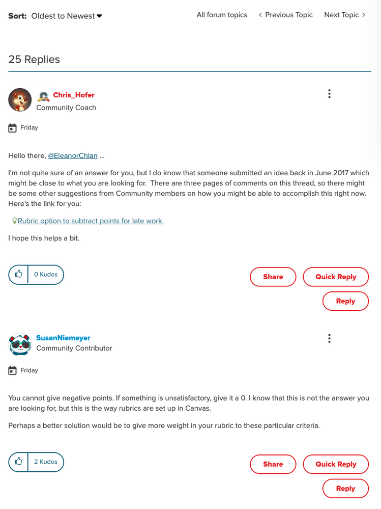
The current design of our question forum pages have too many elements, buttons, and too much text. There’s a lot of sidebar content that distracts from the question. There are too many buttons at the bottom of every question and reply. The threads are hard to follow and sometimes turn into a giant wall of text. Here’s a sample of what a question looks like right now.
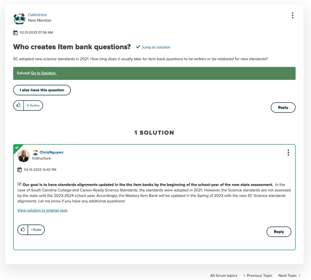
We set out to improve the question forum topic pages in two main ways: 1) simplify the user interface and 2) put the focus on the question, solution, and replies.
To do that, we added a subtle drop shadow behind the question, increased the subject font size, made it wider, and moved simplified sidebar content to the bottom of the page. This puts the question front and center, with the marked solution coming immediately after. The question is easier to read and distractions are limited. Users can interact with the question and explore additional content at the bottom of the page.
Additionally, we also simplified the number, color, and placement of buttons at the bottom of each post. In the old design, there are 4-5 buttons at the bottom of each post. In the updated design, we’ve removed half of those buttons, so there are only 2-3 buttons at the bottom of replies and topics. We also removed the bright red for a dark blue, and did a bit of tweaking on placement.
We hope you enjoy the new question forum topic page design and that it helps you discover and interact with even more people in the Instructure Community!
Guides Page Redesign
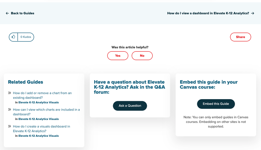
We’ve also been hard at work improving and refreshing our guides pages. We’ve done similar design work on these pages to simplify the layout, colors, and spacing on these pages. Sidebar content has been moved to the bottom of the page. The number of widgets and components at the bottom of each guide has also been reduced and simplified. We hope the content that remains is easy to navigate and intuitive to use.
Here’s a snapshot of what a guide looks like with the old design:
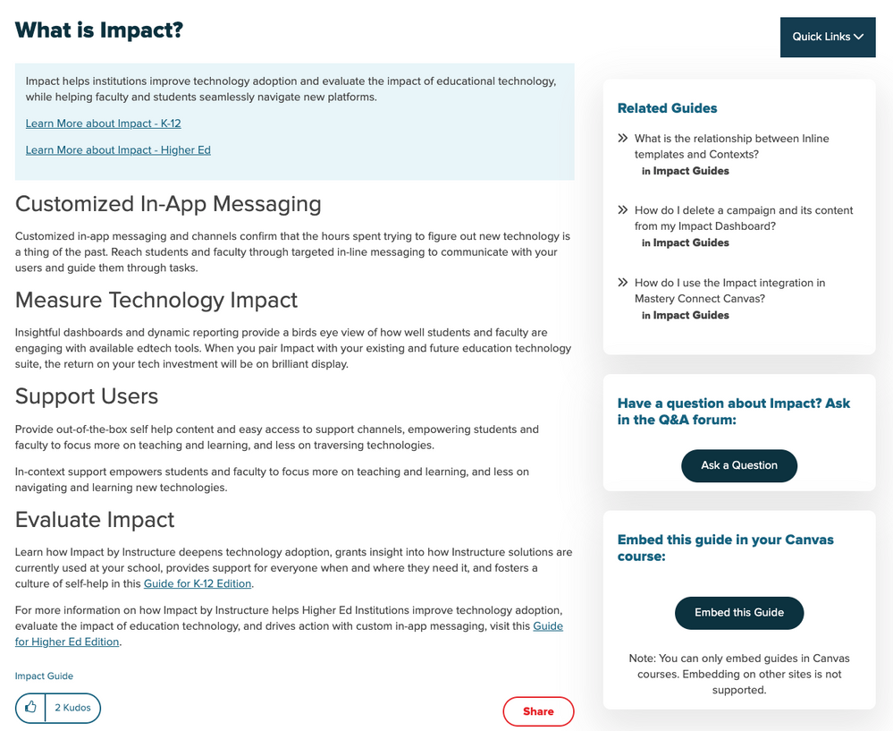
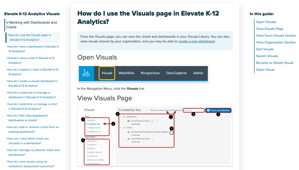
We focused the design of these guides pages around a popular user experience: landing on one of these pages from a search engine. In the old design, many users landed on the page from a search engine and weren’t sure where to go next, especially if that particular page didn’t answer their question. In an effort to solve some of these problems, we added a chapter navigation element on the left-hand side of the page and a table of contents navigation element on the right side. You can easily find other guides within the same space as the current guide and quickly navigate to them. The table of contents allows you to skip to relevant content and browse all guide headers.
Here is a guide with the new design:
As always, we’re open to feedback and suggestions in the comments section of this post. Thanks so much for your continued engagement, feedback, and partnership to make this the best online Community!
You must be a registered user to add a comment. If you've already registered, sign in. Otherwise, register and sign in.


