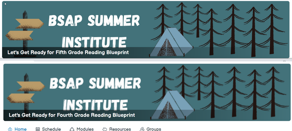
C4E blurry banners
- Mark as New
- Bookmark
- Subscribe
- Mute
- Subscribe to RSS Feed
- Permalink
- Report Inappropriate Content
Has anyone come up with best settings/tools for creating C4E banner images to avoid blurryness? I've created a banner in Canva with the recommended 5:1 ratio. Everything looks nice and crisp in Canva and in the thumbnail on the course settings screen, but after saving and reloading my homepage everything is blurry. I've tried ratios from 1000:200 to 4000:800 and different Canva fonts and stickers, but nothing I've tried results in a crisp resolution in Canvas. A vector graphic would be ideal, but Canvas doesn't accept .svg files for the banner so I'm using a .png. Are people creating crisp, clear banners for C4E? What are you using?
Solved! Go to Solution.
- Mark as New
- Bookmark
- Subscribe
- Mute
- Subscribe to RSS Feed
- Permalink
- Report Inappropriate Content
Hello Audra,
Thank you for contacting Canvas Support. We're sorry to hear you've been experiencing issues with you C4E banner images. It sounds like you have exhausted and tried many different picture types and ratios. It is true that we don't accept .svg for the banner but .png and .jpg etc. The 5:1 ratio should be working as intended. It may be the image itself that you have. There is a small update regarding the banner size and you can get specific pixel suggestions here: https://community.canvaslms.com/t5/Canvas-for-Elementary-Archived/Project-Update-June-25/ba-p/470584
Because of the complexity of the issue, and the need to view the specifications of your images, it would be best if you contacted Canvas Support directly to pinpoint the source of the issue and provide a resolution:
https://community.canvaslms.com/t5/Canvas-Basics-Guide/How-do-I-contact-Canvas-Support/ta-p/389767

