The Dos and Don’ts of Icon Maker
- Subscribe to RSS Feed
- Mark as New
- Mark as Read
- Bookmark
- Subscribe
- Printer Friendly Page
- Report Inappropriate Content
The Dos and Don’ts of Icon Maker
• ID Best Practices for the New Icon Maker
• Do and Don’t Examples for the new Icon Maker
@Laurie_Norris and I are so excited to share the newest feature coming to your Rich Content Editor (RCE)-- the Icon Maker! Since this amazing feature launched this weekend, we wanted to offer some Instructional Design best practices for using these icons to maximize the effectiveness of your courses and keep accessibility at the forefront of course design. To check out how to use the Icon Maker, visit @dlyons's blog post.
What, Why, and How?
What is Icon Maker?
As David Lyons mentioned in his product launch blog post,
“Icon Maker in Canvas will allow teachers and course designers to create simple and reusable icons directly inside the Canvas RCE.”
Icons can be a visual symbol used to designate content or used as a navigational tool.
Why use icons?
Icon Maker can create appealing visual icons to welcome and engage your audience.
Icons can serve as:
- A visual cue for learners to associate an image with an action.
- A way to develop visual interest and chunk content.
- A design element that provides a cohesive look to your course.
How do icons work?
Icons are literally and figuratively images; the Canvas Product Team has just provided a way to create them natively in Canvas.
When building your icons in Icon Maker, remember:
- If text is included on your icon, a screen reader will not recognize the text.
- If there’s no alt text, the accessibility checker will flag the icon as inaccessible.
- If you adhere to accessibility guidelines, your icons will add to the effectiveness of your course.
Consider Accessibility
Accessibility is your learners' ability to access your content. When we consider accessibility, we must consider how the information is presented and how it may be received. For more quick tips on accessibility, check out our last blog post!
Dos of Icon Maker
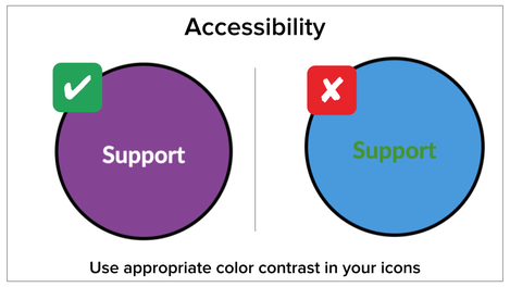
When considering accessibility, you will want to make sure the images you create in Icon Maker model simplicity and have appropriate color contrast.
- Do: Model Simplicity
- Select a color palette that doesn’t conflict with existing images on the page or your institution’s branding.
- Format your icons similarly so learners can navigate easily through your course.
- We encourage icon distinction, but there should be a thread of consistency between each icon.
- Do: Use Appropriate Color Contrast
- Select colors that do not conflict with one another or bring attention to the key content in your images.
- We encourage creativity in color choice, but style should not supersede access.
- Note: The accessibility checker does not recognize color contrast errors in images, including those created using the Icon Maker. Proper color contrast is essential for those with visual impairments.
- You can check for color contrast using the WebAIM contrast checker or this awesome CCA tool!
Don’ts of Icon Maker
You will also want to ensure that you don’t ignore accessibility rules. Choosing inappropriate colors or forgetting to label your images using alt text can negatively impact a learner’s experience in your course.
- Don’t: Choose Inappropriate Colors
- Be sure your colors don’t draw unnecessary attention, and instead, highlight information that’s important.
- Don’t forget to leverage the tools we provided for color contrast above!
- Don’t: Forget to Use Alt Text
- We encourage you to take the time to describe the image and its purpose in your alt text to help engage learners and increase your images’ usability.
- Alt text is what a screen reader narrates as a learner navigates through your course.
Consider When and Where to Use Icons
When creating your images in Icon Maker, consider when and where you are using them. Icons can serve many different purposes, whether it’s to add visual interest (decoration), take learners to a new destination (navigation), and/or provide visual context to a lesson (information). For this reason, we must be strategic in when and where we use icons.
Dos of Icon Maker
Overall, it’s imperative that we practice simplicity when determining when and where to use icons. Learners should be able to quickly identify an icon’s purpose. When we include too many images on the same page, it will be more difficult for our learners to make these distinctions.
- Do: Practice Simplicity
- Keep your page clutter-free for easy navigation and setting a clear purpose
- We encourage you to be consistent in your design and placement of icons so that the transition from page to page in your course is seamless.
- We recommend limiting the number of images on your page. A good rule of thumb is to include one icon per Heading 2 plus a few additional decorative or informational icons.
Don’ts of Icon Maker
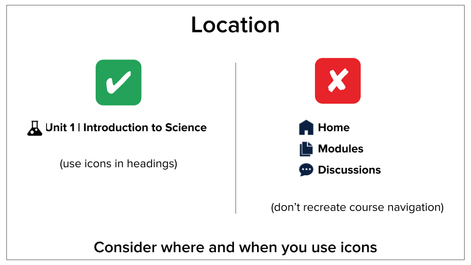
Be careful not to recreate navigation that is inherent to Canvas. Canvas has a robust and clear navigational system already established; when we use icons to override that navigational system, we can detract from what’s most important.
In fact, our team at Canvas has seen this on more than one occasion. In one instance, a student with a visual impairment using a screen reader had difficulty with his online course – specifically the overuse of navigational images. On each page, discussion, quiz, and assignment navigational icons were included to help direct learners back to “home”, “grades”, “discussions”, etc.
While we know this was designed with good intention, it distracted from the learner’s course experience. The audio on the screen reader reads the image description plus the destination of the image for every icon on every page. This was confusing to the student, causing him to think he had a glitch in his screen reader or Canvas course.
Though we may be well-intentioned, we must remember that our efforts may cause more harm than good.
- Don’t: Recreate Canvas Navigation
- If a simple navigational system is present, there’s no need to make a new icon. In other words, as we say here in the South, “If it ain’t broke, don’t fix it.”
- Note: We encourage the use of navigational icons on home pages but we recommend that you refrain from adding these navigational pieces to every page in your Canvas course.
Consider the Audience
When you build icons to consider your audience, you put their needs above your own. In other words, I’m worried about what my learner may think more than I am concerned about what I think.
Dos of Icon Maker
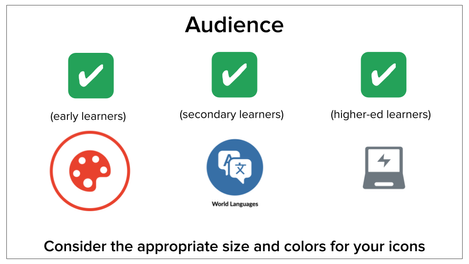
Icons will look different depending on the age you are designing for. Consider the appropriate size, colors, and amount of icons to meet the needs of your learners.
- Do: Consider the Age of Your Learners
- For a younger audience (primary-elementary school):
- You will want to build larger icons (large or extra-large in Icon Maker)
- You’ll want the colors to be engaging and subject appropriate
- You should use fewer icons to reduce cognitive load
- For a secondary audience (middle-high school):
- You will want to use mid-sized icons (medium in Icon Maker)
- You want the colors to be engaging and subject appropriate
- You should only use necessary icons to reduce cognitive load
- For a higher-education audience:
- You will want to use mid-sized icons (medium in Icon Maker)
- You want the colors to be simple and to compliment your institution’s branding
- You should only use necessary icons to reduce cognitive load
Don’ts of Icon Maker
When you don’t consider your audience, you may find that learners have trouble navigating through your course or feel overwhelmed by the content at hand.
- Don’t: Ignore your Learners’ Needs
- After creating icons, always be open to changing your layout to support what your learners need. If your sizes, colors, and/or amount of icons are creating confusion for your learners, it’s never too late to remake them with their considerations in mind.
Consider the Message You Send
Images and icons serve a purpose and portray a message - whether it’s for visual engagement, for navigational purposes, or for providing information. It’s important to consider the message you want to impart using your icon. Explore our Ready-Made Template Suite to see examples of how to leverage icons to send the right message.
Dos of Icon Maker
When considering your icon’s message, you want to make sure that your icons are visually appealing, useful, organized, and consistent.
- Do: Make Icons Visually Appealing and Useful
- You can also check out this awesome resource to create your color palette and simplify your design process!
- Be sure to choose the right colors while keeping the accessibility rules in mind.
- Do: Use Icons as Symbols
- Note: Icon Maker’s smallest size looks good with Heading 2.
- Use the same “math icon” for information about your math course
- Use the same “extracurricular icon” when referring to extracurricular content
- We encourage you to include icons on the same line as Canvas’s Heading 2.
- These can designate specific actions, information, or instruction. For example:
Don’ts of Icon Maker
Be sure you keep your purpose in mind when creating your icons in Icon Maker.
- Don’t: Misrepresent Your Icon’s Purpose
- Creating an icon using a symbol that doesn’t match its purpose can confuse your learners. You wouldn’t want to send the wrong message
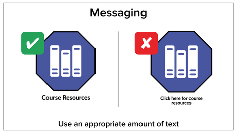
- Don’t: Include Too Much Text
- We recommend limiting text on an icon to 3-4 words.
- Once again, remember to consider your audience. Especially when making icons for younger audiences should include minimal text.
- Icons should have limited text to send quick and easy messages to your learners.
Final Thoughts
We are so excited about this new feature and know it will make your lives much easier! When using Icon Maker, remember to consider (1) accessibility, (2) when and where to use the icons, (3) your audience, and (4) the message you are sending. We hope that these Instructional Design tips will help you make the most of Canvas’s new Icon Maker. We can’t wait to see what you all create! This is just the beginning of what you can do with Icons in Canvas. To elevate your course design even further, contact your CSM to purchase our Instructional Design services.
Please comment below. We’d love to hear from you!
Our Instructional Design team offers templates, consultation, badging services, course evaluations, workshops, and more. If you would like to learn more about our services, please contact your CSM or @deonne_johnson, Manager, Learning Services, via djohnson@instructure.com
You must be a registered user to add a comment. If you've already registered, sign in. Otherwise, register and sign in.


