[Account Settings] More intuitive term sorting/presentation

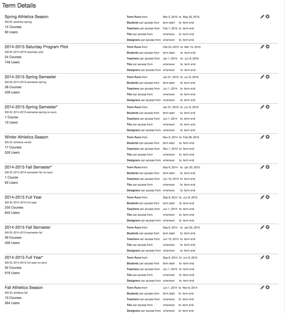
So, my impression is that terms are sorted based on date and, perhaps, name. But it doesn't seem consistent. For example, here's the term order on the admin Terms page, which appears to be in descending order by start date, with terms with the same dates sorted alphabetically. Which makes sense.

38274_Screen Shot 2015-04-19 at 11.48.16 AM.pngScreen Shot 2015-04-19 at 11.48.16 AM.png

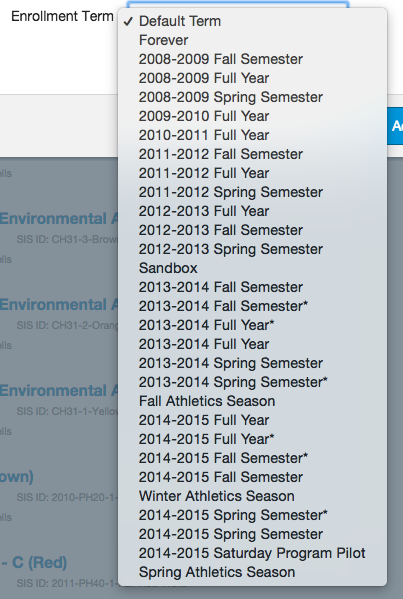
But now, when I go to a term pull-down menu, that order is reversed, putting my active terms at the bottom of the list:

38275_Screen Shot 2015-04-19 at 11.50.12 AM.pngScreen Shot 2015-04-19 at 11.50.12 AM.png

I see three key improvements to be made in the presentation of terms:

  1. Let's be consistent and use the same order in every listing. Doesn't matter what order -- but it should be the same. I don't have the bandwidth to re-figure this out every time I look at it.
  2. Let's make sure the active terms are most readily available. This probably means that they should stay at the top of the Terms page and move to the top of the drop-down menu.
  3. Let's mark active terms so that they're more readily apparent. For example (as you can see below), I use some CSS to highlight active courses in user details -- that visual cue for active terms would be great. And in the drop-down, there could be a divider between the active terms (top of the menu, ideally) and the inactive terms (bottom of the menu, ideally).

38276_Screen Shot 2015-04-19 at 11.54.05 AM.pngScreen Shot 2015-04-19 at 11.54.05 AM.png

(As an aside… what on earth order are courses listed in? I mean… jeez. Also, obviously, I fiddled with the CSS of the div that holds the course listing so it autosizes to include everything, rather than just display 3 or 4 courses.)

47 Comments
biray
Instructure Alumni
Instructure Alumni

I can see how more consistency and intuitive organization of course and term sorting in Canvas would make more sense. Smiley Happy

mlattke
Instructure
Instructure

I agree with this very thorough assessment of the way terms appear.  It is currently overly difficult to find the term you are looking for if you have a long list of terms.

SHEBENE
Community Champion

Additionally it would be nice that eventually we could hide or archive a term without nuking it.

SethBattis
Community Contributor
Author

Okay. It's not that I've been obsessing about this. Much. But I was pondering what my optimal ordering would be, given my agglomeration of terms and term dates, and I came up with this:

Screen Shot 2015-05-08 at 8.29.27 AM.png

Essentially what I've done is create four groupings of terms:

  1. Active Terms -- at the top, most frequently needed, sorted in order by start date ascending and then alphabetically ascending
  2. Undated Terms -- also frequently used (maybe it should be first? who knows? This is what UX testing is for, right?) sorted alphabetically
  3. Future Terms -- next most needed, sorted by start date ascending and then alphabetically
  4. Past Terms -- least often needed (amiright?) but not never needed, sorted by end date descending, then alphabetically. Why end date descending? Because it feels right to me… it feels like I'm positioned in time and looking forward and back.

Of course, my actual term list is somewhat longer than the menu I mocked up, but the general idea stands, I think. And it makes me happy just to look at a better organized version of my term list.

SHEBENE
Community Champion

Why can't I "like" this comment more than once?

That's awesome. Let's make that screenshot happen people! (and add archiving if possible)

clong
Community Champion

YES!!! I was just thinking that as institutions start approaching more and more years of Canvas use this is going to be a big problem. I'd love to see something like  @SethBattis ​ suggestion above come to be.

mhebert
Community Novice

Please! This gets very confusing when you have dozens (hundreds?) of sections that look virtually identical.

ejbauer
Community Explorer

Definitely need courses sorted by term! Something similar to following screenshot.

courses by term.JPG

SethBattis
Community Contributor
Author

Huh. As I'm resetting the academic year, I notice that there is a third space where term sorting could be gainfully employed: individual users' course listings (duh).

Screen Shot 2015-06-26 at 10.11.08 AM.png

Right now, you can see a mix of courses where I went back in an renamed courses at the end of the year (since Canvas wasn't showing the terms next to them) and those that have not (yet) been renamed. Really, this list should be broken up into (persistently collapsible -- remember what I collapsed) sections by term. Sorted in the same order as everywhere else.

hesspe
Community Champion

I can't see a reason why Canvas doesn't enforce putting a start date on any term that is created.  It seems to me that would help build a sort algorithm based on term start date, and I can't see a downside to doing that.  If you do, I'm curious to know what it is.  As it stands now the default start date is "whenever".  For some reason where I am, we've left the default in place, and I can't see how that can be useful.  One thing it really complicates is someone attempting to adjust dates when copying a course.