I have this problem as well. I teach middle school math. My team uses assignment groups for daily warm-ups. The average for one week's worth of warm-ups is taken as a minor grade. Our current method is to create the warm-ups and put them in an assignment group (which calculates the average for us). This average doesn't sync, however. Our solution is to create an unseen/dummy assignment that will sync. We simply retype the grades into the the dummy assignment, and this syncs with our gradebook system.
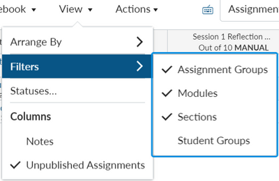
To do this, it's necessary to see both columns at a time, preferably side by side. When viewing one module at a time, the dummy assignment doesn't appear, so all modules must be viewed. This is a daunting view, and finding the 2 columns and dragging them past multitudes of widely spaced columns is very frustrating.
To complicate matters, our admin would like us to allow students to rework these warm-ups to improve grades.... and they do! On one hand, this is great. However, when the gradebook column that calculates the average changes, the dummy assignment column doesn't. We regularly need to view both columns, side by side, to ensure that the grade that syncs is representative of the student's performance within Canvas.
Columns with less margin would be very helpful, but the ability to recolor an entire column (or just a heading) would be immensely helpful. Visually speaking (in my opinion) Canvas gradebook isn't geared toward busy teachers. There is too much white space, only one font, and no color except for indicators.
I personally would benefit from the ability to format my Canvas gradebook view....similar to how I format my Skyward gradebook view or a spreadsheet.


This discussion post is outdated and has been archived. Please use the Community question forums and official documentation for the most current and accurate information.